
Matt

MA-701

MA-702

MA-703

MA-704

MA-705

MA-706

MA-707

MA-708

MA-709

MA-710

MA-711

MA-712

MA-713

MA-714

MA-715

MA-716

MA-717

MA-718

MA-719

MA-720

MA-736

MA-737

MA-738

MA-739

MA-740

MA-741

MA-742

MA-743

MA-744

MA-745

MA-746

MA-747

MA-748
Matt Guide
ASA Matt Laminates: Quiet Colour for Modern Cabinetry
A calm surface can be one of the most deliberate choices in an interior. ASA Matt Laminates by Mark Decor focus on colour that supports furniture proportions without demanding constant attention. The Matt Series spans light whites and ivories, warm neutral shades, grey families and selected softer colours. Its appeal lies in the relationship between colour, light and surrounding materials rather than in a large printed pattern.
The series is particularly relevant to contemporary kitchen shutters, wardrobes, study cabinetry and full-height storage. Because cabinet faces often form long, continuous surfaces, even a subtle shift from cooler white to warmer ivory can change how a room feels. This page focuses on matte finish laminate sheets and the choices a designer makes when planning subdued furniture surfaces. Broader comparisons between Matt and Metallic finishes belong on the main ASA Laminates page.
White and Ivory Matt Laminates for Light Interiors
Pale matt colours can make cabinetry feel integrated with bright walls, light floors and simple architectural lines. The catalogue's light options include visually distinct white, ivory and porcelain-inspired swatches. A cooler white may coordinate well with brushed steel and pale grey surfaces; a warmer ivory may soften an interior containing oak, limestone-like counters or linen upholstery. These are design interpretations of catalogue swatches, not promises about a calibrated factory colour value.
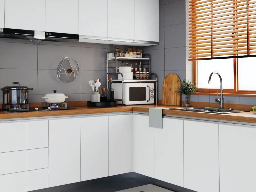
When choosing pale cabinet fronts, evaluate the effect of the room's light temperature. Warm LED lighting can change the appearance of a cool white, while strong daylight can make creamy finishes appear lighter than expected. For modular kitchens, compare the sample beside the worktop and backsplash. For a bedroom wardrobe, hold it near curtains and the floor. A matt surface can look elegant without needing an additional decorative overlay.
Greige, Taupe and Warm Neutrals
Beige-grey, mushroom, taupe and other intermediate shades are useful when a room combines different materials. A perfectly white cabinet may feel detached from warm timber; a strongly brown surface may be too dominant. A balanced neutral can connect the two. The ASA Matt catalogue includes soft mid-tones that can work with natural wood, subdued metals, creamy paint and stone-look interior elements.
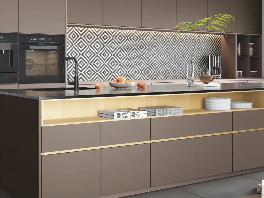
Kitchen designers often use these hues on base cabinets while keeping overhead storage lighter. Wardrobes can use a related neutral across several door panels to create a continuous backdrop. A warmer neutral may also provide a softer setting for black handles or dark-framed glass. The most successful palette is one that treats the laminate, handle, flooring and countertop as a group.
Muted Pink, Grey, Green and Blue Colour Families
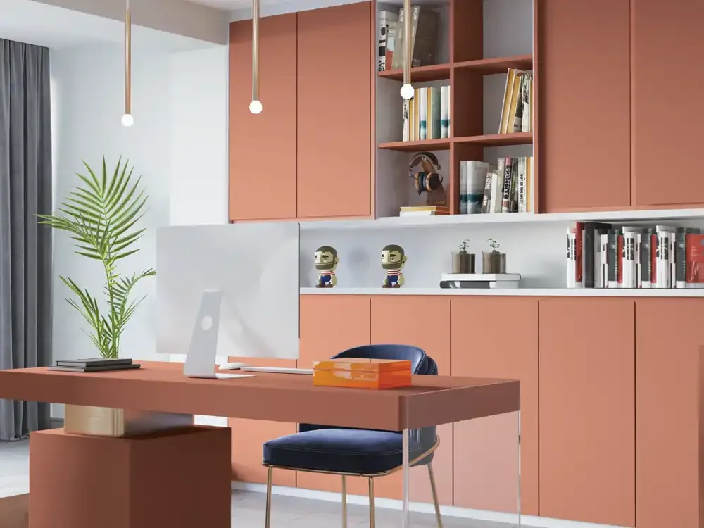
Not every contemporary furniture design needs to rely on beige and white. The Matt Series also presents softer coloured swatches, including pink-influenced neutrals, greys, green-blue tones and muted teal families. These shades can bring identity to a dressing area, a study, children's-room storage or selected kitchen cabinets while keeping the overall mood restrained.
A dusty pink can coordinate with pale oak and warm stone; a soft grey can sit beside darker metal fixtures; a quiet green can connect cabinetry to botanical accents and timber. A muted blue or teal may suit a coastal or contemporary scheme when used in carefully selected areas. Instead of mixing several of these shades on one long wall, choose a primary colour and use the rest only where the design calls for contrast.
Kitchen Shutters and Modular Furniture Planning
The flat planes of cabinet shutters make finish selection particularly important. With ASA Matt Laminate Sheets, the impression comes from clean lines, aligned panels and deliberate hardware choices. In a compact kitchen, a light Matt finish may prevent tall cabinets from appearing heavy. A mid-tone can create visual balance beneath a bright countertop, while a deeper colour can define an island or separate pantry area.
Before specifying sheets, review cabinet sizes and cutting arrangements with the fabricator. The same colour may appear slightly different on a large plane compared with a small catalogue sample because it receives light from a different angle. Consider how joints align with doors and whether edge bands match, contrast or disappear visually. Good detailing usually contributes more to the finished result than adding several decorative surfaces at once.
Wardrobe Doors, Dressing Units and Bedroom Storage
Bedroom furniture benefits from a comfortable visual rhythm. Full-height wardrobes can dominate the wall, so low-key matt colours allow bedding, artwork and lighting to remain important. A warm white or beige-grey may suit a room with natural textures; a deep neutral can make the same space feel more architectural. The choice should reflect the room size, available daylight and the intended visual weight of the wardrobe.
The Matt Series can also extend to bedside cabinets, dressing-table drawers or integrated study storage, creating continuity across separate furniture pieces. Repeating one finish strategically gives the interior a consistent language without forcing every surface to match. Where a wardrobe includes mirrored panels or glass, check how reflection changes the apparent colour of adjacent laminate.
Understanding the Finish and Its Care
The catalogue identifies the Matt Series separately from Metallic and illustrates shared surface-protection features, including anti-fingerprint and scratch-related claims. A subdued finish can make furniture pleasant to live with, but it does not make marks or cleaning requirements disappear. High-contact areas such as frequently opened shutters and desk drawers still require sensible care and suitable hardware.
Use a soft cloth and the product's recommended cleaning method. Avoid abrasive pads and strong chemicals unless a current technical sheet expressly permits them. Wipe spills promptly and check cabinet edges, because moisture exposure at joints can affect the assembled substrate even where the decorative sheet has water-resistance claims. Finish selection and care should work together, particularly in busy kitchens and shared workplaces.
Matt Sheet Dimensions and Installation Considerations
The supplied catalogue gives the ASA Matt range as 8 × 4 ft sheets with 1 mm thickness. These are nominal collection specifications, not final installed shutter dimensions. The laminate forms a decorative surface over an appropriate prepared substrate and should be used with a compatible bonding system. Confirm current technical instructions, edge treatment and installation tolerances for the project.
Plan the placement of seams, handles and exposed corners before the sheet is cut. Where several shutters meet, consistent orientation and careful alignment matter. If a project combines matt cabinetry with another laminate finish, fabricate and view a sample junction first. The catalogue refers to MARK BOND as a related adhesive option; confirm the appropriate formulation and application method rather than treating a brand mention as a universal adhesive specification.
Styling Matt Furniture with Other Materials
Matt laminate surfaces work well when the rest of the interior has a clear visual hierarchy. Pair a soft neutral with a textured timber to introduce warmth, or set a deep matt grey beside a light stone-look worktop for contrast. Brushed metals may complement restrained cabinet fronts, while matte black handles can create a crisp rhythm across drawers and tall wardrobes.
The surface should complement rather than imitate every surrounding material. A pale wardrobe can sit comfortably beside warm timber flooring even when the colours do not match exactly. In an office, calm matt cabinetry can support a more prominent reception feature or lighting installation. In a home study, using the same shade on drawer fronts and overhead storage can make a small workspace feel intentional and organised.
When to Choose Matt Rather than Metallic
Choose Matt when the goal is continuity, low-key colour and furniture that works as a background for other design elements. A Metallic finish can be effective as an accent, but it usually attracts more visual attention. On long kitchen runs or full-height wardrobes, too much competing shine can pull focus away from the room's proportions. A Matt finish can therefore be a useful anchor for a larger material palette.
This doesn't make one series universally better than another. The correct decision depends on location, desired contrast and personal taste. For detailed metallic-look finish selection, use the dedicated Metallic subcategory page. For collection-wide specifications and comparisons, use the parent ASA Laminates category. Comparing the two finish families side by side makes it easier to select a coherent furniture palette.
Selecting Specific Matt Colours for a Project
Mark Decor's Matt products are identified by MA codes. The colour descriptions on individual product pages can help narrow the shortlist, but the product code and physical swatch remain important when confirming a selection. Several names printed in the supplied catalogue have ambiguities across swatches, so editorial colour labels should not be substituted for the official order reference without confirmation.
A practical sample board might compare a pale white, a warm mid-tone and one muted accent colour against the actual worktop, hardware and flooring. Observe the samples from the approximate distance at which the finished furniture will be viewed. Note which shade feels calm over a large area, which creates contrast and whether the selected colour is likely to remain comfortable under evening lighting.