
Fluted Acrylic
Collections
Fluted Acrylic Guide
Fluted Acrylic Sheets for Considered Interior Design
Fluted Acrylic Sheets introduce repeated lines, shifting highlights and a more architectural surface into modern interiors. Instead of relying on a printed motif alone, a ribbed design creates its character through the way narrow vertical channels meet the light. It can bring order to an otherwise plain wall, make a compact feature feel taller, or give a decorative backdrop definition without heavy ornament. Mark Decor places this expression within its Fluted Acrylic collection, where clean solids and marble-inspired finishes support different interior palettes.
The best starting point is not simply choosing the most dramatic colour. Consider the room's daylight, the surrounding furniture, the scale of the feature and whether the fluted surface will sit beside quieter adjoining panels. The collection can work as a restrained background in a neutral room or as a stronger visual accent in a coordinated setting. Its appeal lies in pairing visible texture with the polished character associated with acrylic decorative surfaces.
How Fluting Changes the Appearance of an Interior
A series of parallel ribs can make a surface feel active even when the colour itself is understated. As illumination moves through the day, the face of the panel and the recessed lines catch different levels of brightness. Under warm artificial lighting, pale profiles can read softer and deeper colours can show more pronounced contrast. This makes ribbed acrylic panels useful when a design calls for detail that remains organised and repetitive rather than illustrative or busy.
Acrylic Laminates, Refined Colour and Surface Finish
Fluted Acrylic Laminates offer a different decorative direction from ordinary flat-colour furniture surfacing. The distinctive element is the interplay of surface form and colour, not a claim that every related acrylic sheet necessarily has the same physical grooves. The supplied Mark Decor catalogue presents ribbed designs alongside smaller coordinating swatches. Those accompanying swatches are helpful for colour planning, but their precise surface profile should be confirmed against the product sample before being described as fluted.
The colour range illustrated in the catalogue includes light white and ivory tones, warm beige, muted grey-green, deeper graphite, aquatic blue and teal, silver-grey, charcoal, and marble-look surfaces. Rather than treating all of them as interchangeable, think about the role each colour plays. Whites make the repeated lines subtle; darker shades give them contrast; mineral effects add movement that interacts with the underlying geometry. Samples should be checked in the planned room because rendered images and printing cannot guarantee exact colour.
Where Decorative Fluted Acrylic Panels Work Best
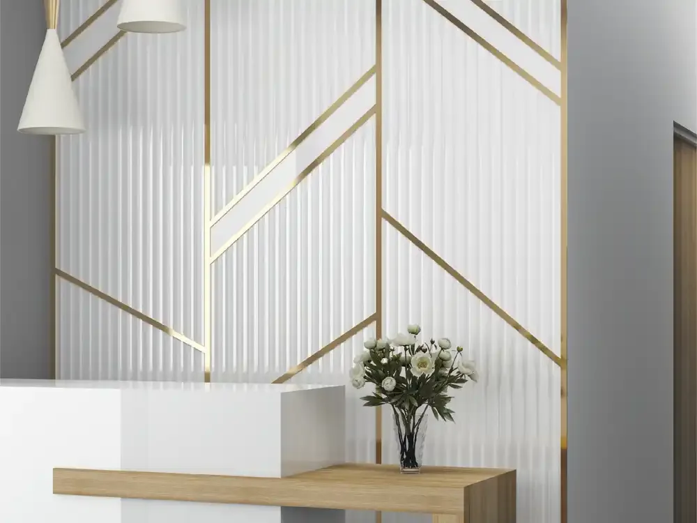
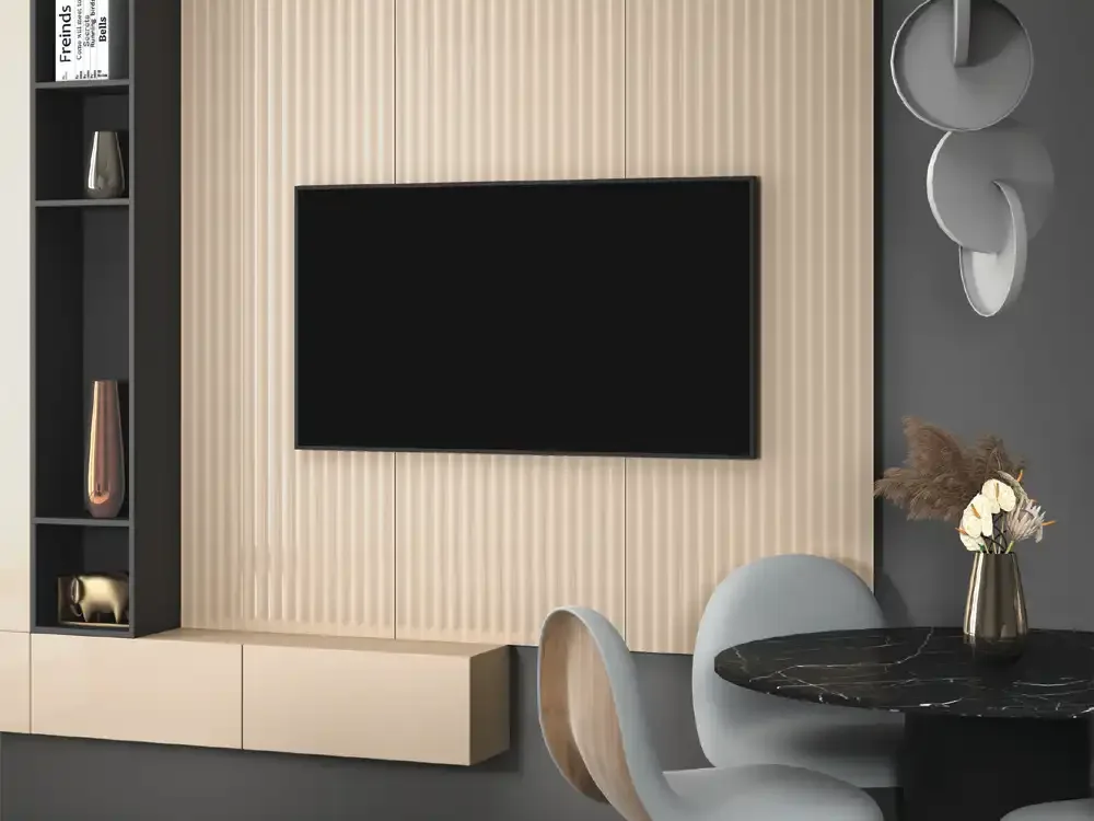
Feature walls are a natural starting point, particularly in living areas where a surface can anchor a console, framed artwork or television setting. The catalogue shows a pale fluted backdrop with fine metallic accents and another warm ribbed backdrop behind a screen. These are useful design references, not universal installation instructions. The surrounding wall construction, mounting method and heat-producing equipment must still be assessed independently before any decorative panel is installed.
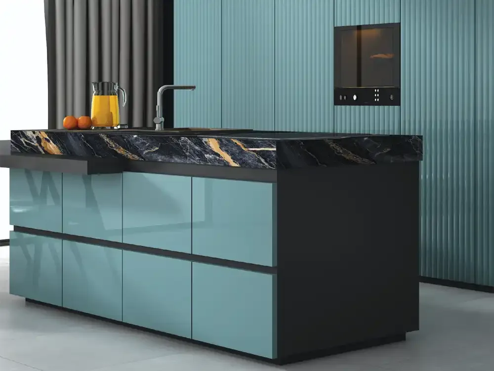
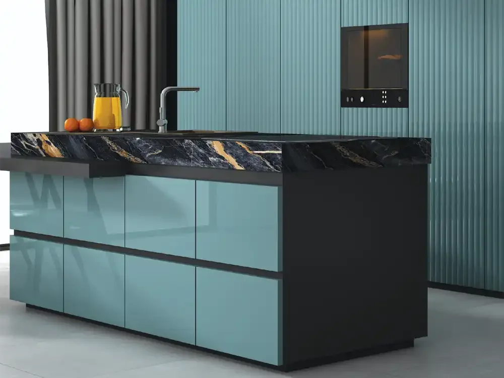
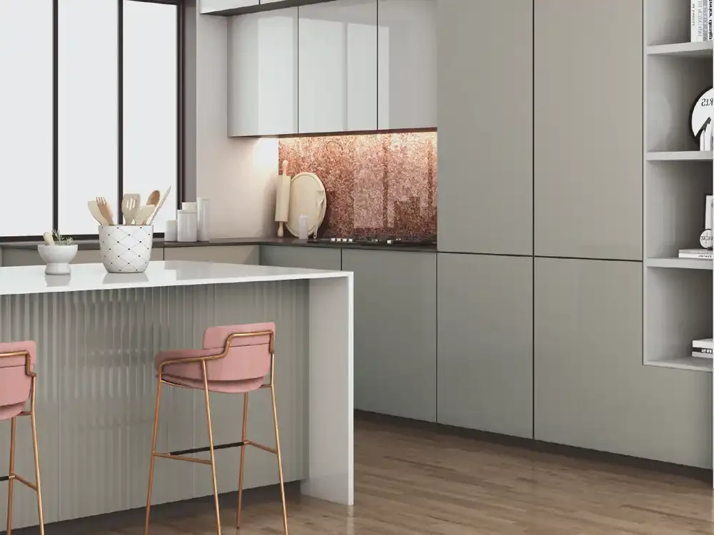
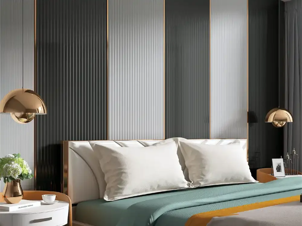
Other catalogue illustrations include kitchen cabinetry, a lounge or bedroom backdrop, an island-facing decorative zone and a reception setting. Each uses the material differently: one introduces vertical detail beside broad cabinet planes, another sets a quiet rhythm behind furniture, and another combines soft colour with commercial interiors. For a designer wall panel treatment, choose a limited area when the room already includes strong stone, timber or patterned fabrics. Keep neighbouring materials simple enough that the fluting remains deliberate.
Verified Sheet Format and Performance Information
The supplied Fluted Acrylic catalogue states a 2440 × 1220 mm sheet size and 2.5 mm thickness. It also identifies 6H anti-scratch hardness and describes a high-gloss, acrylic-based surface with stain resistance, easy-clean care and an anti-bacterial surface. These are collection-level catalogue statements; they should not be expanded into unrelated certifications, guaranteed scratch-proof performance or claims about every installation environment. Actual fabrication tolerances, substrate requirements and finished system performance may depend on the selected design and installation method.
The technical comparison page discusses gloss, colour consistency, UV resistance, water resistance and heat resistance for the acrylic laminate category. Such comparative performance information is useful when evaluating materials, but it does not replace project-specific suitability testing. In particular, moisture resistance of a decorative sheet is not the same as making an entire cabinet or wall assembly waterproof. Edges, substrate, sealants and surrounding construction remain important to the finished result.
Selecting a Colour for Living Rooms and Bedrooms
For a living room with dark wood furniture or brass-coloured details, an off-white or warm beige ribbed finish can create contrast without adding another strong hue. A cooler silver or muted sage-grey profile may suit stone-look flooring, pale upholstery and black metal trim. Deep charcoal or graphite can give a seating or media wall a more dramatic appearance, especially when another surface in the room supplies warmth. The preferred effect should be tested under both daylight and evening lighting.
Bedroom surfaces often benefit from a calmer treatment. An ivory ribbed feature near the headboard can add structure while leaving textiles and bedside lighting as the main visual focus. A grey-green shade can coordinate with timber and neutral upholstery, while a slightly darker panel can define a smaller alcove or dressing area. Consider reflected light and the distance between beds, wardrobes and the decorative wall, since high-gloss materials may create highlights that feel stronger in smaller rooms.
Kitchen, Furniture and Reception Design Considerations
Kitchens mix many surfaces in a confined space: worktops, backsplash material, handle profiles, cabinet doors and appliances. Fluted detail usually benefits from a supporting role, such as a carefully chosen vertical band, a display wall or an architectural accent beside smoother cabinetry. The catalogue includes kitchen-oriented examples, but an acrylic decorative panel should not be treated as an unrestricted splash-zone or heat-zone solution. Review the adhesive, substrate, ventilation, clearance and exposure conditions with the installer.
In furniture-led interiors, acrylic finishes can be coordinated with plain cabinet surfaces rather than repeated on every face. The same principle applies to reception desks, display joinery and office feature sections. A pale fluted backdrop can make a commercial space feel clean and orderly; teal, darker grey or a veined design can communicate a more expressive identity. Plan the direction and continuation of the grooves before finalising panel placement and cuts.
Choosing Between Solids and Marble-Inspired Designs
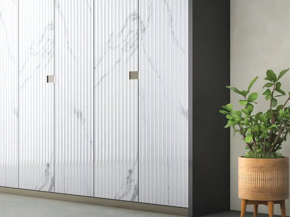
A solid-colour fluted surface works best when the geometry should be the main visual event. Light colours soften the channels, mid-tones reveal their rhythm, and dark finishes produce bolder tonal variation. A marble-inspired acrylic design introduces an additional visual layer: printed veining across the repeated texture. Such combinations may be effective as a focused feature panel, though they can compete with strongly patterned stone or furniture elsewhere in the room.
When choosing between the two, assess the scale of the room, the surrounding finishes and the desired longevity of the palette. Solids are often simpler to coordinate over time, while a marble-look design may be more expressive in a single feature. The Mark Decor catalogue illustrates both light veined designs and a very dark marble-inspired example. These should be regarded as decorative finishes, not as natural marble sheets.
Fabrication, Bonding and Care Without Overclaiming
The catalogue recommends Mark Bond adhesive for acrylic laminate applications and gives practical preparation and care guidance. It advises using a clean, non-abrasive cloth and avoiding aggressive cleaners, direct flame, unsuitable heat exposure and poorly prepared substrates. Panel appearance depends as much on the base surface, correct adhesive method and controlled handling as on the decorative sheet itself. Moisture in plywood or another substrate can affect the assembly even when the decorative face has moisture-resistant properties.
Before installation, confirm the selected profile, sheet orientation, exact wall or furniture measurements and suitable substrate. Plan edge protection and junctions rather than assuming a decorative sheet is self-supporting. The catalogue cautions about direct sunlight, improper chemicals and exposure to temperatures above 30°C–35°C over extended periods. Projects with unusual sunlight, temperature or humidity should be reviewed with the manufacturer or qualified fabricator.
Explore the Mark Fluted Subcategory
The Fluted Acrylic category provides the broad overview of sheet format, practical considerations and design choices. For actual design selection, continue to the Mark Fluted subcategory, where specific ribbed appearances and coordinating colours can be compared against product codes. This separation helps buyers browse the range systematically: start with the surface type, then examine the visual details of an individual option rather than assuming one finish represents the entire collection.
Because catalogue artwork includes related flat colour references as well as ribbed panels, use the product image and code together when discussing a quotation or sample. A consistent design brief should identify the preferred finish, intended room, required quantity and relevant wall or furniture dimensions. Mark Decor's product pages can then provide the next level of design-specific information.
Why a Thoughtful Fluted Acrylic Selection Matters
A decorative feature has to work in a real interior, not just in isolation. The best choice combines a suitable colour, the scale of ribbing, realistic performance expectations and an installation plan that respects the material. When the surface is used selectively, decorative acrylic panels can introduce depth and continuity without overwhelming adjacent materials. A good specification also distinguishes between catalogue-backed facts and assumptions that need confirmation before purchase.
For architects, furniture professionals and homeowners, Mark Decor's Fluted Acrylic category is therefore a starting point for comparing contemporary decorative textures with practical sheet information. The collection is most useful when pattern, finish, lighting and application are considered together. Selecting the appropriate product code and verifying a physical sample are more valuable than choosing a finish solely from a screen.