Volume - 7
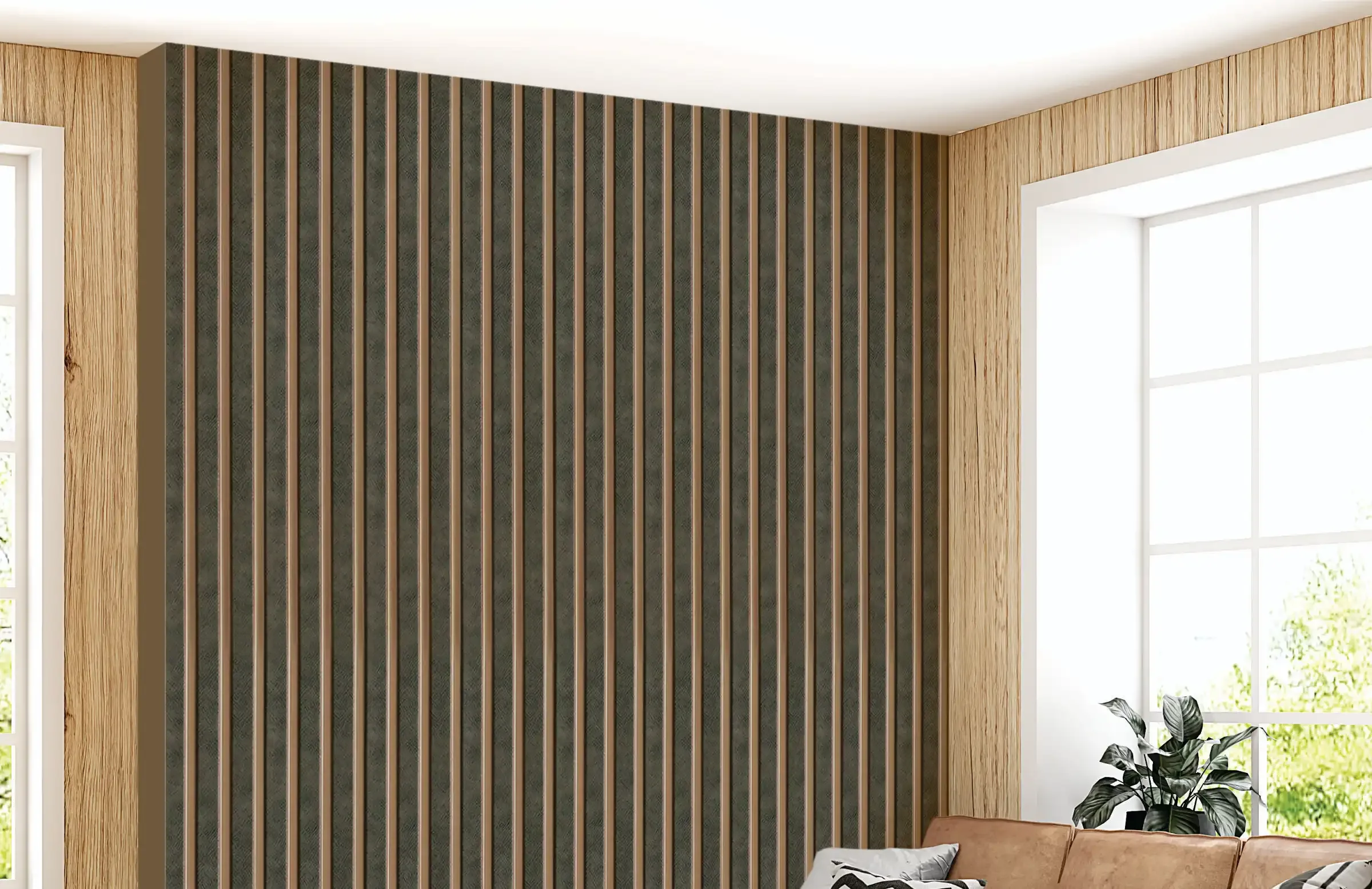
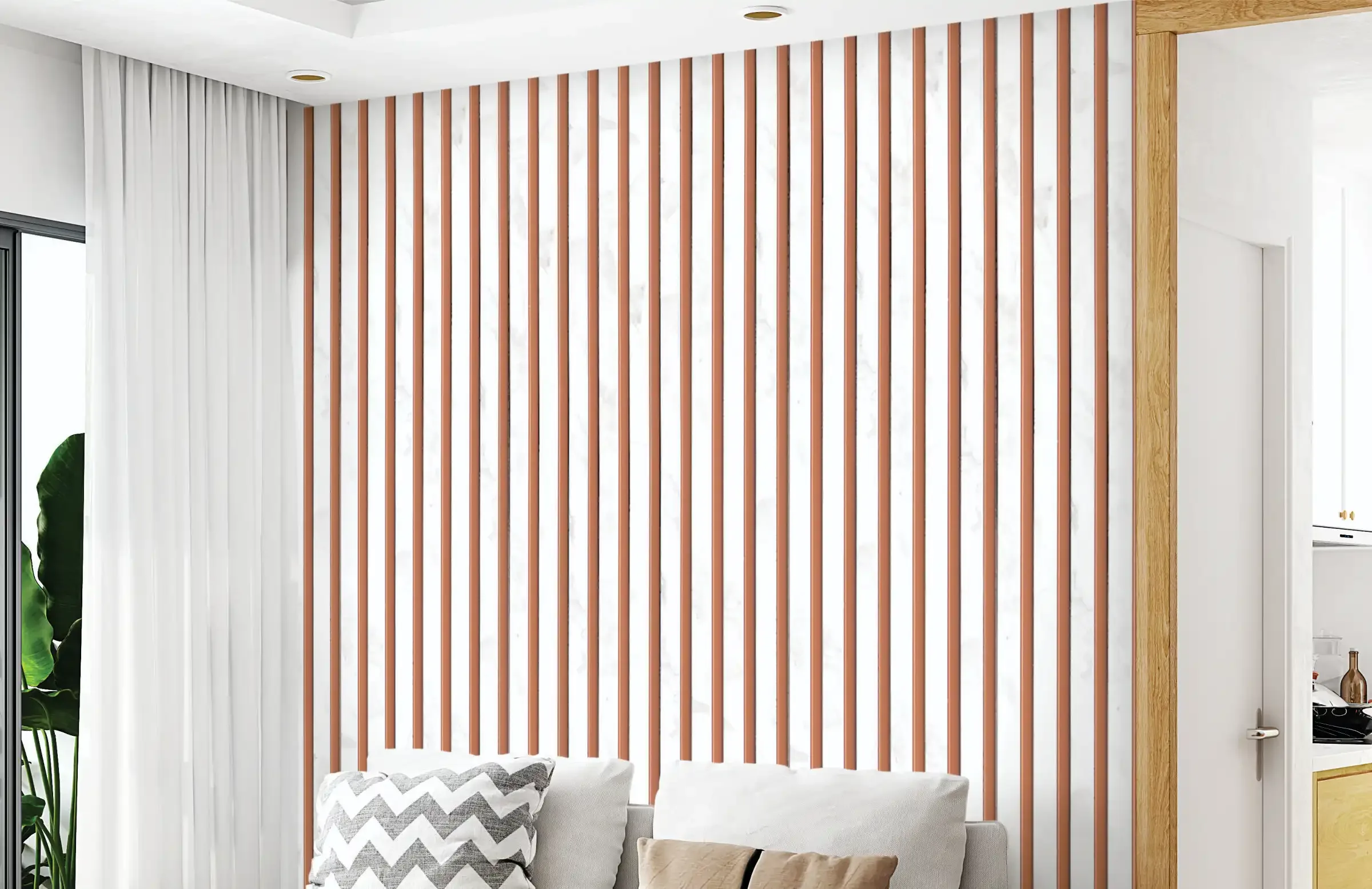
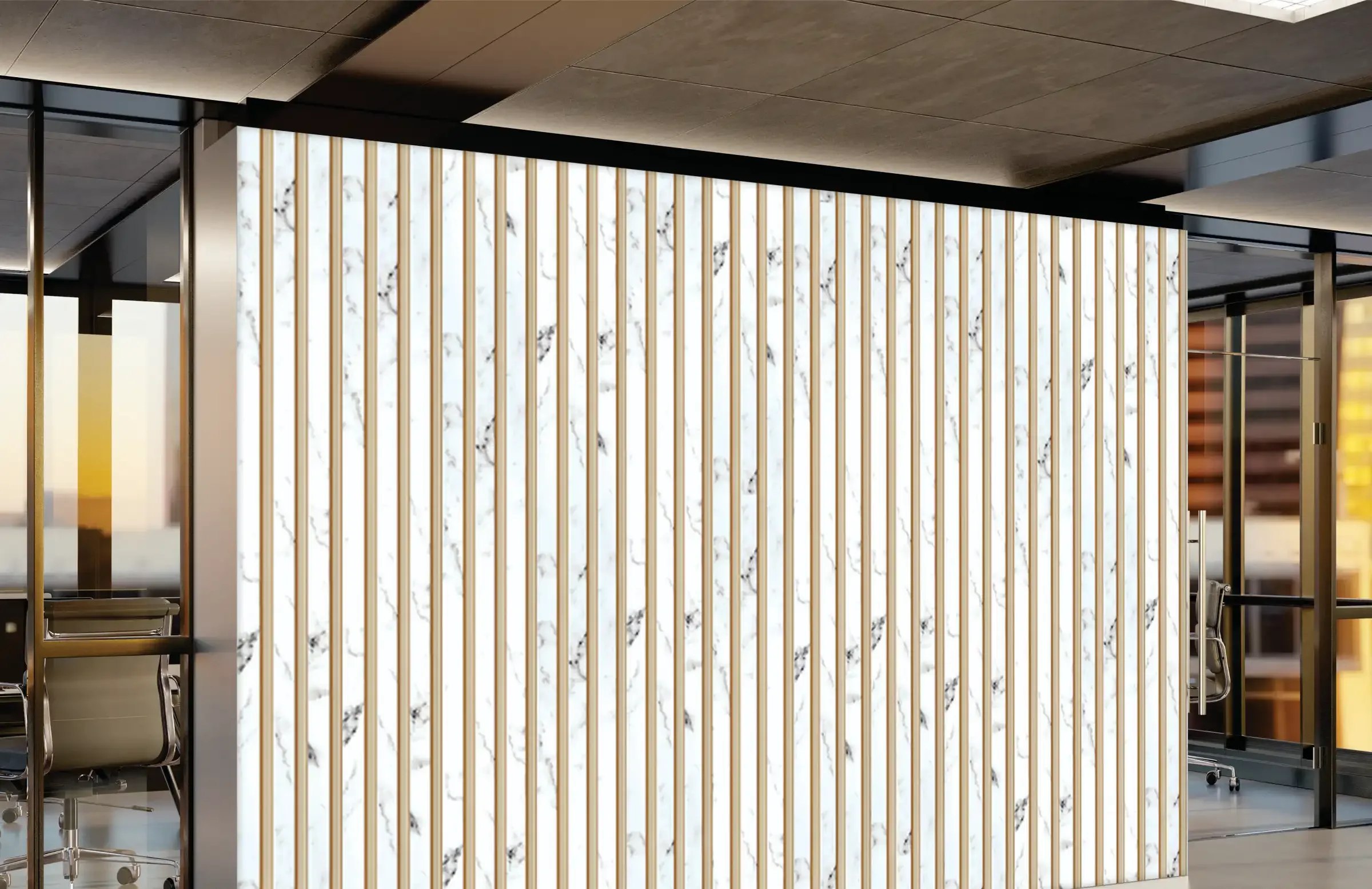
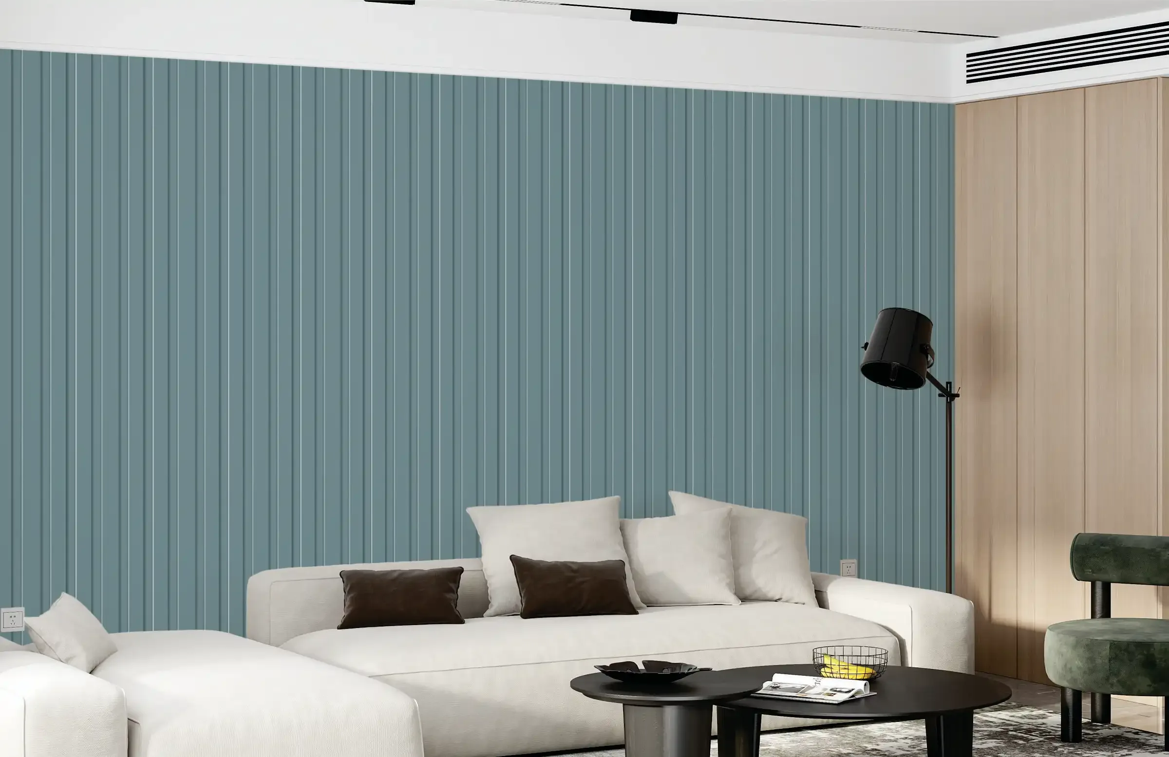
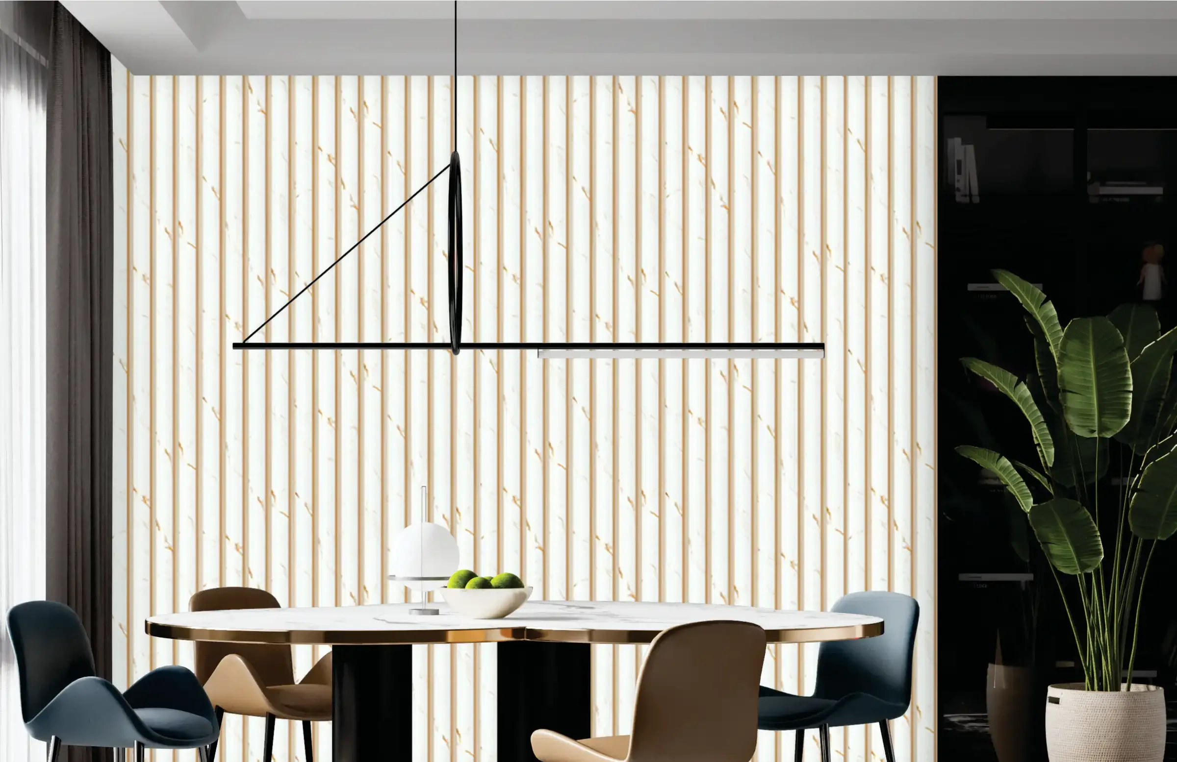
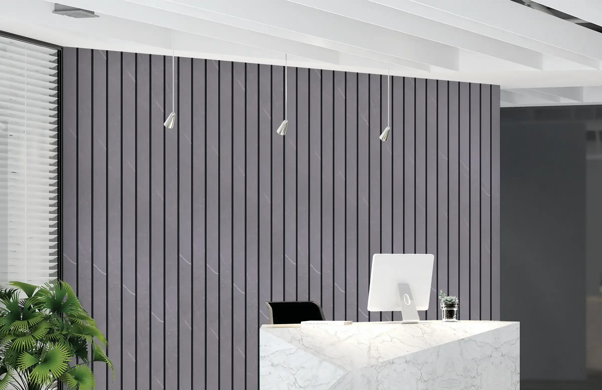
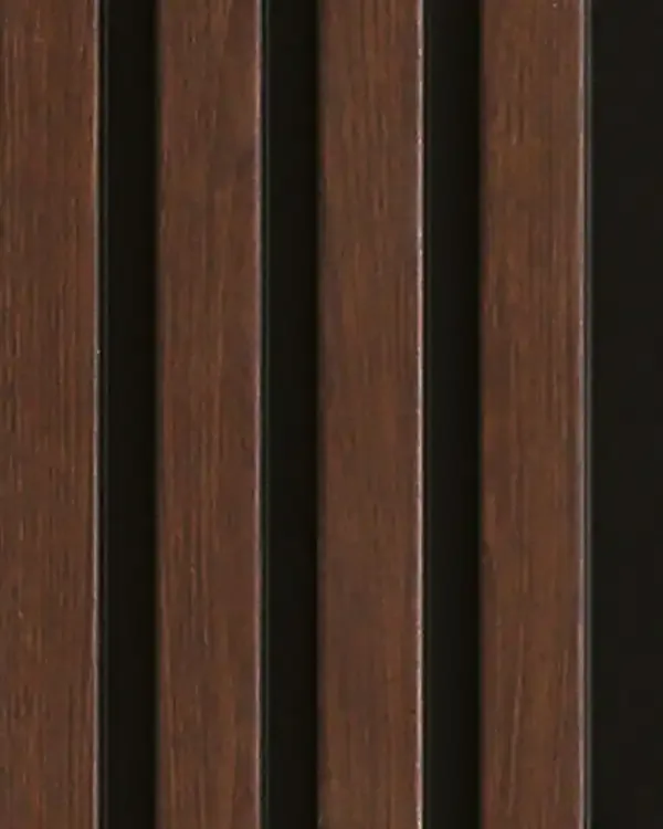
Mark Decor Volume - 7 is a 48-design collection of high-grade PVC louvers created in a 120 mm wide profile with a 10 mm thickness. The range includes wood finishes, marble effec...
BITA 02
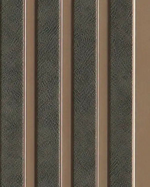
BITA 03
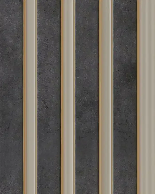
BITA 06
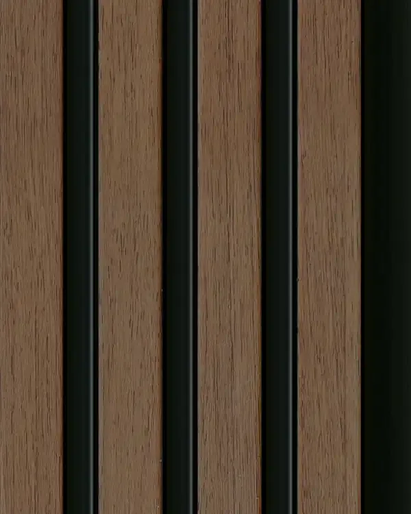
BITA 07
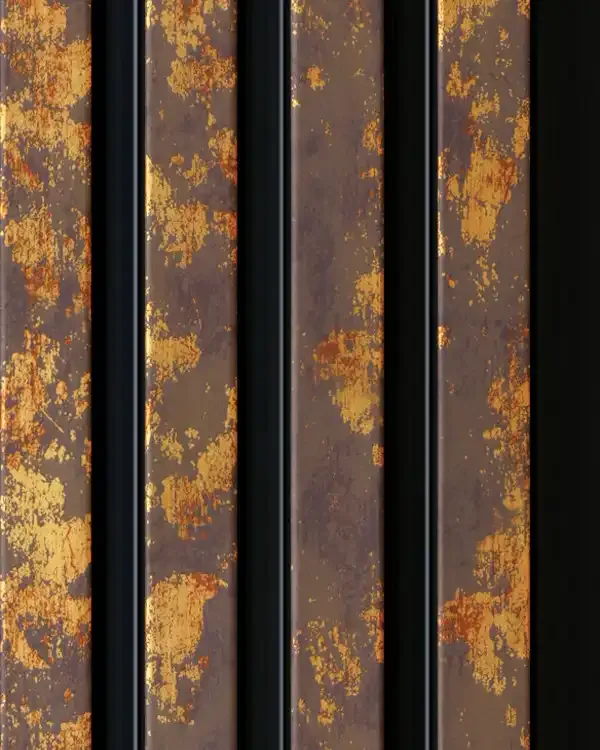
BITA 08
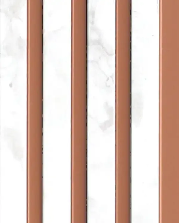
BITA 09
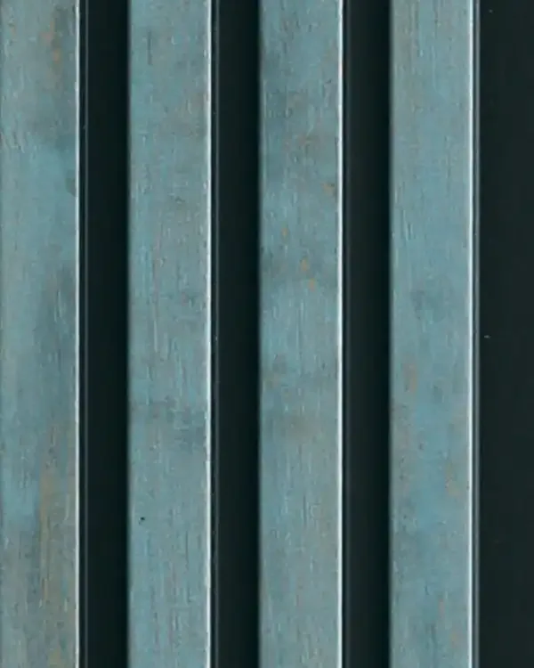
BITA 11
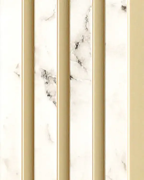
BITA 12
BITA 25
BITA 26
BITA 27
BITA 28
BITA 29
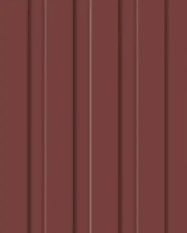
BITA 30
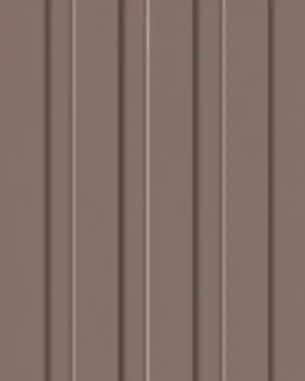
BITA 31
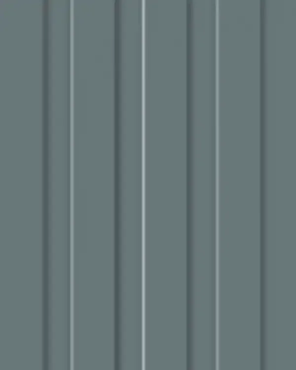
BITA 32
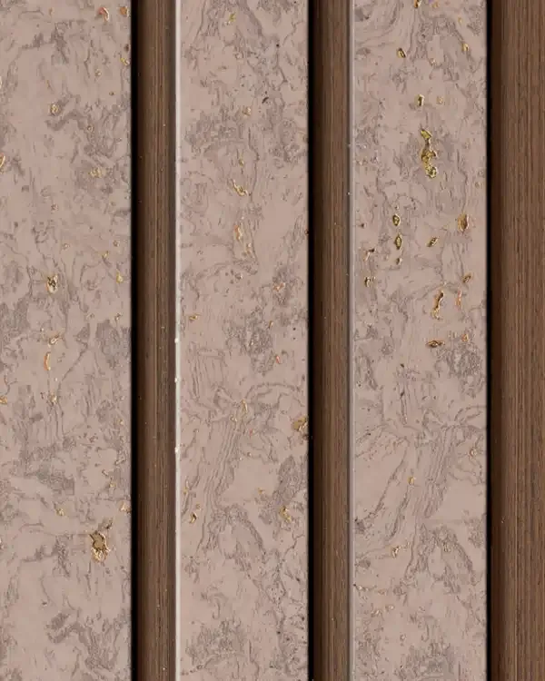
MD-2001
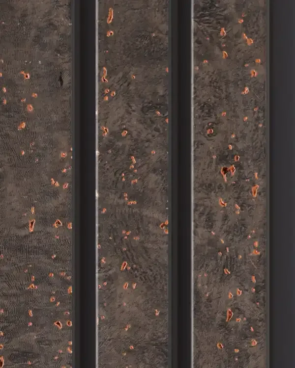
MD-2002
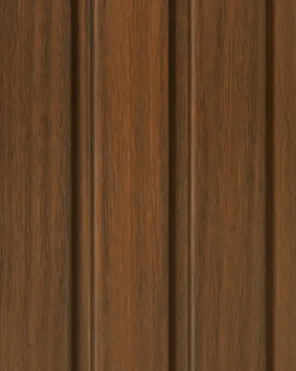
MD-2003
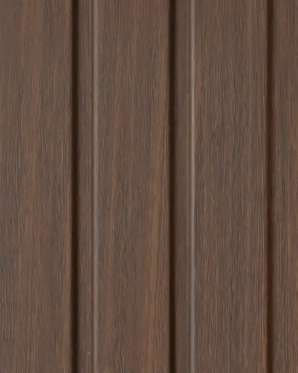
MD-2004
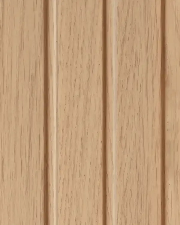
MD-2005
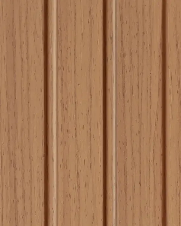
MD-2006
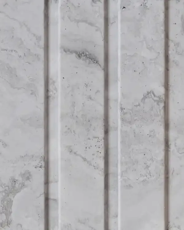
MD-2007
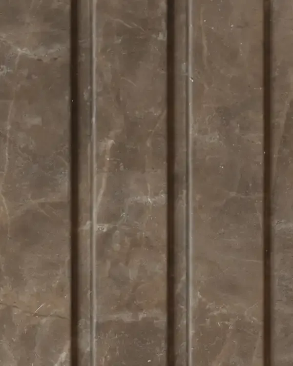
MD-2008
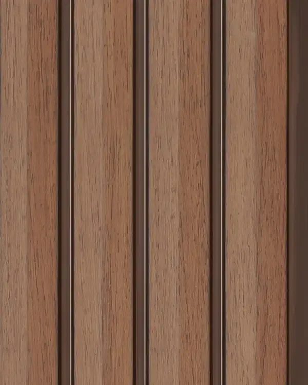
MD-2601
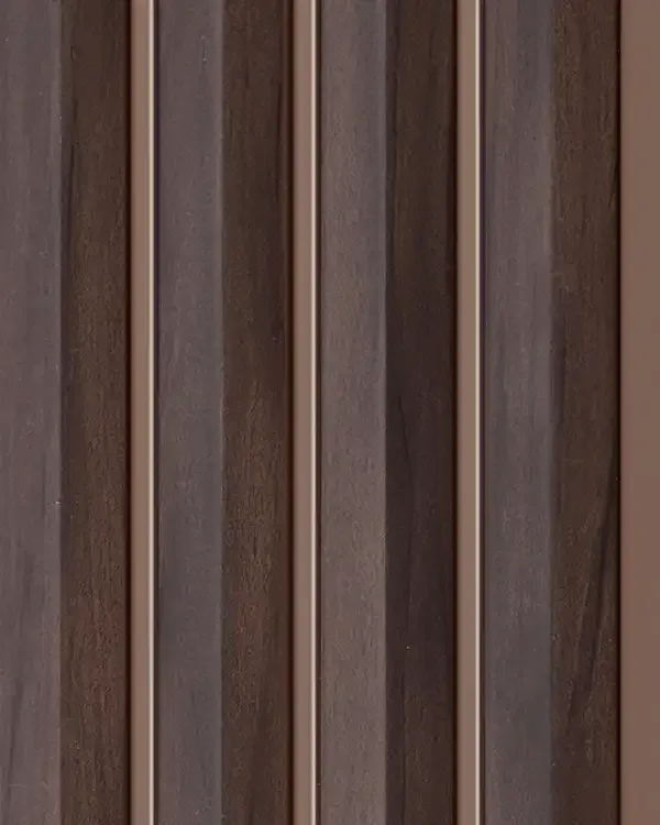
MD-2602
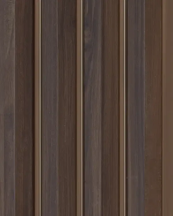
MD-2603
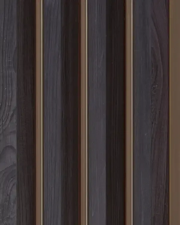
MD-2604
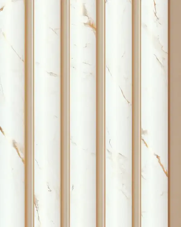
MD-3901
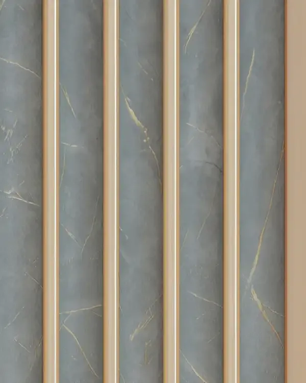
MD-3902
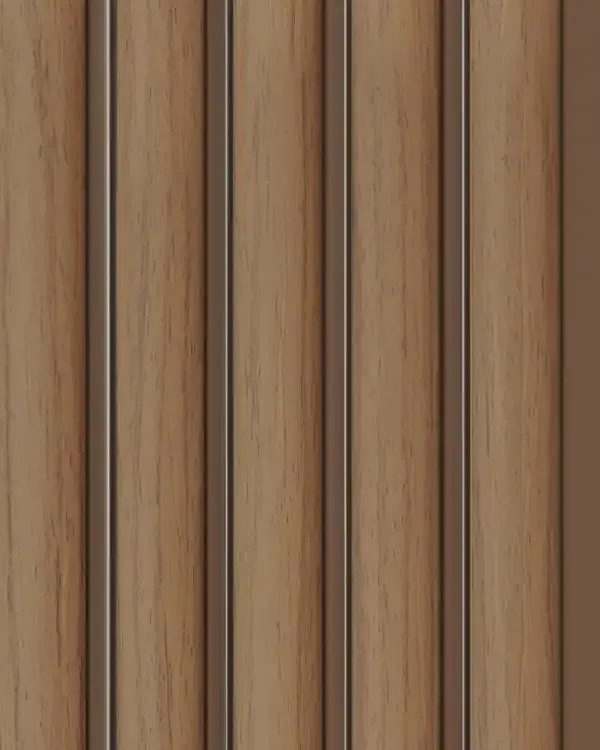
MD-3903
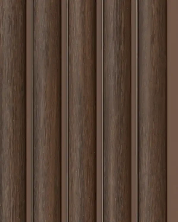
MD-3904
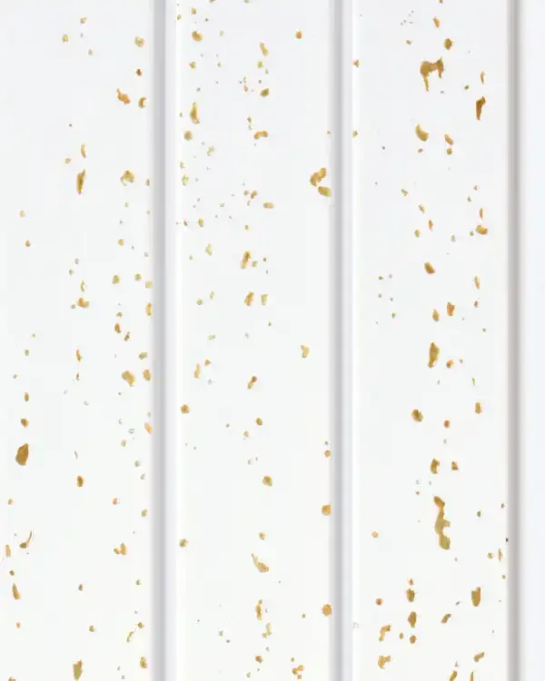
MD-4001
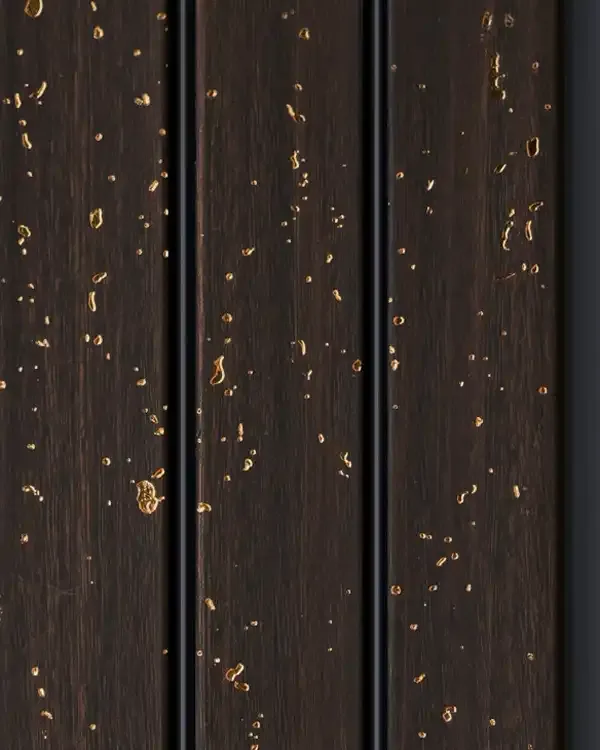
MD-4002
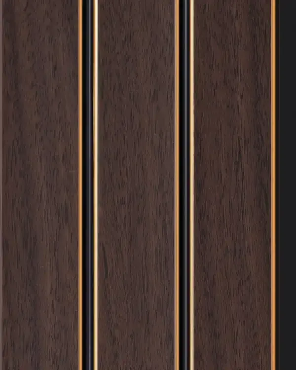
MD-4003
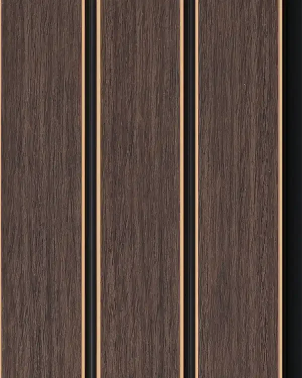
MD-4004
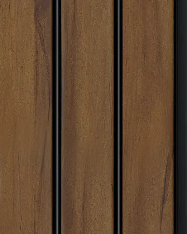
MD-4005
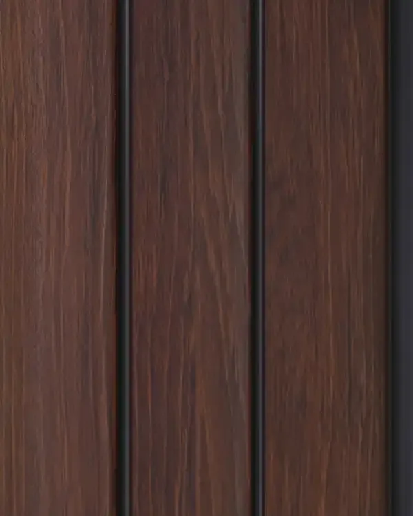
MD-4006
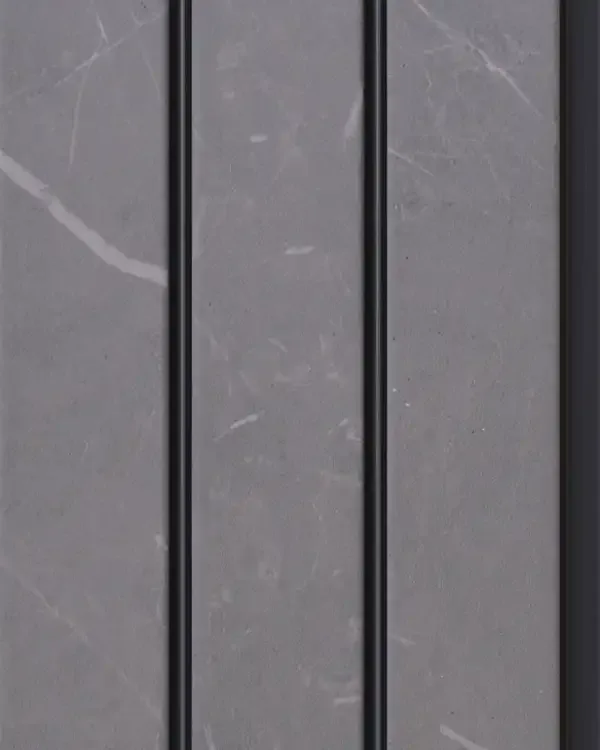
MD-4007
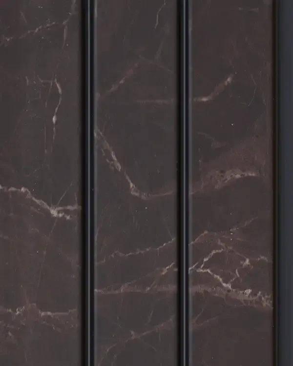
MD-4008
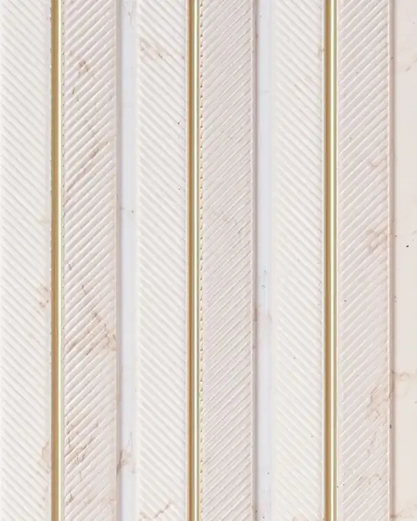
MD-5001
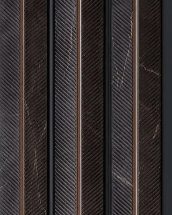
MD-5002
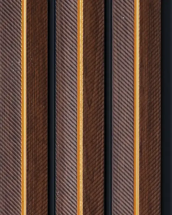
MD-5003
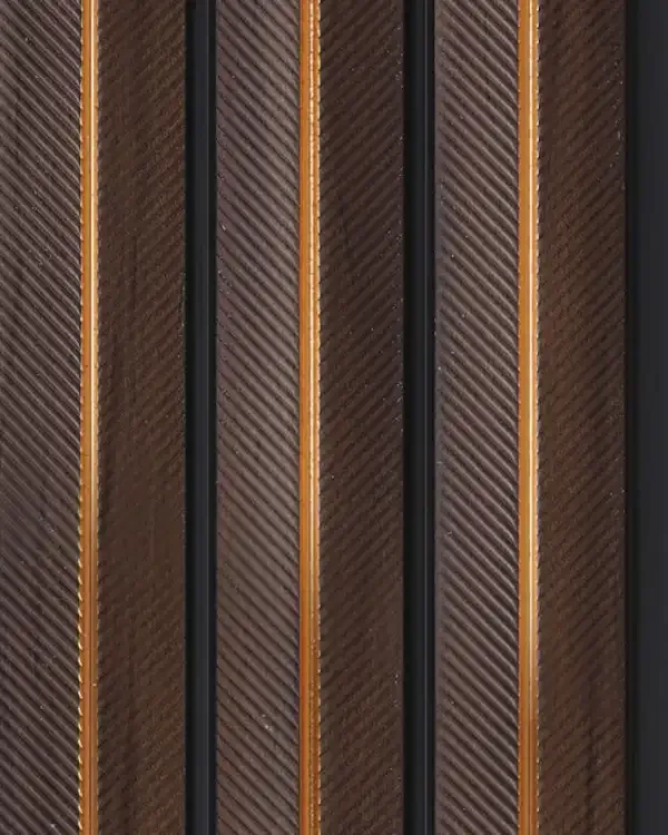
MD-5004
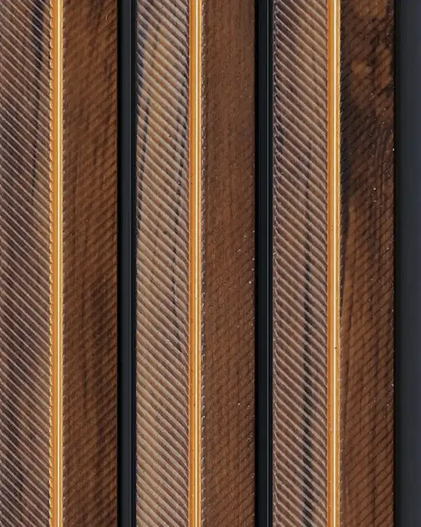
MD-5005
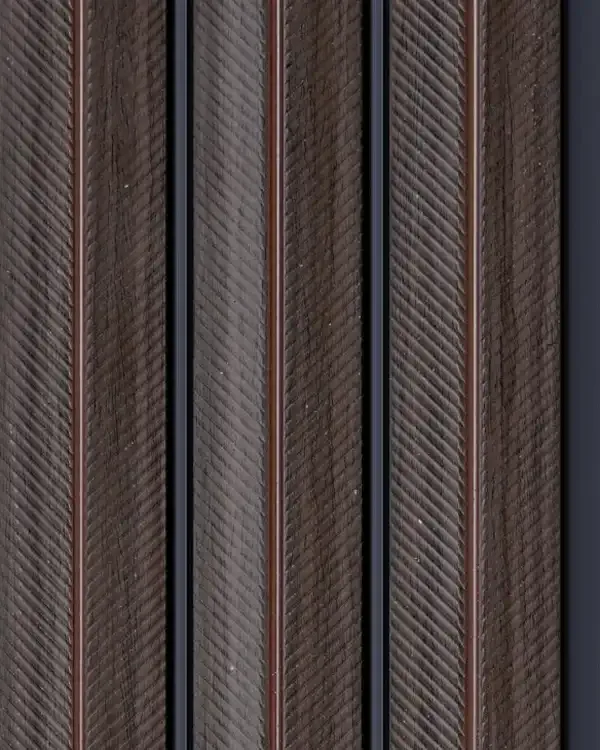
MD-5006
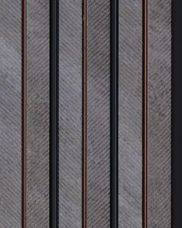
MD-5007
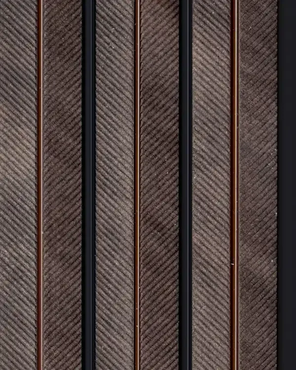
MD-5008
Volume - 7 Guide
Volume - 7 Wall Louvers with a Defined 120 mm Rhythm
Volume - 7 is a separate Mark Decor louver series built around a nominal 120 mm face and a distinctive selection of decorative finishes. The existing PIM describes 48 designs, including warm wood looks, pale and dark marble effects, grey mineral appearances, patina blue, oxidised-metal-style surfaces and contemporary solid colours. Its search identity should therefore combine the series name, the 120 mm profile and this particular decorative palette—not compete with every other Mark Decor page for the broad term “Louvers.”
The regular width gives the series a repeated vertical rhythm that can be read at different distances. A wall covered in light, closely related shades may appear almost continuous from across the room; a strong mineral or patina design can make individual profiles more visible. The goal is to select the finish and pattern density that work with the architecture, not simply to choose the most dramatic image in the range.
Understanding Volume - 7 Size Information
The supplied PIM describes Volume - 7 with a 120 mm width and 10 mm thickness. It shows a 2440 mm displayed panel format while also discussing length options from 8 to 12 feet in collection information. Those statements should be treated carefully: a range-level length offering does not prove that every individual design is available in all lengths. Always confirm the exact code and current manufacturing or stock options before planning a specific wall.
Profile width affects panel rhythm; thickness influences junction treatment; length governs how the panel relates to ceilings and horizontal seams. A measured elevation should establish how many full units can fit and where cuts or trims may occur. Ask for effective coverage and joining instructions instead of dividing wall width by a nominal dimension without allowance for the actual installation system.
Patina Blue and Oxidised-Look Decorative Surfaces
One important Volume - 7 design direction is its patina and weathered-metal-inspired appearance. A muted blue or oxidised-looking surface can give a room an atmospheric character without relying on bright, saturated colour. Used on a modest wall, this type of finish can connect dark furniture, black hardware and stone textures; used on a very large area, it may demand simpler furnishings to prevent visual overload.
The words patina and oxidised describe the visual effect of the decorative surface. They do not establish that the panel is made from oxidised metal or that it should be cared for like raw metal. Review a physical sample under the intended lighting: some accents can look warmer or cooler depending on light temperature, and photographs may not capture their full contrast.
Marble and Mineral Looks within the Volume - 7 Palette
Volume - 7 also includes light marble impressions, grey stone-inspired motifs and textured mineral directions. Pale marble can support an airy reception or a brighter living room; charcoal stone-like appearances can give a TV area more contrast. The 120 mm repetition adds vertical structure over the decorative print, so the same stone impression can read differently from a broad flat sheet.
The surface should be considered beside actual flooring and cabinetry. A highly veined countertop may be better balanced by a quieter louver, while a plain floor can accommodate a more expressive decorative wall. Describe these finishes accurately as looks or effects; do not present them as solid natural marble, quarried stone or any material not supported by the actual technical specification.
Wood-Inspired Volume - 7 Designs for Warm Interiors
Alongside mineral and patina effects, Volume - 7 offers wood-inspired shades from lighter grains to deeper browns. The resulting wall can feel inviting without adding more furniture mass. Mid-tone wood looks often work with cream, beige and muted grey rooms, while darker tones provide stronger contrast against pale upholstery or white storage.
Look closely at the undertone of any wood-inspired finish. Two products may both be called walnut but differ in redness, darkness and grain intensity. Compare them with the physical floor sample or furniture laminate and review them in daylight. The aim is deliberate coordination, not a claim that the decorative surface is made from solid timber.
The 120 mm Profile on TV Walls and Media Zones
On a television feature wall, the repeated Volume - 7 width can create a measured background behind a console or along the sides of the screen. A quieter ash, soft marble or muted grey treatment may keep visual attention on the display, while a deep charcoal, black or mineral effect can help the television blend into a darker architectural frame.
Avoid installing fixtures solely into decorative panel material without an appropriate structural backing. Screen brackets, cabinets and shelving should use their specified supports. Plan access to wiring, power, audio connections and ventilation before finalising the louver layout. When grazing lighting is used, check that highlights in the selected finish do not reflect distractingly in the screen.
Bedroom Panels with Colour and Profile Continuity
A bedroom design can use Volume - 7 to establish a continuous vertical backdrop behind a low bed or to frame a recessed dressing zone. A subdued timber appearance often feels warm and familiar, while a misty grey or pale mineral panel creates a cooler, more contemporary result. A dramatic patina or black-accented finish may be appropriate as a narrow side feature rather than a full-width headboard wall.
Think about how the panel terminates at the bedside tables and at the ceiling. Balanced proportions can be more effective than covering an arbitrary rectangle. Soft, diffused lighting helps the wall sit calmly in the room; bright, sharp grazing light makes the ribs more prominent. Evaluate the desired atmosphere before deciding where the panel should start and stop.
Dining, Office and Reception Wall Design
Volume - 7 can support dining-room walls and professional interiors because its finishes offer both discreet and expressive directions. A lighter mineral surface can complement a contemporary dining table without dominating it. In an office meeting space, a quiet wood effect can give warmth behind a conference table. In a reception, a patina or dark mineral design may create a strong background for carefully positioned signage.
Commercial suitability should still be checked on a case-by-case basis. Cleaning, direct impacts, equipment installation, fire provisions and wall construction can all change the technical requirements. A visually suitable photograph does not replace the exact product specification and current fixing recommendation for the chosen project.
Creating Contrast with Solid Colours and Charcoal Tones
Solid-colour designs in Volume - 7 allow the panel rhythm itself to become the primary feature. In a light colour, the linework reads through gentle shadows. In a darker tone, the repeated grooves can give a more sculptural appearance. Charcoal Louvers are one possible accent within this mix, particularly when the surrounding furniture and floor are relatively light.
Avoid using dark colour as a default definition of premium design. It can look powerful in a reception or media wall but may feel heavy in a small room with few windows. Test the actual shade at wall scale, include evening lighting in the review, and be sure the intended pattern remains visible without an excessive number of spotlights.
Selecting the Exact Design and Planning the Repeat
Before choosing a Volume - 7 code, compare the design at three scales: a sample held nearby, a view across the room and the intended full-wall elevation. Some finishes reveal most of their detail close up; others create a strong overall pattern from a distance. Sketch where doors, columns and shelves interrupt the vertical repeat so the installation does not end on an awkward partial profile.
Next verify panel availability and dimensions for the chosen design. Discuss corners, trims and the required fixing surface with the installer. Any special environment such as a kitchen work zone, exposed exterior face or wet area requires project-specific technical approval; a broad decorative-use label should not be stretched into a universal performance promise.
How Volume - 7 Differs from Other Louver Collections
Volume - 7 deserves its own page because it combines a 120 mm decorative profile with a particular range of patina, mineral, marble, wood and solid-colour looks. Infinite is organised around Alpha-Beta pairings; Volume - 5 is especially useful for its broad finish-led selection; Volume - 6 is identified by its 2900 mm tall format; and 30 CM Louvera offers a 300 mm face.
Use this page to decide whether the Volume - 7 finish language and profile rhythm fit the project. Then inspect the individual product pages for exact colour and code details. Broad collection comparisons belong to the Louvers category, which helps keep each subcategory focused and reduces unnecessary overlap in their SEO copy.