
Mark Fluted



MD-1014

MD-1016

MD-1018

MD-1021

MD-1023

MD-1024

MD-1028

MD-1031

MD-1032

MD-1033

MD-1035

MD-1036
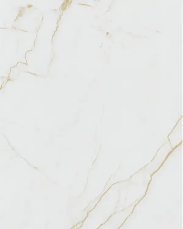
MD-1041

MD-1042

MD-1071

MD-1072

MD-1073
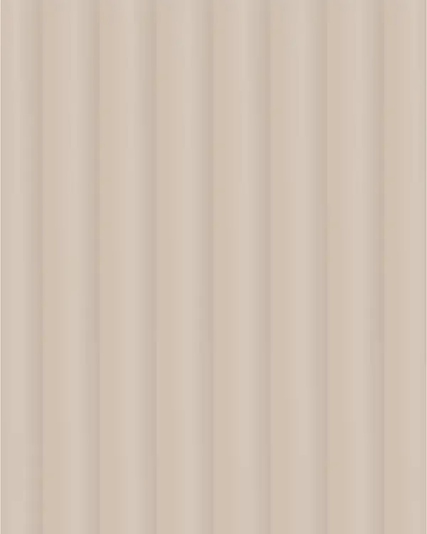
MD-1074

MD-1075

MD-1076
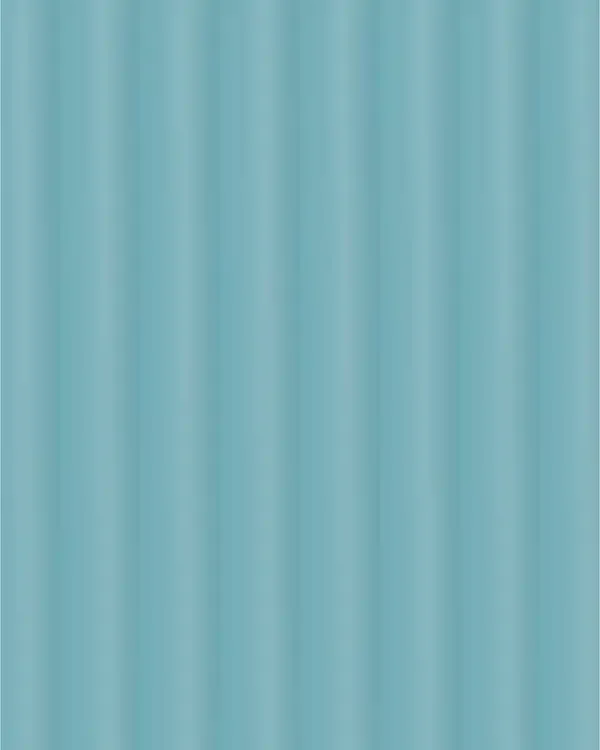
MD-1077
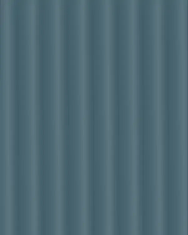
MD-1078

MD-1079

MD-1080

MD-1081

MD-1082

MD-1083

MD-1084
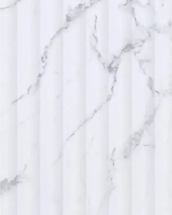
MD-1087

MD-1088
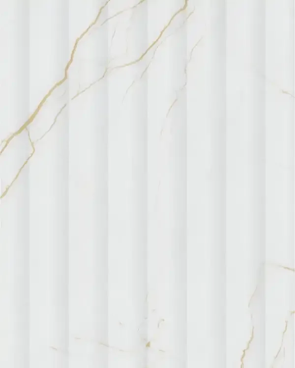
MD-1089

MD-1090
Mark Fluted Guide
Mark Fluted: A Closer Look at the Ribbed Acrylic Collection
Mark Fluted is the design-led collection within Mark Decor Fluted Acrylic, intended for specifiers who want to compare individual shades, repeating line details and coordinated decorative finishes. The collection moves from restrained whites and beiges to cooler greens and blues, darker greys and marble-inspired colours. What brings these appearances together is the carefully presented visual dialogue between upright ribbing and the furniture or wall surfaces beside it. A successful design uses that rhythm intentionally rather than applying a patterned face indiscriminately throughout the room.
The catalogue spreads organise the range into illustrated ribbed panels and smaller matching swatches. This matters when selecting an exact SKU: the illustration of one main panel establishes a fluted appearance, while a neighbouring swatch may establish only a coordinating colour. Mark Fluted should therefore be browsed by product code and verified sample, with appearance and profile discussed as separate details when the source does not explicitly confirm both.
Ribbed Designs Versus Coordinating Swatches
The 32-product PIM mapping prepared for this collection comprises 18 catalogue-illustrated fluted designs and 14 coordinating swatches whose ribbed relief is not separately confirmed in the supplied catalogue. The product copy treats those companion references conservatively. This avoids the common mistake of promising the same groove profile across every related SKU when a flat illustration alone cannot substantiate it. Buyers should confirm the delivered face before using a suffix-code variant as an architectural feature.
This distinction is useful in projects that combine strong texture with quieter cabinet or wall surfaces. A ribbed accent can give a reception wall movement, while a related smooth or differently textured colour can help maintain continuity across adjacent furniture. The swatches can establish tonal relationships without requiring every visible surface to repeat the same lines. Always compare a physical piece of each selected code under realistic lighting before finalising a coordinated scheme.
White and Ivory Ribbed Profiles: MD-1071 and MD-1072
The opening catalogue group shows MD-1071 as a bright white ribbed appearance and MD-1072 as a warmer, softer ivory alternative. Both rely on narrow, repeated vertical lines, but they create different impressions once placed near timber and metal. A crisp white can emphasise clean geometry in a contemporary room; a creamy ivory is gentler beside warm flooring, brass-coloured details or upholstered furniture. Rather than placing both on the same feature wall, choose the shade that responds better to the adjoining materials.
Warm Neutral Flutes and Matching Beige Tones
MD-1073 and MD-1074 introduce champagne-cream and sandstone-beige fluted looks in the product review. They suit interiors that favour quiet warmth over stark white contrast. The catalogue presents this tonal direction behind a television setting, illustrating how vertical ribs can complement straightforward cabinetry, shelves and soft furnishings. Such an accent is most coherent when the wall's height and the surrounding furniture lines are planned together, especially where the ribs meet the edge of a console or built-in unit.
The companion references MD-1014-F and MD-1016-F are shown as smaller warm neutral colour swatches. They can help a designer compare a related beige or oat-toned finish with the visibly grooved panels, but the catalogue does not separately prove that their faces have identical physical fluting. If a project requires both texture and smooth coordination, request the exact sample for each selected code and confirm the surface profile before final specifications are signed.
Grey-Green and Graphite: MD-1075 and MD-1076
The next illustrated pair introduces a muted sage-grey fluted finish and a deeper smoky graphite direction. MD-1075 carries the calm, slightly green cast that can work with pale stone, wood and desaturated interior palettes. MD-1076 reads stronger and darker, especially when the ribs catch side-lighting. The catalogue places grey-toned acrylic accents within a kitchen composition, suggesting a disciplined approach where broad smooth cabinet planes are balanced by selected textured portions.
The smaller related swatches include MD-1031-F and MD-1028-F. Their printed colour blocks may be useful for cabinetry coordination, yet they should be considered colour references until their physical profile is confirmed. In compact spaces, a large dark ribbed field can feel heavier than a small sample suggests. Use a grey-green accent when subtlety matters; use graphite where the project needs a more assertive architectural point of focus.
Lagoon Blue and Deep Slate Teal for Accent Interiors
MD-1077 and MD-1078 shift the collection toward expressive blue and teal. The first appears brighter, bringing an aquatic energy to an otherwise neutral setting, while the second has a deeper blue-grey character. The catalogue illustrates this family around an island-like furniture composition, where a defined vertical wall treatment helps the space feel intentional. Such saturated surfaces benefit from careful balance with countertops, flooring, lighting and furniture edges so the feature stays prominent without dominating the room.
MD-1024-F and MD-1032-F appear as accompanying colour swatches for this palette. Their relationship to the main panels is primarily visual in the supplied pages; their relief profile remains unverified. A designer might select lagoon blue for one prominent zone and a calmer companion for secondary cabinet faces. The decision should be based on actual samples because blues and teals can shift noticeably between daylight, warm LEDs and photographs.
Silver Mist, Charcoal and the Role of Contrast
The Mark Fluted catalogue shows MD-1079 as a light silver-mist ribbed treatment and MD-1080 as a deep charcoal version. The illustrations use these tones in a bedroom setting where strong dark and light elements alternate across a feature wall. This demonstrates why ribbed acrylic wall panels are often chosen as part of a wider composition: the same groove spacing can appear delicate in silver and highly dramatic in near-black.
Pewter, Oat and Softly Coloured Fluted Details
MD-1081 offers a more medium pewter-steel colour direction, while MD-1082 illustrates an oat-beige ribbed finish. Both can sit comfortably between very pale profiles and more saturated feature colours. Their catalogue spread includes a kitchen-oriented interior, where vertical texture is balanced against broad upper cabinetry. Such designs can be effective in spaces that need interest without the visual weight of black or deep teal.
Further into the range, MD-1083 introduces a gentle mint-like tone and MD-1084 a pale lavender-grey appearance. These cool pastel directions can refresh a reception or display setting without forcing a vivid contrast. The related swatches MD-1035-F, MD-1018-F, MD-1023-F and MD-1021-F help with colour planning, although they should not be described as proven grooved surfaces. The project's dominant material palette should decide whether a muted metallic-neutral or a restrained pastel is the better companion.
Marble-Inspired Fluting: Four Distinct Directions
The final catalogue spreads show four notably different marble-look ribbed surfaces. MD-1087 presents a pale white ground with grey marble-like veining; MD-1088 develops a cooler, more pronounced grey vein effect. MD-1089 brings a white or ivory base with fine gold-toned movement, while MD-1090 takes the collection into a very dark field with warm copper-like veining. These are decorative interpretations of mineral patterns, not a representation that the panels are made of natural marble.
Because marble-style veining already carries visual movement, pairing it with narrow flutes produces a stronger surface than either detail alone. The catalogue depicts this approach as a distinctive furniture-wall or feature composition. Nearby swatches MD-1041-F and MD-1042-F help illustrate related light and dark veined palettes, but their physical relief remains unconfirmed. When specifying one of these patterns, view a sufficiently large sample to understand both the veining scale and the effect of the repeated vertical lines.
Where Mark Fluted Works in a Room
Mark Fluted is best considered at the scale of a composition rather than as a single fashionable sheet. A narrow residential feature may require a quieter shade to avoid drawing disproportionate attention; a wide commercial backdrop can accommodate deeper colours and stronger veining. The illustrated settings include TV walls, kitchen interiors, bedroom backdrops and reception surfaces. These examples demonstrate design possibilities, not unconditional permission for installation in high-heat, exterior, wet or load-bearing applications.
Dimensions, Hardness and Care for the Collection
The catalogue states 2440 × 1220 mm sheet size, 2.5 mm nominal thickness and a 6H anti-scratch performance claim for the acrylic laminate range. It also lists high-gloss appearance, easy cleaning, stain resistance, an anti-bacterial surface and 100% pure acrylic wording. These are catalogue-specified surface claims, not a complete specification of every layer in a finished furniture or wall assembly. Check the exact selected product and manufacturer guidance before making further performance commitments.
Care guidance calls for non-abrasive cleaning, suitable adhesive and attention to substrate condition. The catalogue warns against direct flame, aggressive chemicals, prolonged unsuitable temperature exposure and certain direct-sunlight conditions. Decorative acrylic should not be treated as indestructible simply because it resists routine scratches or moisture at the face. Correct bonding, dry and stable substrates, edge detailing and realistic environmental conditions are essential to a durable result.
How to Choose and Specify a Mark Fluted Design
Begin with the functional role: a subtle textured background, a darker accent, a coloured furniture feature or a marble-inspired statement. Next, shortlist designs by their catalogue code and compare samples at the actual installation site. Evaluate the colour under day and evening light, and check how the ribs relate to the scale of adjacent furniture. If the choice includes a coordinating suffix-code swatch, confirm whether its actual delivered surface has grooves, a smooth finish or another construction.
Finally, document the selected code, sheet orientation, required quantities, cutting plan, substrate, installer requirements and recommended adhesive. The Mark Fluted collection provides enough visual range for both understated and expressive interiors, but the most credible specification is the one grounded in the real sheet and intended assembly. The category page supplies the broader material overview; this subcategory provides the code-by-code design direction for choosing a finish.