NGA - Metallic







NGA - Metallic Guide
NGA Metallic Acrylic Laminates for Pearl-Led Furniture Finishes
NGA Metallic acrylic laminates by Mark Decor bring a restrained lustrous appearance to furniture fronts and interior cabinetry. The five documented designs use pearl white, champagne silver, titanium grey, crisp silver and a soft lilac-tinted metallic direction. Rather than relying on a broad rainbow of colours, this subcategory explores what small shifts in tone and reflected light can do to a coordinated room.
Metallic in this context describes the decorative appearance of an acrylic laminate. It does not mean these sheets are solid metal or have the performance of aluminium cladding. The category-level NGA guide compares all finish families; this page is specifically for projects selecting a metallic-finish acrylic laminate with subtle, sophisticated visual movement.
The Five Metallic Designs at a Glance
The supplied PIM mapping identifies NGA-821 as Pearl White Metallic, NGA-822 as Champagne Silver Pearl, NGA-823 as Titanium Mist, NGA-824 as Arctic Silver Metallic and NGA-825 as Pearl Lilac Titanium. These are editorial colour descriptors based on catalogue swatches, not changes to the official product codes or master names. Their practical role is to communicate subtle visible differences among closely related cool and warm finishes.
A design shortlist should begin with the tone of the room. Pearl white can complement understated wardrobes; champagne silver may warm a neutral display cabinet; titanium grey can suit sharper workplace furniture. Request physical samples before interpreting the exact degree of shimmer or undertone.
Pearl White for Calm, Light-Led Interiors
NGA-821 offers a luminous pearl-white direction suitable for interiors where plain white seems too flat but dramatic metallic colour would be excessive. Beside ivory upholstery, pale oak or creamy stone-look finishes, its subtle effect can establish a refined backdrop. Under cool light, the same swatch may appear crisper; under warmer lamps, nearby material choices can make the overall composition feel softer.
Consider it for selected wardrobe shutters, dressing cabinets or interior furniture where large repeated planes deserve a little nuance. A pearl-like sheen is still reflective enough to respond to surrounding objects and light. Examine the physical sheet vertically and from an angle, not only straight-on under a showroom spotlight.
Champagne Silver and the Balance of Warm and Cool
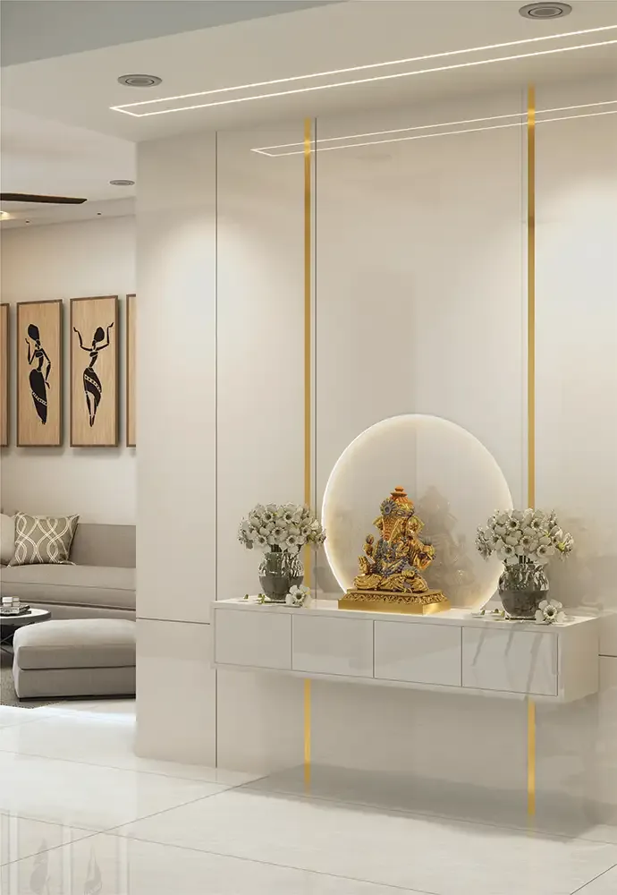
NGA-822 occupies a useful middle ground between a warmer champagne suggestion and a silvery neutral. That combination can connect brushed-metal handles, beige fabrics, lightly stained wood and pale stone-look materials without requiring an overt gold finish. For living-room accent cabinetry, it can create a modest decorative focal point beside quieter painted or timber surfaces.
Keep the quantity of lustrous materials controlled. If the room also contains mirrored glass, glossy floor tile and a shiny ceiling feature, adding metallic fronts throughout may reduce visual hierarchy. Test one grouped cabinet elevation and judge whether the champagne-silver note is supporting other materials or competing with them.
Titanium Mist: A Cool Neutral With Depth
NGA-823 is editorially described as Titanium Mist, a light titanium-grey direction with a slightly industrial visual language. It can work with graphite, steel-coloured hardware, white work surfaces and restrained timber. For office storage or a reception cabinet, the finish can introduce polish without requiring a dark, strongly reflective front. The choice is aesthetic, not a claim of metallic construction.
Grey family swatches are sensitive to lighting temperature. A titanium-like tone may appear more neutral in daylight, cooler under white LEDs or warmer beside amber illumination. Compare with the actual walls and flooring, especially in rooms where the cabinet will remain visible from several angles.
Arctic Silver for Precise Contemporary Details
NGA-824 follows a crisp silver-grey design direction. Where architecture uses clean lines and sparse hardware, such a finish can reinforce a contemporary presentation. It may suit a reception counter front, display cabinet or a selected vertical furniture plane that needs visual definition without introducing a strong colour. The exact decorative sheen should be assessed from an original sample.
Avoid assuming “silver” automatically matches every stainless-steel fitting. A laminate surface and brushed metal hardware reflect light differently, even when both look silvery in a catalogue. Compare actual pieces together, allowing for nearby glass, painted board and fabric so the room reads as a composed design rather than a collection of unrelated metallic textures.
Pearl Lilac for Boutique and Personalised Furniture
NGA-825 introduces a gentle grey-lilac direction into the otherwise largely neutral Metallic series. This subtle tint can add character to boutique reception furniture, personal dressing spaces or a selected display section. It offers an alternative to overt pink, purple or cold grey while keeping the luminous family resemblance to the other Metallic designs.
Under warmer lamps, the lilac note may soften; under cool light it may be more evident. Confirm the shade beside fabrics and signage rather than choosing it by label alone. Its value is in the understated hue shift, not in any unverified special coating or material chemistry.
Accent Furniture Versus Large-Area Metallic Surfaces
Metallic-finish cabinets can work as a highlight or an entire coordinated furniture plane. The right proportion depends on visual complexity elsewhere. A room with strong stone veining, bold wallpaper and decorative light fixtures may benefit from a limited metallic accent. A quiet white-and-wood setting may accommodate a larger bank of pearlescent wardrobe fronts without becoming busy.
Before committing, sketch the full elevation: where does the luminous finish begin and end, and what lies beside it? Consider using the metallic sheet on a primary front while a surrounding panel or open shelf remains matte. Contrast should be deliberate rather than improvised after fabrication.
Reception Furniture, Showrooms and Retail Display Areas
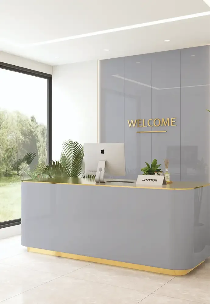
The NGA catalogue illustrates reception tables, showrooms and commercial interior spaces as potential applications. Metallic finishes can reinforce a polished welcome when paired with appropriate sign graphics, lighting and simple lines. Pearl white can read discreetly premium, silver offers a precise modern direction, and titanium grey complements many office palettes. These are design recommendations, not formal guarantees of suitability for heavy public use.
Commercial settings require additional checks: repeated cleaning, contact patterns, substrate stability, fire or safety rules and any documentation specified by the project. Confirm the required assembly and obtain written manufacturer guidance where necessary. A decorative surface appearance alone is not evidence of regulatory compliance.
Matching Metallic Acrylic With Handles, Glass and Timber
A convincing metallic furniture scheme is usually built around material relationships. Pearl white pairs differently with brass-look handles than titanium mist does; champagne silver can bridge warm and cool components; arctic silver may relate neatly to glass and graphite. Use a small sample board that includes the actual laminate, selected edge strip, hardware and adjacent furniture surface.
Look at the combination from a seated and standing position. Metallic highlights can move with the viewpoint, so a sample that looks calm straight-on may feel more active at the room entrance. Test surfaces in the intended orientation before confirming the final placement.
Sheet Specification and Fabrication Considerations
The NGA catalogue specifies 8 × 4 ft acrylic laminate sheets at 1.5 mm thickness. This refers to the decorative sheet, not the completed panel assembly. The supporting board, adhesive, edge treatment and overall construction must be reviewed for the furniture and installation site. Record the exact NGA-821 to NGA-825 product code in schedules and quotations.
Take care with placement, surface protection and handling during fabrication. A metallic-finish front can reveal unevenness in the supporting panel and inconsistent adjacent lighting. Confirm straightness, substrate preparation, cut allowance, batch continuity and manufacturer instructions before a large order is processed.
Surface Performance and Meaningful Limitations
Mark Decor's NGA technical material lists 6H anti-scratch performance along with comparative gloss, UV and water-resistance statements. These are the manufacturer's descriptions; they are not a blanket assurance that furniture fronts cannot be marked or exposed to any environment. A pearlescent appearance does not make the sheet heat-proof, scratch-proof or suitable for every installation.
The same catalogue discourages outdoor use, direct prolonged sunshine, aggressive chemical cleaning and applications that expose the laminate to high temperature or hot cookware. Respect those limits and request up-to-date project-specific documentation wherever a special performance requirement applies.
Adhesion and Edges Require Technical Approval
Metallic finish quality depends on the whole assembly. The manufacturer identifies Mark Bond as a recommended adhesive for NGA and warns about damp or uneven supporting surfaces, synthetic rubber glues and inadequate pressing. Discuss the intended substrate and fabrication method with a competent installer. Improper bonding can compromise even an attractive, carefully selected finish.
Edge details are especially visible when a cabinet face has a uniform pearl or silver tone. Approve a sample corner with the chosen edging and handle treatment. Do not assume the laminate can wrap around every curved profile, or that the same bond specification works for every board.
Care of Pearlescent and Metallic-Look Fronts
Routine care should protect the finish rather than attempt to polish it aggressively. The NGA catalogue advises wiping with water and a clean, non-abrasive cloth, using mild household cleaners only when necessary. Avoid strong solvents, scouring sponges and unapproved stain-removing chemicals. Wipe away grit carefully so the cleaning process itself does not leave marks.
For a reception or wardrobe installation, provide simple written care instructions to the final user. Avoid direct heat and harsh sunlight beyond the manufacturer's recommendations. A design chosen for subtle lustre will retain its intended visual clarity best through thoughtful day-to-day handling.
Choosing the Right NGA Metallic Product Code
Start with the desired undertone: pearl white for gentle brightness, champagne silver for warm-cool balance, titanium or arctic silver for crisp neutrality, and pearl lilac for a distinct understated accent. Compare no more than two or three physical samples against the actual board, flooring and hardware. Watch the appearance in several lighting conditions.
Once the colour is approved, use the correct NGA code in every purchase and fabrication document. If you need a much broader palette, explore NGA Glossy; if you want visible fine decorative glints rather than a pearlescent effect, compare the separate NGA Sparkle series. This keeps each collection choice clear.