
NGA - Sparkle





NGA - Sparkle Guide
NGA Sparkle Acrylic Laminates for Light-Catching Details
NGA Sparkle acrylic laminates by Mark Decor are designed around a small but expressive visual idea: fine decorative highlights that become more noticeable as the light changes. Unlike a plain-colour Glossy face or the pearlescent tone of Metallic, Sparkle brings a distinct sense of scattered shimmer to wardrobes, display fronts and furniture accents. The collection is intentionally compact, with four documented NGA product codes.
This guide concentrates on using that light-catching effect thoughtfully. The broader NGA category helps choose among finish families; the Sparkle subcategory explores the four colours, how glint and lighting interact, and why a carefully placed accent may be more effective than shimmer on every surface.
Four Sparkle Finishes With Different Colour Temperatures
The current catalogue mapping identifies NGA-817 as Diamond Frost White, NGA-818 as Champagne Haze, NGA-819 as Crystal Ivory and NGA-820 as Silver Cloud Sparkle. These editorial descriptors reflect the swatches' apparent visual direction. They do not alter the official product names or imply that the surface contains diamond, crystal, silver or any other named physical mineral.
Their differences are important. Bright white can feel fresh and precise; champagne haze introduces gentle warmth; ivory offers a softer white impression; silvery grey leans cooler. Choose by viewing real material, particularly because small colour shifts may be harder to judge when decorative highlights compete with the base tone.
Diamond Frost White: A Luminous Starting Point
NGA-817 reads as a crisp white sparkle direction. For a wardrobe or a dressing-unit front, the design can add interest to a very restrained room without bringing in a strong hue. The white ground may coordinate with pale floors, neutral walls and contemporary upholstery, while the decorative highlights provide a little movement as someone walks past the furniture.
Do not assume that a white sparkle sample matches every other white finish. Put it beside painted board, cabinetry edges and the room's lighting to check temperature and reflection. If the surrounding materials are already glossy or mirrored, test whether the additional shimmer contributes positively or makes the elevation too visually busy.
Champagne Haze: A Softer Warm Accent
NGA-818 offers a champagne-greige direction with a warm, muted sparkle effect. It can work beside oak tones, beige upholstery, warm white walls and selected brass-coloured details without committing the entire room to a high-contrast metallic theme. A living-room display cabinet or smaller accent panel is one place to explore this balance.
The fine highlights can behave differently under a warm strip light, a shaded pendant and natural daylight. Sample the material in the intended vertical position. If the champagne effect seems too prominent beside an existing decorative stone pattern, use it more sparingly or combine it with an uncomplicated plain-colour surface.
Crystal Ivory: A Gentle Decorative White
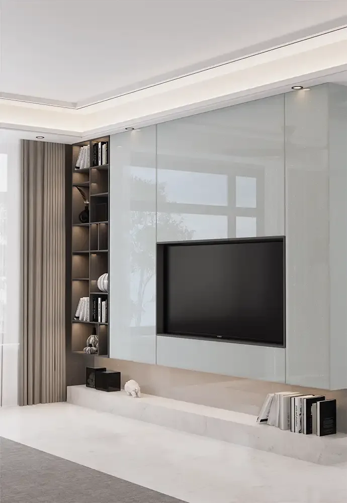
NGA-819 sits in a cooler ivory-white direction in the editorial swatch mapping. It may suit a TV-unit storage front, light furniture composition or a bedroom cabinet where the intention is a soft decorative finish, not a dramatic colour statement. Its value lies in the interaction between an understated base colour and small luminous details.
A light finish should still be assessed against the entire room. Pure-white walls may change how ivory reads; dark timber can make its glints more prominent through contrast. Check the sample from the usual sitting position and from the room entrance before planning the final shutter grouping.
Silver Cloud Sparkle and Cooler Contemporary Schemes
NGA-820 has a pale silver-grey character with a decorative sparkle impression. It can create a cool-toned highlight in a cabinet surrounded by graphite, white, light stone-look material or understated timber. For a media cabinet or display furniture, the restrained grey family may provide depth without the weight of a dark surface.
Grey has a habit of changing with its neighbours. Beside warm beige it may look cooler; next to blue-grey paint it may blend more quietly. Test it at the actual site with the selected handles and any display lighting. An editorial colour name is a shortlist aid, not a substitute for approving the physical surface.
Position Sparkle Where Lighting Can Reveal It
Because shimmer responds to illumination, the same sheet can appear comparatively calm in diffuse daylight and more decorative beneath directed artificial lighting. A dressing niche, display cabinet or smaller front beside a feature light can be a useful location. The intention should be to give the material enough light to read, not to flood it with reflections that distract from everything else.
Avoid basing the decision on a studio photograph with highly controlled lighting. View a sample under ambient light, near the final luminaire and from a normal walking angle. The best placement may be the one where the glint appears gradually instead of becoming the room's only focal point.
Wardrobe Shutters: Designing With Small Sparkle Areas
A tall wardrobe is a substantial colour field. On multiple matching doors, even a soft sparkle can establish a strong overall effect once repeated across several metres. A restrained strategy might use sparkle on one wardrobe section, dressing niche or accent pair of shutters, supported by plain doors elsewhere. Alternatively, a simple room with minimal textiles and decoration may accommodate a larger coordinated sparkle group.
Sketch all the doors together and check where the eye will travel. Decide whether the sparkle should accent the centre, frame a dressing table or follow the whole cabinet bank. Include mirrors, handles and light fixtures in that decision.
TV Units and Display Cabinets Without Visual Competition
Sparkle can lend interest to display furniture, but it should not compete with the objects on show. If shelves already contain reflective ceramics, glass or metallic decor, a limited NGA Sparkle front may be enough. A calm white or greige surrounding finish can help the eye read the display. For television areas, place shimmer away from unnecessary glare where practical.
The catalogue includes TV units as a decorative application, not as permission to expose laminate sheets to hot equipment or block ventilation. Keep electrical, heat-management and maintenance requirements separate from surface styling. Discuss an actual cabinet assembly with the installer.
Pairing Sparkle With Matte, Timber and Stone-Look Surfaces
A decorative highlight is easiest to appreciate when surrounded by less assertive materials. Matte-painted walls, natural wood-look cabinets, upholstered furniture and quiet stone-look surfaces can all provide a backdrop. The goal is not to mix every fashionable material. Select one main neutral, one warm or cool accent and a purposeful quantity of sparkle.
For a warm interior, test NGA-818 or NGA-819 beside creams and oak tones. For a cooler scheme, NGA-817 or NGA-820 may provide a coherent starting point. These are design suggestions grounded in swatch appearance; exact matches require physical samples.
Choosing Hardware and Edge Details for Sparkle Fronts
Handles and cabinet edges can either support or interrupt the surface. A dark slim handle may sharpen a light sparkle design; a pale edge treatment may allow the door to read as one quieter plane. Before fabricating, inspect the proposed edging, hinge positioning and corner finish together with the actual decorative sheet. A showroom swatch alone hides the construction details that become visible after installation.
The finish's small highlights may emphasise uneven surface preparation under strong light. Review flatness, substrate compatibility and pressing as seriously as colour matching. The completed cabinet matters more than a decorative material viewed without its supporting assembly.
Documented Dimensions and Supplier Checks
The shared NGA catalogue specification is 8 × 4 ft sheet size and 1.5 mm thickness, including the Sparkle range. This is the laminate sheet dimension, not the total thickness of a finished furniture shutter. Quantity calculation should account for cuts, edges, orientation, handling allowance and any project-specific assembly details. Check the exact stock code before committing to a large installation.
The four Sparkle designs are identified by NGA-817, NGA-818, NGA-819 and NGA-820. Record their official codes rather than relying on “sparkling white” or “silver sparkle” shorthand. Confirm current stock, sample matching and batch continuity with the supplier.
Read the Anti-Scratch Claim With the Care Restrictions
The manufacturer catalogue lists 6H anti-scratch performance and comparative resistance characteristics for NGA. These statements do not establish that Sparkle sheets resist every sharp object, chemical exposure, wet-service condition or heat source. Decorative shimmer should not be confused with protective coatings that allow unrestricted use in every environment.
The catalogue explicitly discourages outdoor applications, prolonged direct sunlight and high-heat contact. It also advises against abrasive cleaners and other unsuitable treatments. For commercial or unusual installations, obtain current manufacturer guidance and any project-required certificates before choosing the final assembly.
Bonding, Cleaning and Keeping the Finish Consistent
Mark Decor identifies Mark Bond as a recommended NGA adhesive and highlights common risks from damp substrates, improper glues, inadequate pressure and unsuitable fabrication. Ask the installer to validate the substrate and demonstrate an acceptable edge sample before production. A sparkle finish needs a smooth base so the decorative light effect is not interrupted by defects beneath it.
For routine cleaning, use water and a soft non-abrasive cloth. If necessary, follow the manufacturer's mild-cleaner guidance instead of applying harsh solvents or scouring pads. Protect the sheet from careless handling, sustained heat and excessive sun. Consistent care is especially useful on fronts viewed under accent lighting.
When to Choose Sparkle Instead of Glossy or Metallic
Choose Sparkle when the goal is visible fine decorative highlights within a restrained white, champagne, ivory or silver-grey palette. Choose Glossy when plain reflective colour and a wider shade selection matter more. Choose Metallic when the desired effect is pearl-like tonal movement rather than discrete glittering highlights. None of these families is automatically “better”; they serve different visual purposes.
Compare one sample from each shortlisted family under exactly the same light. Record the chosen NGA product code, sample approval and any specific fabrication conditions. A clear selection process keeps the finished interior coherent and prevents an attractive accent from turning into unnecessary surface competition.