Metallic









Metallic Guide
ASA Metallic Laminates: Decorative Light and Accent
A metallic-looking surface can bring a new point of focus to a room without changing its architecture. ASA Metallic Laminates from Mark Decor are presented as a separate finish family within the ASA range, aimed at furniture and selected decorative interior surfaces. Their appeal lies in subtle shine, tonal variation and the way the finish responds visually to nearby lighting, hardware and contrasting matt materials.
The Metallic Series is not simply a shinier version of every Matt colour. It deserves its own design decisions: where should the highlight appear, how much reflected light is desirable and what neighbouring finish will keep the composition balanced? This page concentrates on metallic-look cabinetry, display furniture and small feature zones. General ASA sheet specifications and finish-family comparisons are covered on the parent page, while the Matt subcategory deals with restrained, low-reflection colour choices.
What a Metallic-Look Laminate Adds to Furniture
Metallic finishes introduce an impression of light and depth. Depending on the colour and viewing angle, a surface may seem warmer, cooler, brighter or more understated. This makes them suitable for selected focal elements, such as a reception console, a display unit, a wardrobe inset or the front of a compact feature cabinet. Their decorative effect often works best when the surrounding materials are quieter.
It is important to describe these surfaces accurately. Metallic-look ASA Laminate Sheets refers to the appearance presented in the catalogue; it does not establish that the product contains solid metal or offers the physical properties of aluminium, stainless steel or another metal. Buyers who need a particular substrate composition or protective rating should request the current technical datasheet before committing to a project.
Lustrous Neutrals and Warm Metallic Colour Direction
The catalogue's Metallic swatches suggest a family of pale neutrals, warm blush and muted metallic-inspired finishes. Light champagne-like or pearl-like tones can sit beside creamy cabinetry and warm woods. A softer copper or rose-influenced surface can make a selected drawer bank or dressing niche feel more expressive without turning the entire room into a bright feature. These terms describe visible design impressions, not certified pigment or metal composition.
For a refined result, decide whether the metallic accent should be warm or cool relative to the rest of the interior. Warm lighting, timber and beige stone can make a champagne-like shade feel cohesive. Cooler architectural finishes may call for a softer neutral metallic appearance. If the room already contains brass, chrome and black metal, avoid introducing a fourth dominant reflective tone without a clear plan.
Kitchen Accents without Overloading the Room
A fully metallic-looking kitchen can be visually demanding, especially when the space also contains glossy appliances, polished stone and reflective fixtures. A more considered approach is to choose one accent area: a pantry shutter, a small island panel, a coffee station, a display niche or carefully selected upper cabinets. The metallic-looking finish can then act as a point of contrast beside matt-colour laminates and natural textures.
Before fabrication, place a sample next to the worktop, backsplash, hardware and under-cabinet lighting. A finish that appears soft in a showroom may read more strongly under focused LED strips. Confirm the use conditions and appropriate bonding system; decorative resistance claims do not establish suitability for direct flame, concentrated heat or every cleaning chemical. Thoughtful location is part of successful material selection.
Wardrobe Features and Dressing Room Details
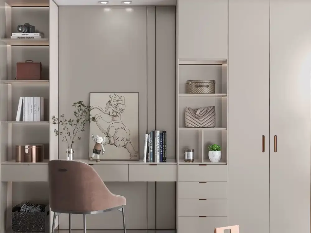
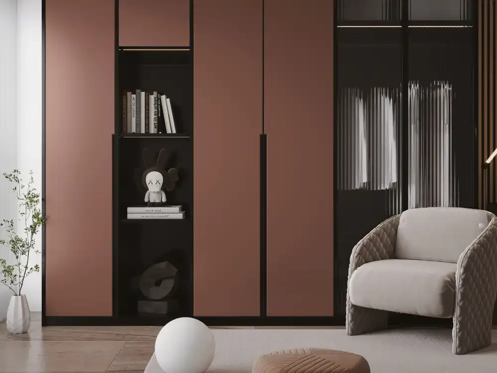
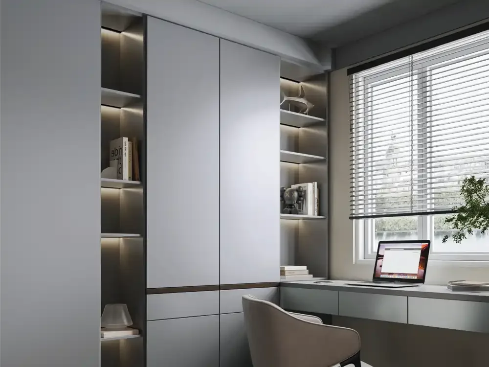
Wardrobes provide enough surface area for a metallic effect to become a major design decision. Rather than covering all doors, consider a selected vertical section, a dressing unit front or a cabinet detail that relates to mirror framing and lighting. A restrained metallic-look laminate can give a dressing area individuality while the main wardrobe remains in a quiet Matt colour.
The balance is especially important in bedrooms, where visual calm often matters more than constant shine. View the sample under bedside lighting, overhead illumination and daylight from the room's actual windows. If a metallic shade makes a small niche feel elegant but seems too dominant across a full door, keep it as an accent. Material placement is often more important than the amount of material specified.
Reception Counters, Retail Displays and Hospitality Furniture
Commercial interiors may use metallic-looking finishes to highlight a brand or customer-facing zone. A reception console, product display, retail counter front or waiting-area cabinet can benefit from one clear feature surface. The effect is strongest when tied to the surrounding architecture: lighting, signage, flooring, upholstery and the existing colour palette.
In a high-contact environment, aesthetics are only part of the decision. The project team should confirm suitability for repeated touching, cleaning, edge exposure and the supporting substrate. A decorative laminate selected for a protected wall-adjacent surface may not be the right choice for a heavily used worktop. Always specify the actual intended surface and ask for current guidance before assuming interchangeability between furniture locations.
Working with Matt Laminates and Natural Textures
Metallic-look finishes usually benefit from a quieter companion. A soft matt white can provide visual breathing room; mushroom or taupe cabinets can temper warm metallic colours; and a wood surface can add an organic counterpoint to a lustrous panel. Choose a limited material palette and vary the proportion of each finish, rather than giving every texture the same visual importance.
For example, a living-room storage wall could use calm Matt fronts over most of its width, then introduce a metallic-looking accent near an open display. A reception counter might reserve the accent for a visitor-facing plane while using a practical neutral elsewhere. This kind of hierarchy lets the Metallic Series express its character without competing with mirrors, signage or decorative lighting.
Sheet Size, Thickness and Material Claims
Mark Decor's supplied ASA catalogue lists an 8 × 4 ft sheet size and 1 mm thickness for the Metallic Series. These collection details help estimate material use, but they are not a replacement for the current product specification or a confirmed cutting plan. Check the selected MA code and physical sheet before finalising large furniture layouts.
The Metallic catalogue describes decorative appearance and general performance-oriented features, but it does not establish solid-metal construction. Nor does a surface-resistance icon prove that an assembled door is waterproof at its joints or fit for outdoor exposure. Such properties depend on the complete installation and should be assessed through verified technical instructions rather than through an image or promotional label alone.
Care and Surface Protection for Metallic-Look Furniture
A reflective-looking decorative surface can show fingerprints, dust, streaking or abrasive marks differently from a quiet matt panel. Establish an appropriate cleaning routine and use soft cloths according to the manufacturer recommendations. Avoid rough scrubbing, sharp tools and strong cleaning products unless the current technical guidance expressly permits them. A scratch-resistant claim is not equivalent to scratch-proof performance.
Edge protection and adhesive selection also matter. Water or cleaning liquid reaching a vulnerable joint may affect the supporting board, even if the decorative laminate itself has resistance features. In retail or office furniture, specify how the surface will be cleaned and maintained before approving its use. Selecting a visually attractive finish and designing for realistic care should happen together.
Planning Lighting around Metallic Decorative Surfaces
Unlike a completely quiet colour plane, a metallic-look finish can change character as visitors move through the space. Spotlight placement, warm or cool LED temperature and reflected daylight influence the perceived tone. Test a sample in at least two lighting conditions, and if possible position it vertically where the finished cabinet or panel will be installed.
Pay particular attention to reflections near screens, mirrors and glass display areas. A small controlled highlight may create the intended premium effect, but a broad reflective area can introduce unwanted glare. Designers can use this behaviour deliberately by keeping the metallic accent away from the strongest direct light or positioning it where soft, indirect light emphasises the finish without overwhelming nearby materials.
Choosing the Right Metallic MA Code
Each product in the Metallic Series is identified by its MA code. The design descriptions on individual product pages help distinguish the swatches, but their descriptive colour names are editorial guidance based on catalogue imagery. They should not replace the official code or a physical sample when confirming the order. Colour reproduction on screens varies across devices and lighting conditions.
Prepare a sample board that includes the intended metallic shade, a matt companion, hardware and a relevant worktop or wall finish. Check whether the finish still creates the desired focal point when seen from normal room distance. Ask the fabricator to confirm sheet dimensions, compatible adhesive and edge treatment. A precise specification turns a metallic-looking idea into a furniture scheme that can be produced consistently.