
NGA - Glossy



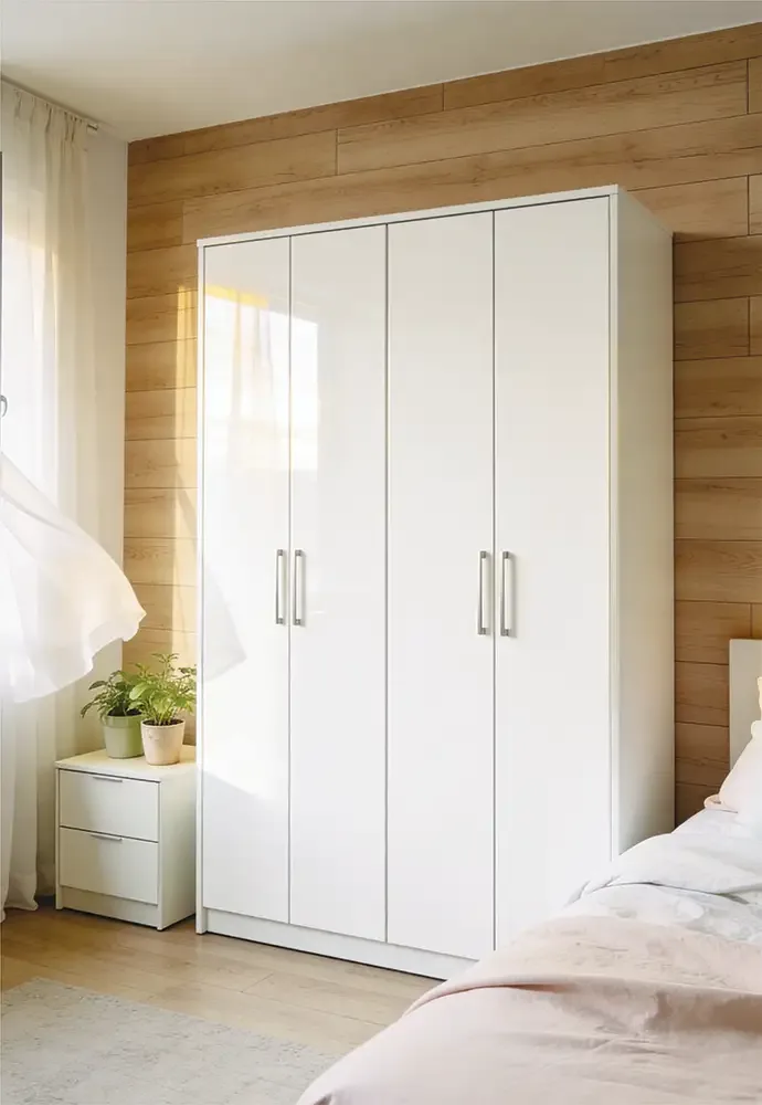
NGA-801

NGA-802

NGA-803

NGA-804

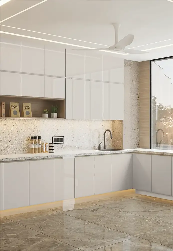
NGA-805

NGA-806

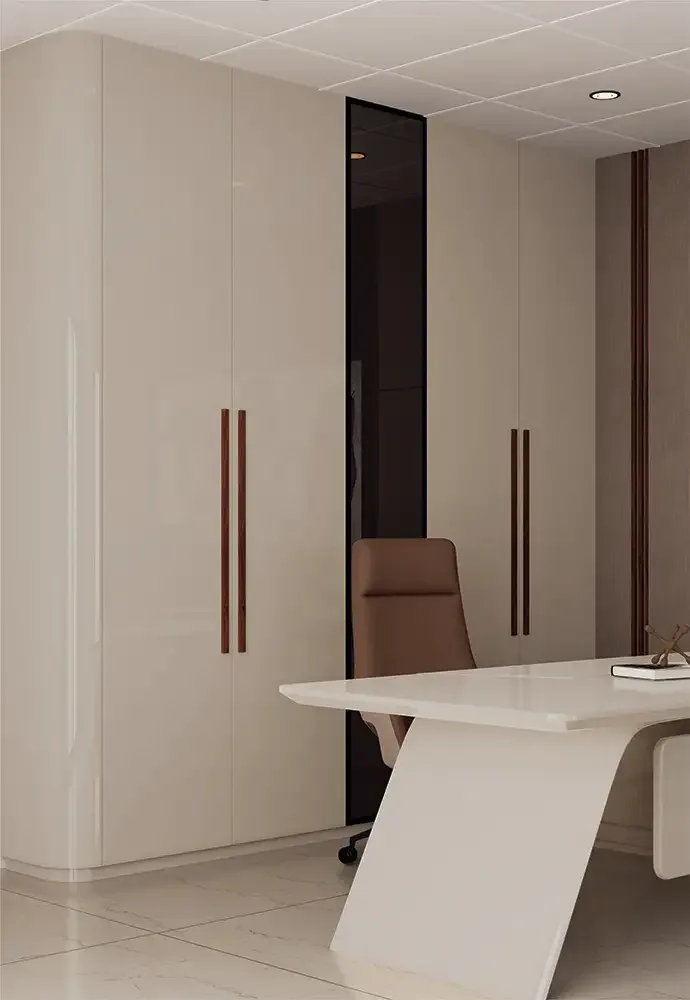
NGA-807

NGA-808

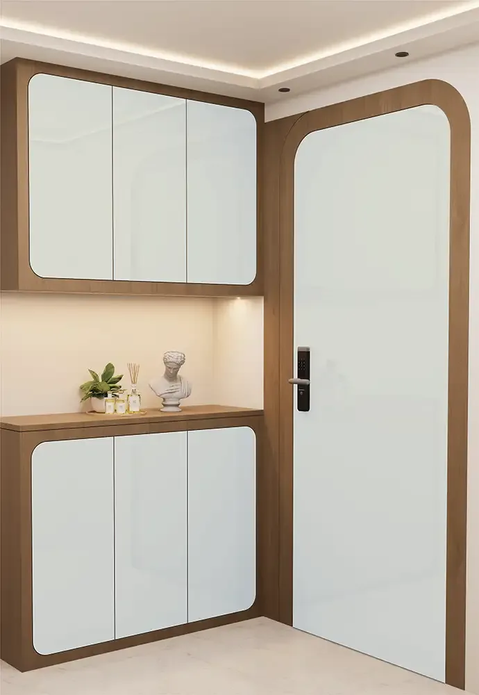
NGA-809

NGA-810

NGA-811

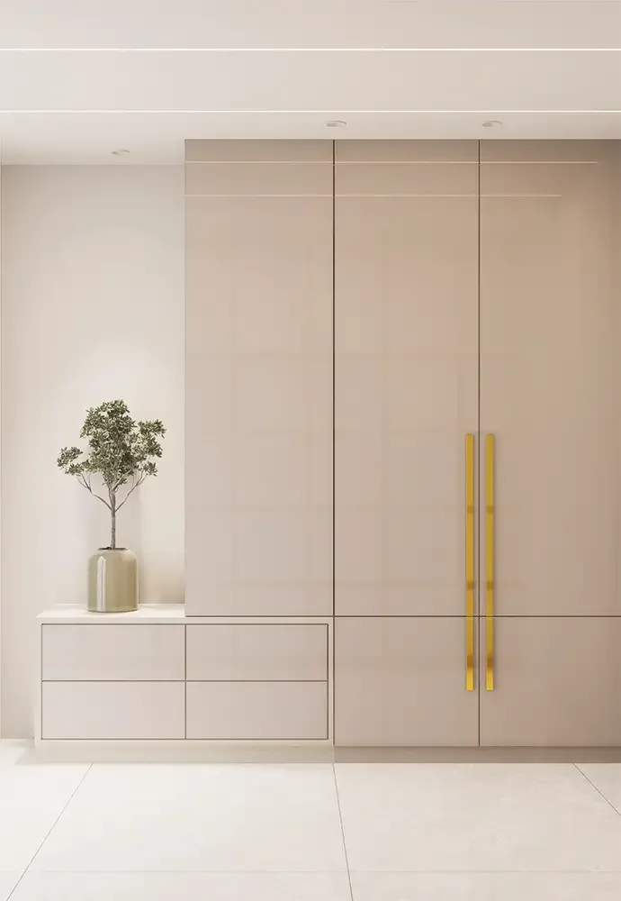
NGA-812

NGA-813

NGA-814

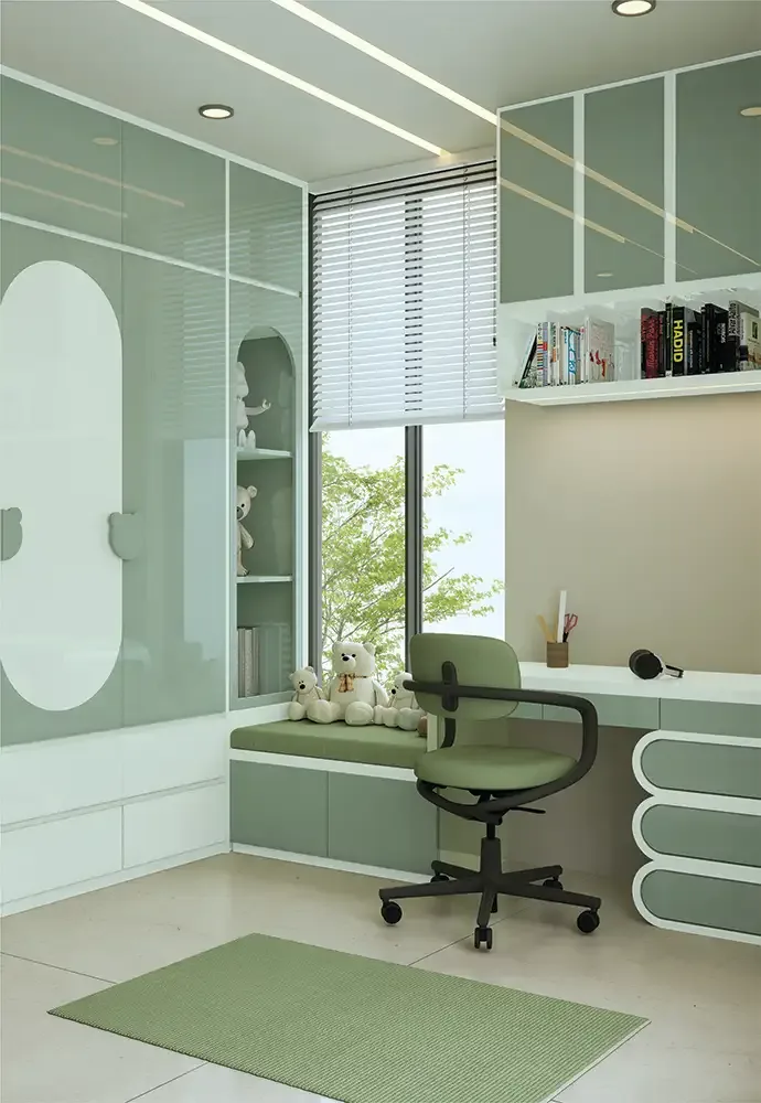
NGA-815

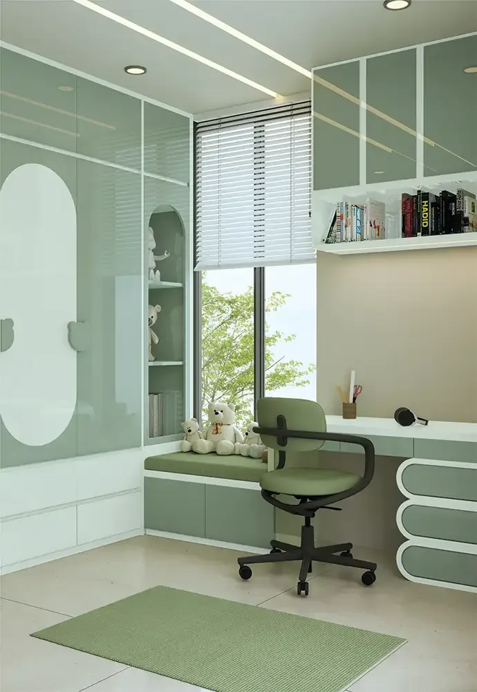
NGA-816
NGA - Glossy Guide
NGA Glossy Acrylic Laminates: Colour-Led Furniture Design
NGA Glossy acrylic laminates by Mark Decor are the plain-colour, reflective branch of New Generation Acrylic. The sixteen documented designs range from bright whites and gentle creams to warmer taupes, pastel accents and deeper grey-green tones. Their purpose is not to imitate a textile or a metallic particle effect. They create a polished, clean-looking furniture plane in which the chosen colour and reflected room light do the decorative work.
This page focuses on choosing among glossy acrylic laminate sheets for wardrobes, kitchen shutters, dressing units and built-in furniture. The main NGA category compares finish families; this page helps narrow the sixteen Glossy colour codes without treating all pale or mid-tone swatches as interchangeable.
White Is a Family of Finishes, Not One Decision
The initial NGA Glossy codes illustrate why specifying simply “white acrylic” can lead to surprises. NGA-801 is described editorially as Pure Snow White, NGA-802 as Porcelain Ivory White and NGA-809 as Ivory Mist White. Each may appear broadly white in a catalogue, yet the amount of warmth or softness changes its relationship with wall paint, marble-look finishes and lighting.
Place these swatches against the exact countertop, wardrobe frame or flooring sample. A clean white beside a warm beige can look crisper than intended; an ivory white beside cool grey might read creamier. The descriptions are helpful design labels, not changes to the official NGA product master names.
Warm Neutrals for Kitchens and Wardrobe Shutters
Glossy finishes need not look stark. The current range includes NGA-803 with a vanilla-cream direction, NGA-804 with peach-sand warmth and NGA-805 with a pale almond-pearl impression. NGA-806 moves toward latte beige, while NGA-807 is a balanced mushroom-taupe design. These tones can create a gentle transition between timber furniture, beige wall colours and soft stone-look surfaces.
A warm neutral is especially useful when a room already contains several materials. Instead of matching everything exactly, repeat a related temperature: cream fronts with honey-toned timber, mushroom taupe beside natural woven fabrics, or beige wardrobes against off-white walls. Test the actual sheet beside the furniture edging before final approval.
Soft Accent Colours Without an Overly Busy Surface
Several Glossy designs offer restrained colour rather than saturated statement shades. NGA-808 introduces dusty rose-taupe; NGA-812 is a lightly pink-tinted white and NGA-813 follows a gentle apricot-blush direction. These editorial descriptions identify visible swatch character, not separate product ranges. A soft accent colour can personalise a wardrobe or dresser while keeping the surrounding room quiet.
Try the chosen colour on one set of doors, a dressing console or a smaller cabinet grouping before committing to every surface. Pastel shades change notably beside warm lamps and darker fabrics. Review them alongside curtain, floor and upholstery samples rather than assuming a printed product photograph accurately predicts the installed colour.
Cool Greys, Blue-Greys and Botanical Tones
The Glossy collection also moves beyond cream and blush. NGA-810 has a lavender-ash-grey direction; NGA-811 reads as steel-mist grey; NGA-814 suggests a cool cloud-blue grey. NGA-815 is a pale eucalyptus-mint concept and NGA-816 follows a richer sage-leaf green. These options help connect acrylic cabinets with contemporary muted interior palettes.
Greys and greens can shift under warm artificial light, sometimes losing the undertone that made them attractive in daylight. If a cabinet faces a large window, inspect the swatch at several times of day. For adjoining rooms, check whether the selected finish harmonises with painted doors, ceiling temperature and visible furniture beyond the immediate installation.
Using Glossy Shutters to Shape Perceived Space
A reflective surface changes how an interior is read because it picks up nearby windows, lighting and objects. On tall wardrobe doors, large uninterrupted colour areas can produce a clear, architectural plane. On a small bank of overhead kitchen cabinets, a pale glossy finish may provide a lighter visual contrast to darker lower storage. Those are design effects, not promises that a material physically enlarges a room.
Pay attention to what a surface reflects. A busy breakfast counter or an uncovered window can make a high-gloss cabinet appear more visually active than expected. Place sample sheets in the intended orientation before confirming a layout, especially where full-height shutters face mirrors or glazed doors.
Cabinet Fronts, Drawer Faces and Design Continuity
For kitchen or furniture shutters, evaluate a Glossy swatch as part of a built-up assembly. Edge profiles, handles, recessed pulls and adjacent finishes may occupy little area but exert a strong influence on the final result. A white sheet with a dark edge can feel graphic, while a similarly toned edge makes the furniture look quieter. The catalogue illustrates cabinetry uses but does not supply every fabrication detail.
Ask the fabricator to demonstrate an edge and corner sample using the intended substrate and bonding method. Confirm where joints, cut-outs and hinge fixings will occur. An attractive finish should also be practical to build and maintain on the actual furniture geometry.
Wardrobe Doors: Control Reflections and Repetition
The strongest reason to test a Glossy finish on a wardrobe is repetition. A single pale sample may look calm, yet eight adjoining tall shutters create a much larger reflective field. Conversely, a darker muted shade may provide desirable depth in a dressing area with diffuse light. Consider the relationship to mirrored doors, curtain folds and any decorative ceiling light above the wardrobe.
If the design includes open niches or shelves, choose whether they should match the fronts or deliberately contrast. A high-contrast timber niche can anchor white cabinetry; a subtly similar interior colour can create a quieter presentation. Check the overall elevation instead of deciding panel by panel.
Glossy Acrylic Sheet Dimensions and Ordering
Mark Decor lists NGA sheets at 8 × 4 ft and 1.5 mm thickness. For the Glossy range, the common format supports planning across its sixteen product codes, but the catalogue format alone does not identify the final board thickness or guarantee an offcut-free cabinet layout. Count full shutter faces, note grainless orientation where relevant and confirm available batch quantities.
A competent cutting plan accounts for sheet handling, edge finishing, damage allowance and the chosen board size. Order by verified product code, not by an editorial colour nickname. If adjoining fronts must look uniform, discuss batch consistency before dispatch and fabrication.
Manufacturer-Listed Surface Characteristics
The technical page presents NGA with a 6H anti-scratch claim, a high-gloss level and favourable resistance comparisons. This does not make the surface invulnerable to sharp objects, abrasive cleaning or careless installation. “Scratch resistant” should be read as a relative performance statement in the manufacturer catalogue, not as permission to treat the laminate like glass or stone.
The same guidance restricts outdoor use, prolonged direct sunlight and excessive heat exposure. For any special application, ask for current written performance and care information. Never extend a furniture-facing product claim into a fire rating, exterior warranty or wet-area installation approval without supporting documentation.
Adhesive Choice and Flat Substrate Preparation
A smooth glossy surface exposes defects in the supporting assembly. An uneven board, local bonding void or trapped contamination can become more apparent in reflection. Mark Decor's catalogue recommends Mark Bond for the NGA range and warns against unsuitable glues, damp substrates and inadequate pressing. Following the latest approved fabrication method is particularly important with reflective plain-colour faces.
Discuss moisture, flatness, pressure, adhesive compatibility and protective handling with the installer before cutting material. The catalogue also flags inappropriate heat and exposure conditions. This article does not replace a manufacturer's fitting specification or prescribe one bonding sequence for every board type.
Daily Cleaning for a Clear Reflective Finish
Dust, oil and handling marks tend to be noticeable on polished cabinet fronts because the surface is intentionally reflective. The manufacturer's care guidance recommends water and a clean, non-abrasive cloth, with only mild cleaning products when necessary. Harsh solvents, stiff scouring tools and unfamiliar stain removers can cause more damage than the mark they are intended to remove.
Create a simple cleaning routine for family members or maintenance staff. Wipe gently, avoid strong pressure on trapped grit and confirm any specialist cleaner before repeated use. The goal is to preserve the intended appearance through normal care rather than rely on an unsupported “maintenance-free” claim.
Compare Glossy With Metallic and Sparkle Before Buying
A Glossy surface puts the colour itself first. NGA Metallic instead uses a pearl-like or titanium-influenced appearance, and NGA Sparkle introduces distinct shimmering details. If the project already has metallic handles, decorative lighting or patterned wallpaper, plain Glossy fronts may be the balancing element. If the room is otherwise restrained, a different NGA finish family may be a useful accent.
Shortlist by visual purpose, not just by colour temperature. A “white” Glossy sheet will not behave exactly like a “white” Sparkle design. View them together under realistic light, then return to the Glossy product listing to make a specific NGA code selection.
A Practical Shortlist for the Sixteen Glossy Designs
For a clean, bright palette, begin with NGA-801, NGA-802 and NGA-809. For warm restraint, compare NGA-803 through NGA-807. For subtle personality, examine NGA-808, NGA-812 and NGA-813. For a cooler or nature-inspired mood, review NGA-810, NGA-811 and NGA-814 through NGA-816. These groupings are editorial navigation aids derived from the supplied swatches.
The final decision should be made against real samples and the actual furniture elevation. Record official product codes, check current stock and ensure the material, edge treatment, adhesive and care requirements suit the project. The best finish is the one that remains coherent across the completed room.