
New Generation Acrylic (NGA)

Collections



New Generation Acrylic (NGA) Guide
New Generation Acrylic Sheets for a Coordinated Interior Palette
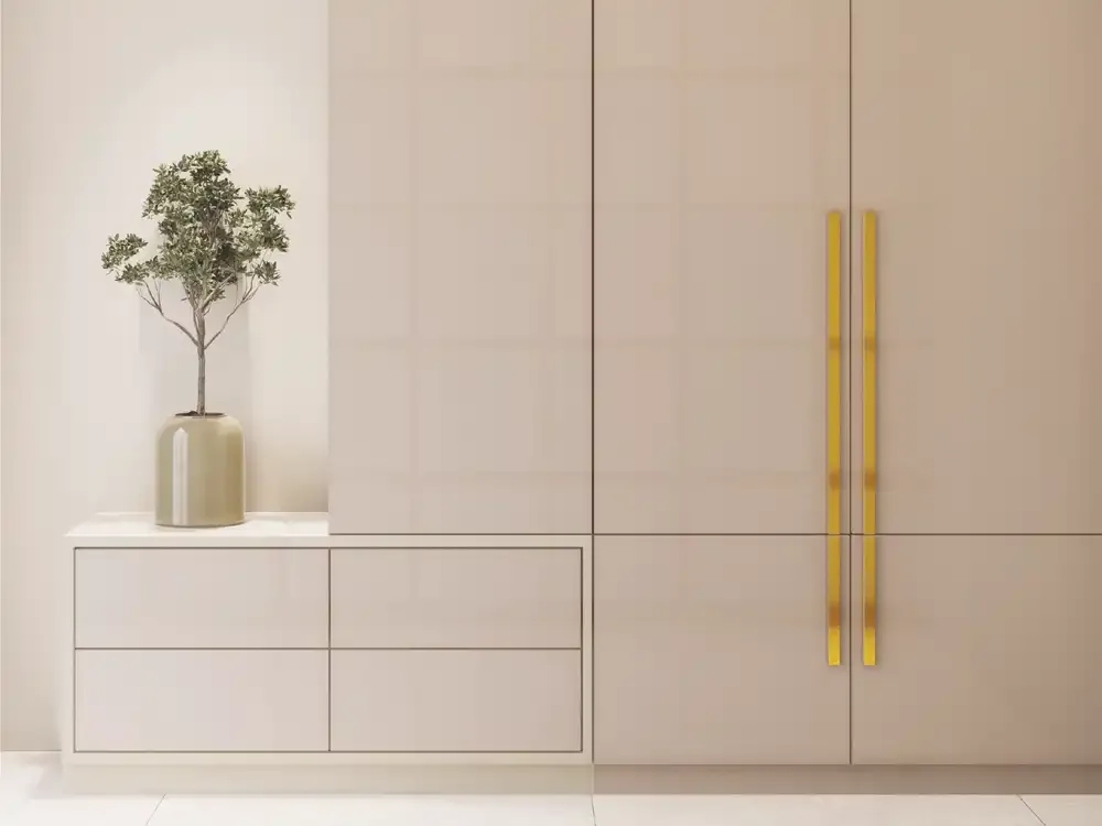
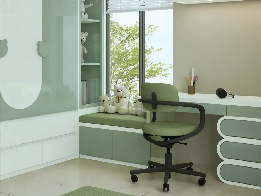
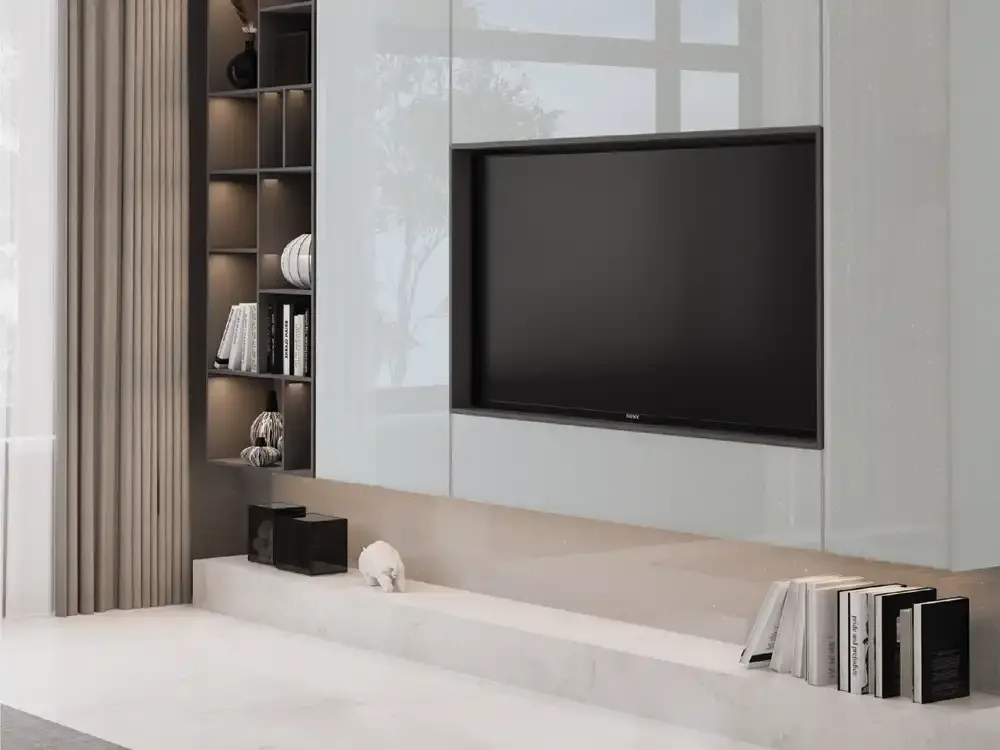
Mark Decor New Generation Acrylic (NGA) brings together three distinct visual directions for decorative furniture and interior-facing surfaces: reflective Glossy, pearlescent Metallic and softly glittering Sparkle. The category is best understood as a collection-selection guide, not as a single surface effect. Each range changes how a cabinet, wardrobe or display wall responds to colour and light, even when the supporting interior materials stay the same.
For shoppers comparing acrylic sheets and acrylic laminates, the first question is what sort of visual energy the room needs. Glossy gives the strongest plain-colour reflection, Metallic adds a subtle light-sensitive pearl effect and Sparkle introduces fine decorative highlights. Use this overview to choose a finish family before moving to the individual NGA product codes.
Three Finish Families, Three Different Design Decisions
A finish label describes the character of the surface, not a guarantee that all twenty-five designs behave identically under lighting. NGA Glossy consists of sixteen colours, including neutral whites, warm taupes, muted pinks, blues and greens. The five Metallic choices concentrate on pale pearl, silver, titanium and softly tinted effects. Four Sparkle designs develop a more visibly decorative shimmer within a compact palette of white, ivory, champagne and silver-grey.
The category should answer which finish direction belongs in a particular room. Its dedicated Glossy, Metallic and Sparkle subcategory pages explain their individual designs and product codes more closely. That separation helps customers avoid comparing unlike effects as though they were just different colour names in one homogeneous sheet family.
Selecting Acrylic Laminate Finishes Around Natural Light
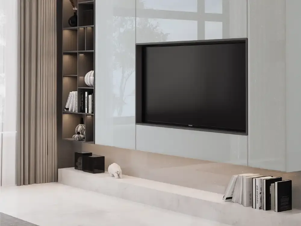
Daylight can make a bright white cabinet feel airy in the morning and more intense beside a large west-facing window later in the day. Artificial light introduces another variable: warm lamps emphasise cream and champagne shades, whereas cooler task lighting may make steel, silver or blue-grey finishes feel more restrained. Reflective fronts also display nearby objects and changing shadows, so the surrounding room affects the visible result.
Before choosing decorative acrylic laminates, place a physical sample vertically beside flooring, handles and the intended wall paint. Review it in daylight and after dark. Compare the effect from the entry point as well as close to the furniture. Swatch images are for design screening; they cannot replace final colour approval under project lighting.
Kitchen Cabinetry: Plan the Fronts, Not Just the Colour
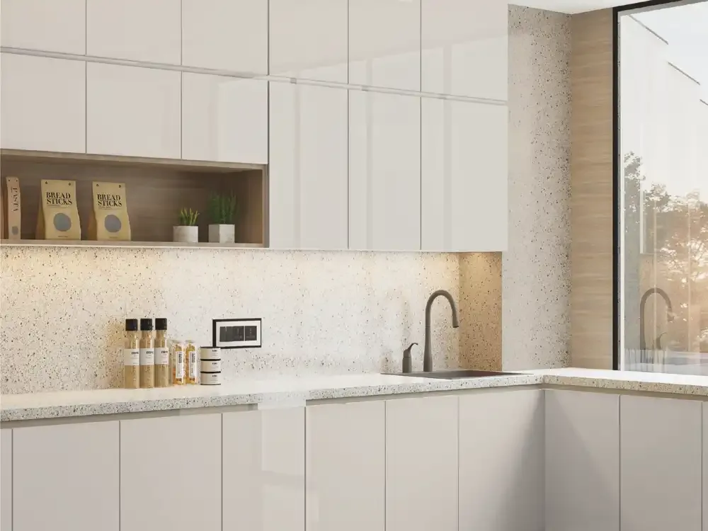
Kitchen design often begins with a worktop or backsplash, but large shutter faces can occupy more visual area than either. A calm NGA neutral can give busy stone-look counters room to breathe, while a pearl or sparkle accent may make sense on selected upper cabinets or a display section. The best selection keeps cabinetry, handles, floor and wall finishes in a deliberate hierarchy instead of giving each an unrelated decorative effect.
The catalogue illustrates kitchen use, but its care notes also matter: the sheets should not be treated as heat-proof cooking surfaces or used directly underneath hot cookware. Confirm the correct substrate, bonding method and location with the installer. This is a decorative vertical-facing product decision, not a substitute for worktop material specification.
Wardrobes and Dressing Areas: Make Large Planes Feel Intentional
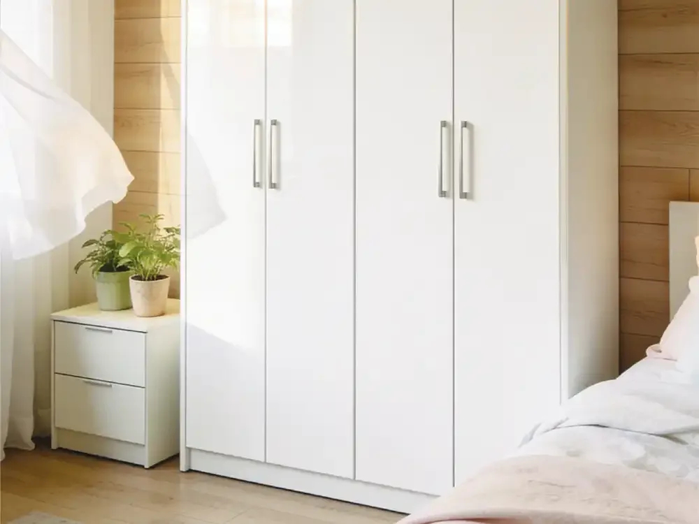
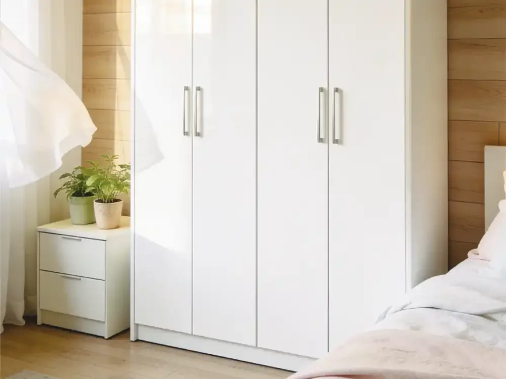
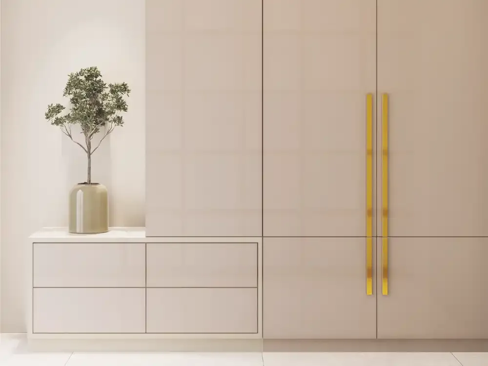
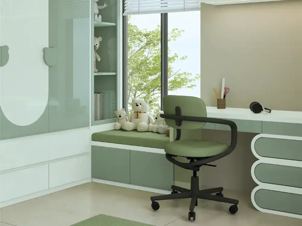
A tall wardrobe has repeated vertical surfaces, so colour consistency and reflectivity matter more than they do on a small sample. Off-white and taupe can integrate with timber furniture; soft blush or sage can introduce subtle personality; metallic neutrals can establish a more tailored dressing-room appearance. Sparkle may suit a selected dressing-unit door rather than every cabinet face where the overall room is already detailed.
For wardrobe acrylic sheets, view adjacent shutter samples side by side rather than in isolation. Consider the effect of seams, finger marks, mirror placement and overhead lighting. Decide whether the wardrobe should disappear quietly into the architecture or serve as the principal decorative element before settling on a finish family.
Bedrooms and Personal Spaces: Build a Restful Surface Mix
Bedrooms benefit from a controlled relationship among fabric, furniture and reflective finishes. A pale NGA Glossy surface can read clean against upholstered headboards, while a muted pearl or low-contrast sparkle can bring dimension to a dressing niche. If wallpaper or bedding already has a strong pattern, a restrained laminate is usually easier to coordinate than another conspicuous visual motif.
Think about how the room will be used in evening light, since bedside lamps and display lighting can change the apparent finish. The source catalogue includes bedroom applications, but that does not establish acoustic or thermal properties. The reason to choose NGA here is visual coordination and an appropriately specified decorative sheet, not unsupported functional claims.
Offices, Receptions and Commercial Interior Schemes
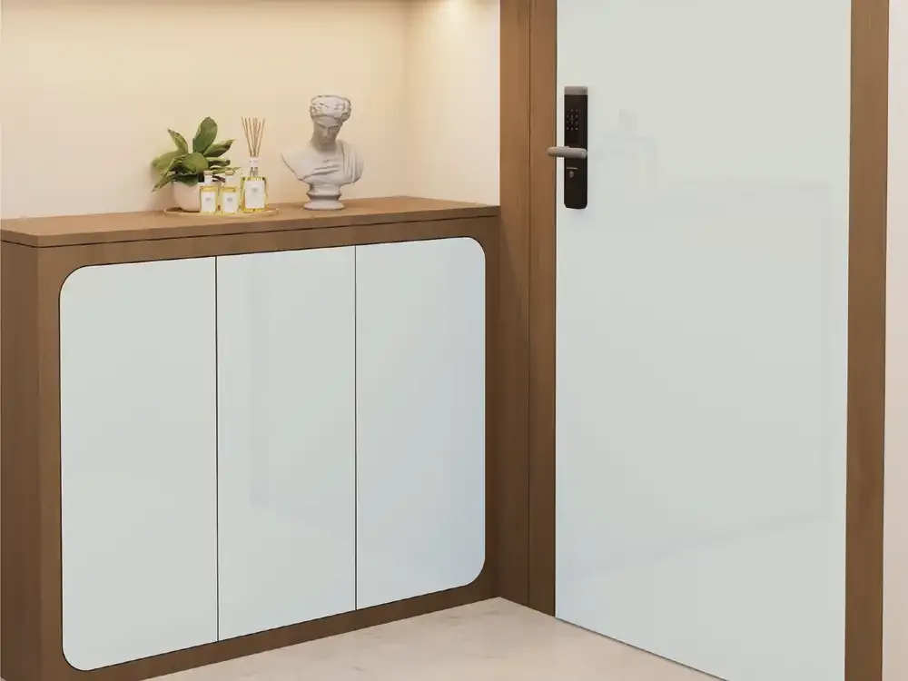
In offices and reception zones, repeatable colour decisions can be more important than selecting the most dramatic sample. A coherent set of NGA finishes can connect an entrance desk, display storage and meeting-room cabinetry. White and titanium tones favour a crisp architectural language; warm champagne and light pearl options can soften a hospitality-style welcome. Sparkle effects work better where the lighting is intentionally part of the design.
The catalogue identifies offices, showrooms and reception settings among possible applications. Actual suitability depends on site conditions, expected handling, installation details and maintenance routines. For heavily used commercial furniture, request the applicable technical documentation and approve the physical finish rather than relying on decorative photography alone.
Colour Families Across the Twenty-Five NGA Designs
The catalogue-backed collection includes sixteen Glossy designs, four Sparkle designs and five Metallic designs. The editorial colour vocabulary associated with individual product codes ranges from snow white and porcelain ivory to mushroom taupe, apricot blush, blue-grey, eucalyptus mint and sage. The Sparkle range covers crystalline white, champagne, ivory and silver-grey; Metallic includes pearl white, champagne silver, titanium and lilac-influenced tones.
These colour descriptors help explain what a printed swatch suggests. They are not replacements for official NGA SKU names or promises that every finish exists in every shade. When discussing a particular colour, link to its corresponding product code and confirm a physical sample before project approval.
Understanding the Documented Sheet Size and Thickness
Mark Decor's NGA catalogue specifies 8 × 4 ft sheets with 1.5 mm thickness. These values are useful when planning cabinet faces, order quantities, transport and basic cutting layouts. They do not specify the thickness of the complete built-up furniture shutter: the supporting board, adhesive, edge finishing and fabrication procedure must be selected separately by the project team.
Treat the sheet dimension as a procurement reference rather than a finished installed coverage guarantee. Cutting waste, pattern orientation, defects and edge allowances can affect required quantity. Confirm current stock, selected design code, batch and the applicable fabrication guidance before placing a bulk order.
Performance Features: Read the Fine Print Alongside the Headline
The manufacturer's technical comparison lists 6H anti-scratch performance, high gloss and favourable UV- and water-resistance characteristics for NGA. These are catalogue statements, not independently verified results provided here. Scratch resistant is not the same as scratch-proof; water resistance does not establish permission for wet-service construction, and resistance to sunlight does not mean the product is approved outdoors.
The catalogue expressly advises against outdoor use and prolonged direct-sunlight exposure. It also cautions about heat, harsh cleaning chemicals and unsuitable adhesives. Buyers should weigh the stated benefits together with those limits, especially for sunny openings, kitchens and projects requiring a formal fire, safety or performance certificate.
Installation Planning Begins With a Compatible Base
Attractive acrylic laminate depends on the quality of the supporting assembly. Flatness, dryness, cleanliness, pressure during bonding and the chosen adhesive all influence how a finished shutter appears. The NGA catalogue recommends Mark Bond and flags risks from damp or uneven substrates, inappropriate glues and insufficient pressing. A clear sample match will not compensate for poor surface preparation.
Discuss the intended board, project humidity, substrate condition, edge treatment, handling and installer experience before work starts. Request the latest official fitting method for the selected use. This guide does not prescribe a universal adhesive recipe or claim that every substrate and bend radius is suitable.
Care, Cleaning and Long-Term Presentation
A refined finish is easiest to maintain when everyday cleaning is gentle. The catalogue advises water and a clean, non-abrasive cloth, with mild household cleaner only when necessary. Avoid harsh solvents, scouring pads and unapproved chemical treatments. Cleaning advice should be tried on an inconspicuous area or validated against the latest manufacturer instructions if site conditions are unusual.
Handle sheets carefully during transport and fabrication to avoid surface marks before installation. The source warns against prolonged heat and sunlight, direct cookware contact and inappropriate horizontal use. A practical maintenance plan matters more than an unqualified claim that any premium surface is maintenance-free.
How to Compare Samples Without Keyword or Finish Confusion
Start with the function of the room and decide whether it needs plain colour reflection, a restrained metallic nuance or a discrete shimmer. Shortlist no more than a few actual NGA codes, then compare them together with the main furniture materials. Record the selected product code, finish family, expected sheet format, sampling reference and any project-specific approval conditions.
This method keeps aesthetic preference separate from technical confirmation. It also prevents one striking photograph from deciding an entire kitchen or wardrobe scheme. Use the linked category branches to compare verified colours: Glossy for broad plain-colour choice, Metallic for pearl-led effects and Sparkle for light-catching decorative highlights.