
Fresco Panels

Collections
Fresco Panels Guide
Fresco Decorative Interior Panels: Design a Wall With Intention
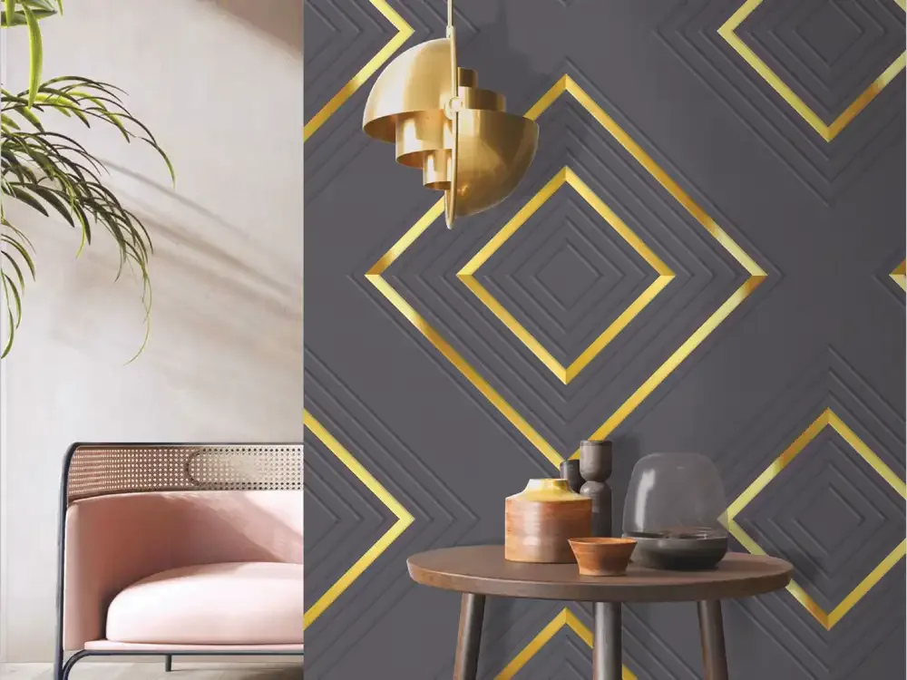
Fresco Panels by Mark Decor offer a way to design interior surfaces through colour, texture and architectural pattern rather than relying on wall paint alone. The collection contains thirty documented product designs, spanning restrained linework, broad curves and stronger graphic shapes. A well-planned composition uses those details to support the furniture and the proportions of a room. The right panel need not be the boldest choice: sometimes a soft off-white surface with a quiet repeated motif has more lasting impact than a dramatic feature across every wall.
This category guide addresses the bigger design decision: how to select a decorative interior panel, where to use it, how much pattern a space can accommodate and which technical questions to resolve before ordering. The linked Fresco range page retains the material-specific HDHMR wall-panel searches and individual product choices.
Different Pattern Families Create Different Architectural Effects
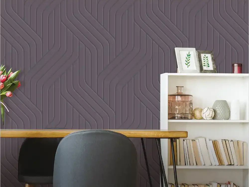
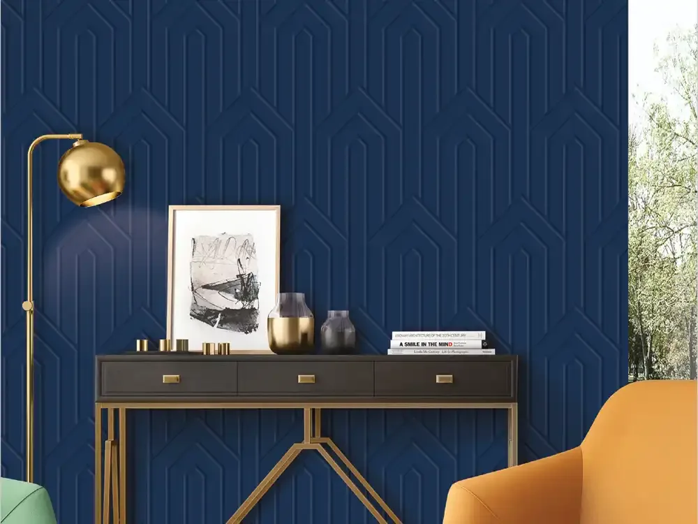
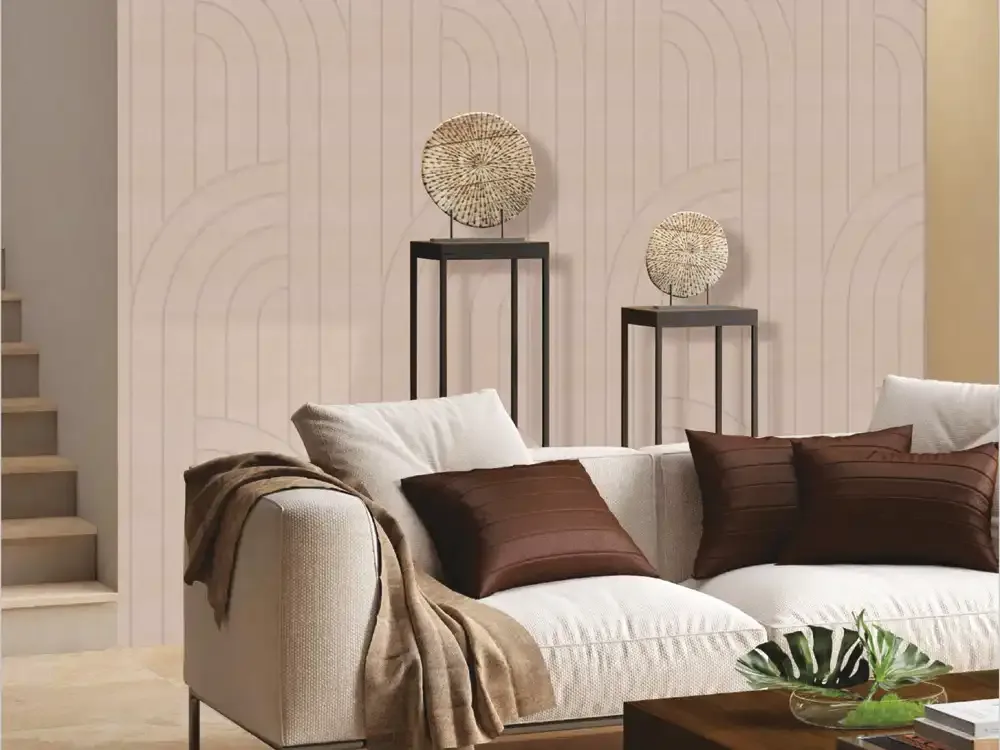
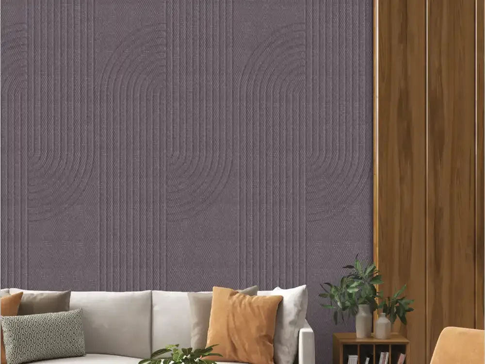
Fresco is not one repeated texture in several colours. Its documented visual families include arc lines, arch geometry, restrained linear bands, chevrons, diamonds, directional arrows, sweeping curves, circular geometry, scallop repeats and maze-like line patterns. Each creates a different reading of space. Long vertical marks reinforce height, softer curves reduce the severity of straight cabinetry, while directional motifs deliberately draw the eye across an accent section. The difference is meaningful when a wall sits behind a sofa, beside a doorway or at the end of a corridor.
Choosing Between Quiet, Balanced and Statement Interiors
One useful design approach is to classify panels by visual intensity. Quiet decorative panels use light tones, gentle texture and small changes in line direction. They can support larger areas without immediately dominating a room. Balanced designs introduce a more recognisable curve, chevron or diamond while keeping the surrounding palette calm. Statement designs rely on dark backgrounds, strong contrast or metallic-coloured accents and work best when the room has a clear focal point.
A Fresco Colour Palette for Coordinated Interiors
The existing PIM product descriptions document white, blush, taupe, graphite, charcoal, navy and marble-look directions, alongside warm copper-, gold- and rose-toned detailing on selected designs. These describe specific visual finishes, not a promise that every colour is available in every pattern. White linework can sharpen a minimal interior; taupe works beside warm oak and stone tones; blush can soften dark cabinetry; and navy or graphite can bring definition to a neutral space. Metallic-coloured accents introduce warmth without requiring every adjoining surface to shine.
Planning Wall Proportions Before Selecting a Motif
A decorative panel layout begins with measurement. Identify where the panelled zone starts and ends, where switches or sockets interrupt it, and whether furniture will obscure part of the pattern. A design that appears centred in a catalogue rendering can feel unbalanced when it meets an off-centre television, a wide wardrobe or a door frame. Sketch the complete elevation and mark every relevant opening before choosing the layout. Consider whether the eye should read one framed accent, a repeated sequence or an uninterrupted full-height treatment.
Fresco's documented 590 mm panel width provides a starting module for layout planning, not a guarantee that every opening divides into an even number of sheets. Calculate edge cuts and visible joins separately.
Balance Vertical Rhythm With Horizontal Furniture Lines
Many Fresco designs contain vertical or directional rhythm. That rhythm can contrast effectively with a long media console, desk, credenza or low seating arrangement. A series of vertical panels can make a low furniture composition feel more architectural; a curved design may soften a room filled with sharp shelving and rectangular openings. The most successful schemes usually have one organised pattern language and a second, quieter material that lets it remain readable.
Living Spaces: Give the Main Wall a Clear Role
In a living room, the feature surface is competing with windows, artwork, upholstery and often a television. Decide which element should receive attention first. If the furniture already contains strong veining, printed textiles or decorative metal, a quieter Fresco line pattern can unify the scheme. If the furnishings are largely plain, a charcoal geometric or accented directional design may become the signature element. The goal is a coherent hierarchy, not as many decorative materials as possible.
Bedrooms and Private Rooms: Texture Without Clutter
Bedrooms often have several large soft surfaces: bedding, curtains, rugs and upholstery. A decorative backdrop should complement those elements instead of forcing every fabric to match a bold wall. Pale scallop, white line and soft taupe designs from the documented Fresco range suggest calmer concepts; blush lines can introduce warmth, while a darker arc or graphic pattern may suit a smaller accent zone. These are colour-planning suggestions, not claims about a product being acoustically treated or upholstered.
Offices, Reception Areas and Hospitality Settings
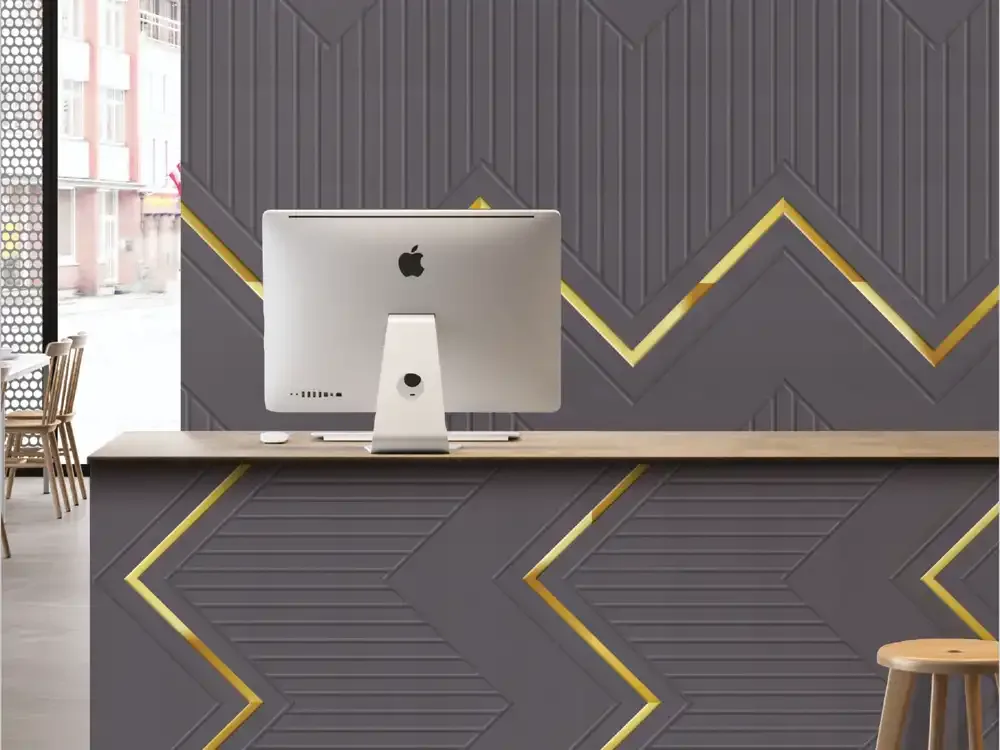
In commercial interiors, decorative surfaces can establish a visual identity without placing a large printed sign on every wall. A reception backdrop might use a directional or geometric Fresco pattern that complements the organisation's main colours. A meeting room may call for subdued graphite or white lines; a hospitality lounge can accommodate warmer accents or larger repeated motifs. The existing PIM illustrations and descriptions include offices, receptions, meeting spaces, retail contexts and hospitality-style interiors.
What the Documented Fresco Material Specification Says
The PIM identifies Fresco as a polymer-coated HDHMR panel, specified at 590 × 2400 mm and 6 mm thickness across the documented designs. These values are relevant when calculating coverage, cutting layouts, transport arrangements and the visual scale of the panel repeat. They do not, by themselves, establish an adhesive type, fixing method, structural performance, outdoor suitability or compatibility with every substrate. HDHMR should be understood as the recorded panel construction, not confused with PVC, WPC or solid-metal decorative panels.
Performance Claims: Useful Guidance, Not Universal Guarantees
The Fresco product record lists moisture resistance and easy maintenance among its features; it also names stability, durability, aesthetic appeal and eco friendliness. These are manufacturer-listed attributes. They should not be expanded into promises of waterproof performance, outdoor weather resistance, a certified fire rating, antimicrobial treatment or universal resistance to chemicals. If a proposed location involves persistent moisture, heavy cleaning, heat or regulatory obligations, the project team should request supporting technical documentation and written application guidance.
This distinction helps dealers and designers make precise recommendations. A product may be well suited to a decorative interior installation without automatically being appropriate behind an unprotected sink, in direct weather or in a specialised fire-rated assembly.
Lighting Can Change the Reading of Lines and Colour
Surface colour is never judged in isolation. A white panel can appear warmer beneath yellow lighting, while navy and graphite become visually deeper in a dim lounge. Shallow directional marks may become more noticeable under side illumination, and metallic-coloured details can shift their perceived contrast with viewing angle. Test a physical sample vertically against both daylight and the actual lighting planned for the room. An LED strip positioned too close to a surface may create a distracting bright edge or exaggerated shadow.
Joining Panels, Corners and Service Openings
The final impression of an architectural panel treatment depends strongly on details that are easy to overlook in early visual planning. Decide how visible joints will be arranged, how a pattern meets a corner and whether a profile or neighbouring material will frame the decorated area. Mark outlet locations, inspection access and future maintenance needs before the final layout is frozen. Pattern direction should remain intentional at returns and cut sections, especially when the design contains strong diagonals or large curves.
Selecting a Design Without Competing With Other Materials
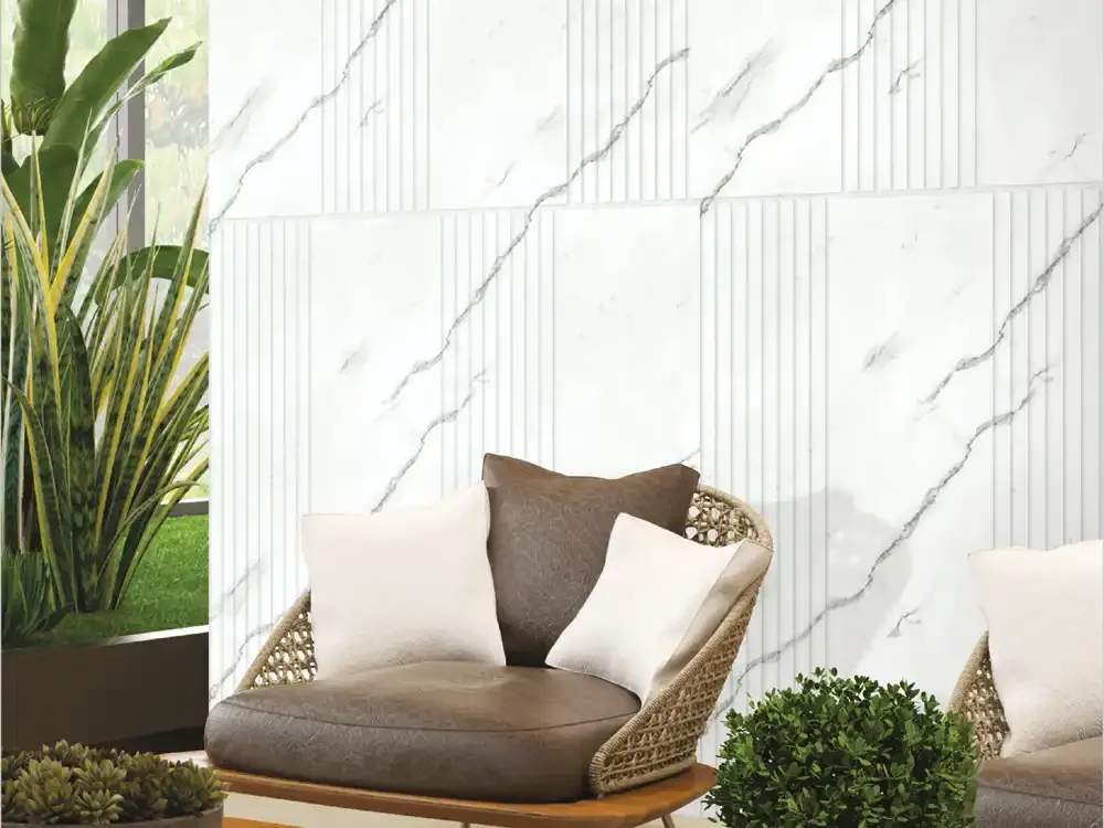
A useful three-sample comparison starts with colour temperature, then pattern scale and finally the surface's visual intensity. Compare each Fresco option beside the project's timber tone, stone or marble surface, upholstery and hardware. If the stone already has large veins, a quiet geometric line can provide structure without a second competing motif. If the room uses plain painted surfaces and restrained furniture, a more expressive curve, arrow or diamond may give it needed identity.
Care, Sample Approval and Responsible Ordering
Before confirming an order, record the exact Fresco product code, design appearance, intended orientation, required quantity, actual coverage, wastage allowance and available sheet size. Request a current physical sample when colour and pattern matching are important; screen images may not match on-site conditions. Confirm the approved fixing and finishing approach before committing to large-scale work. For cleaning, follow the supplied technical instructions and begin with a gentle, approved method rather than assuming all solvents or abrasives are safe.
Explore Fresco Designs From Category to Product Code
This category focuses on the broader choices behind Fresco decorative interior panels: pattern scale, colour coordination, space planning, dimensions and responsible specification. The existing Fresco subcategory is the more detailed destination for HDHMR wall panels, specific TV-wall or bedroom applications and the individual designs. Each of the thirty PIM-listed products has its own identifying code, so users can move from a general interior concept to a precise material reference without relying on a broad keyword alone.