
Volume - 5
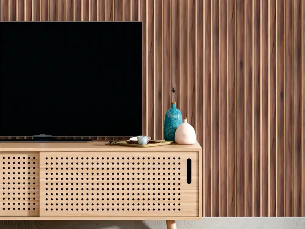
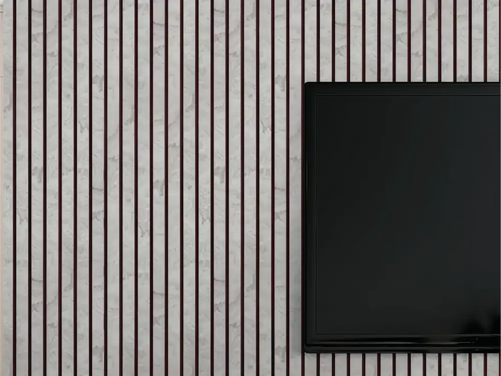
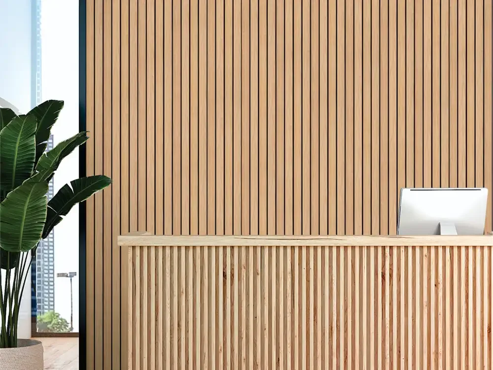
Volume - 5 is a collection of 48 high-grade PVC louver designs developed as seamless designer planks for modern interior walls. The range moves from warm teak, walnut and oak fi...

G-01
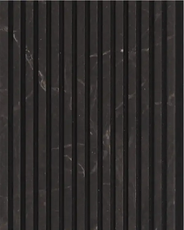
G-02
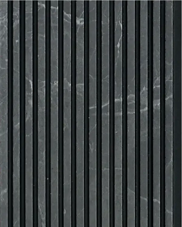
G-03
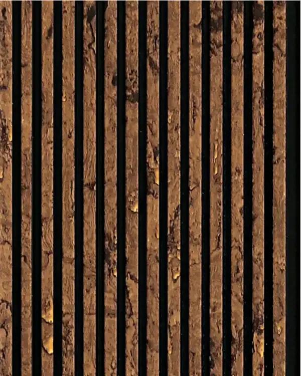
G-04
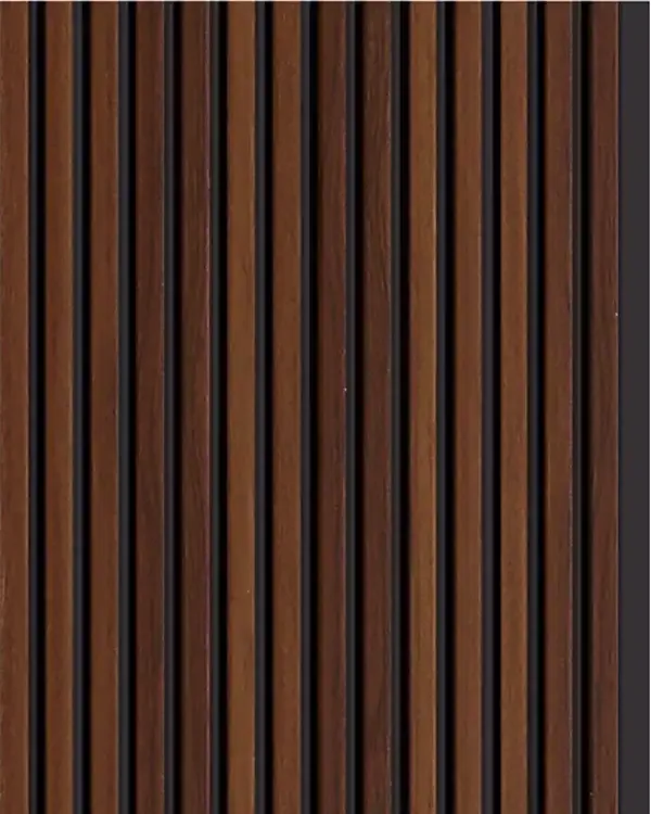
G-05
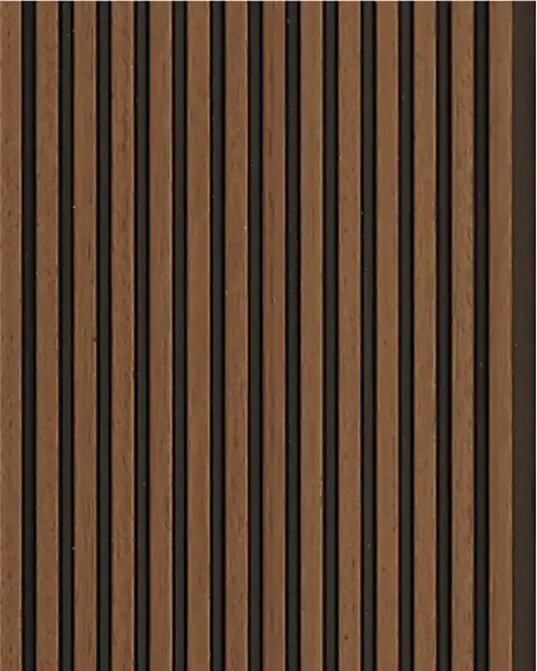
G-06
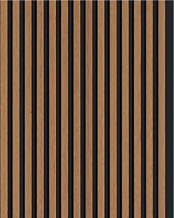
G-07
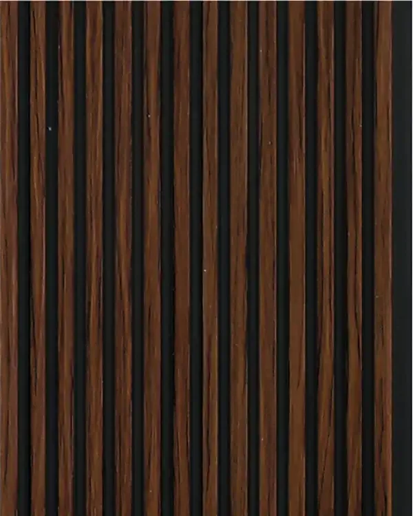
G-08
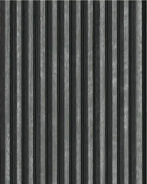
G-09
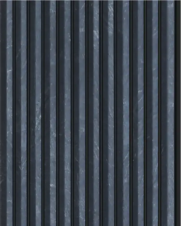
G-10
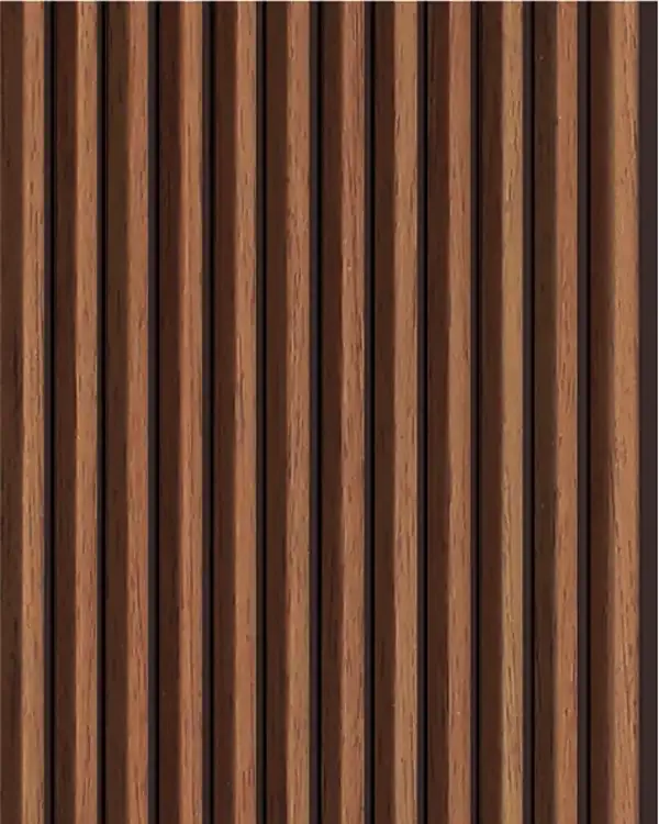
G-11
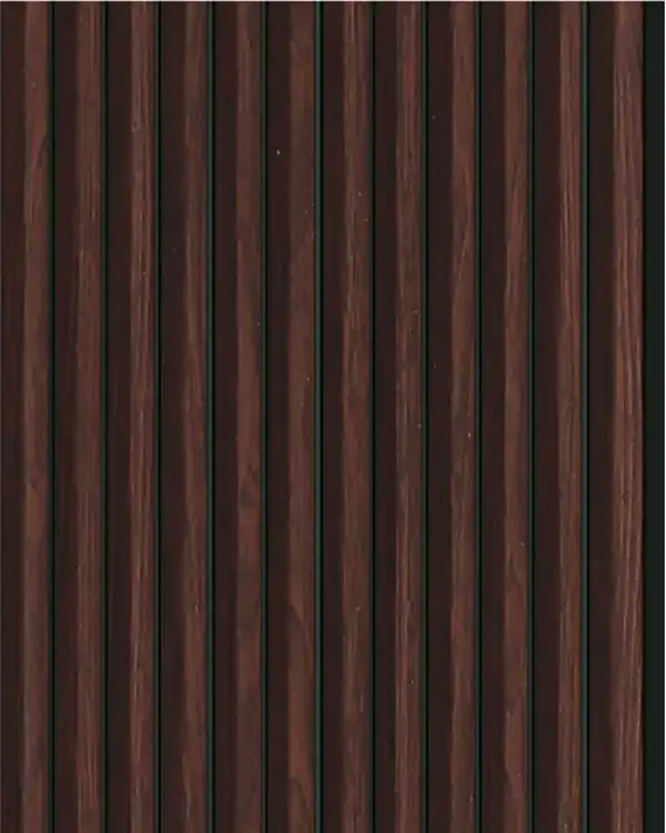
G-12

G-13

G-14

G-15
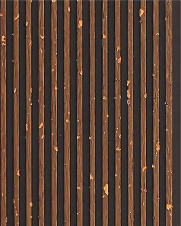
G-16
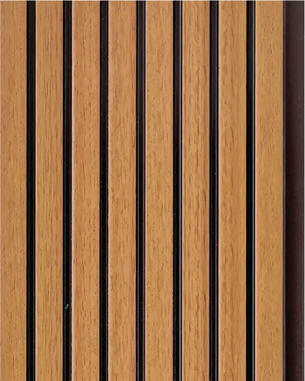
MD-4501
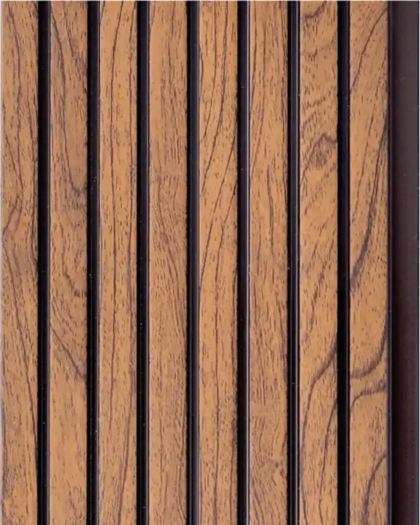
MD-4502
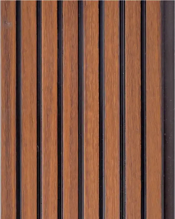
MD-4503
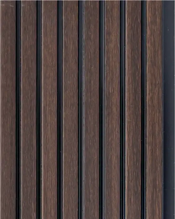
MD-4504
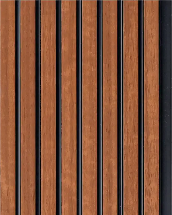
MD-4505
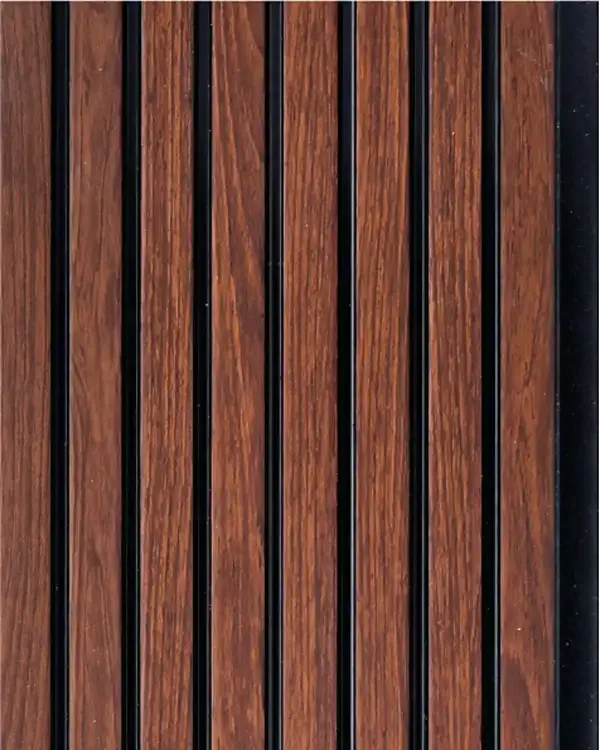
MD-4506
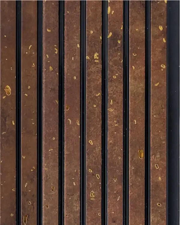
MD-4507
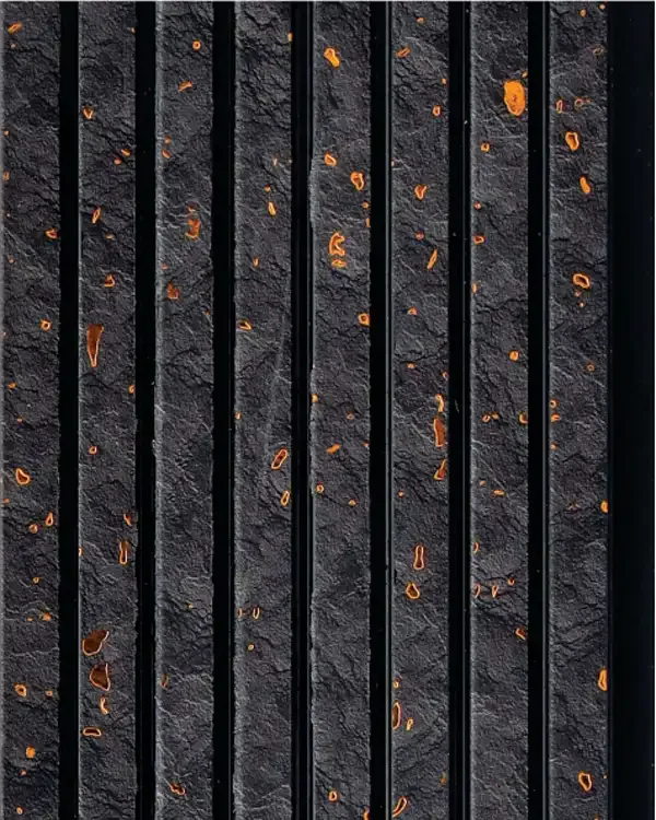
MD-4508

MD-4701
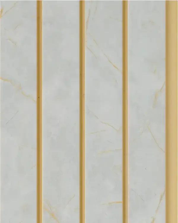
MD-4702
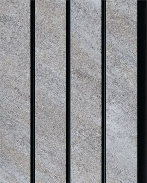
MD-4703
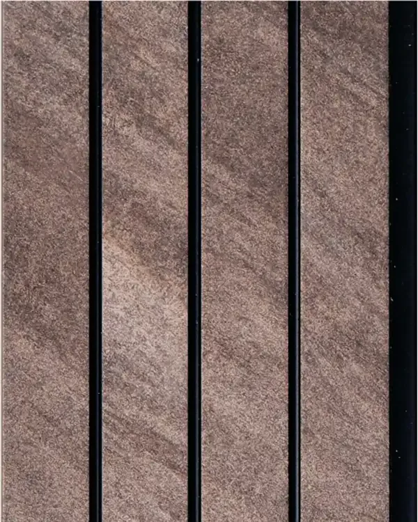
MD-4704
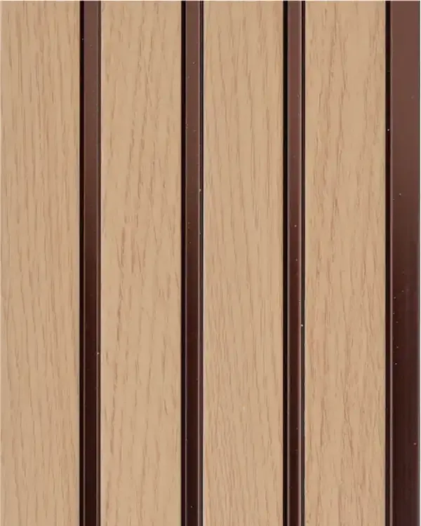
MD-4705
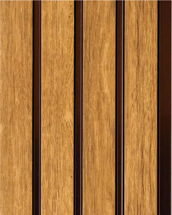
MD-4706
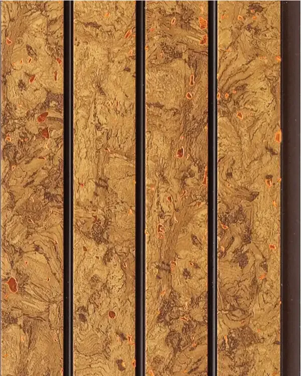
MD-4707
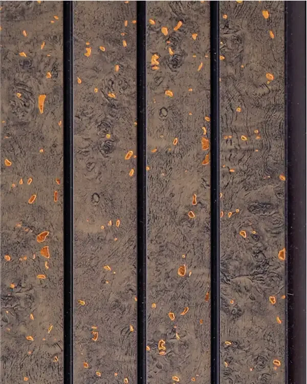
MD-4708
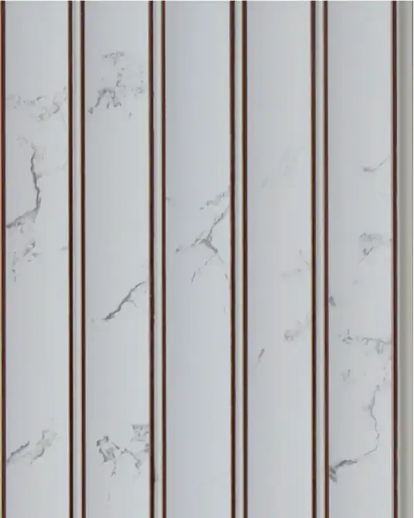
MD-4801
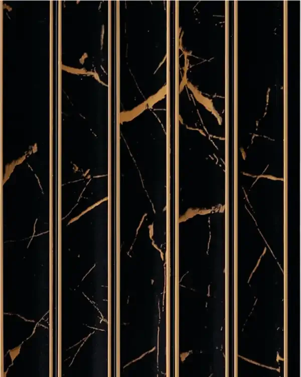
MD-4802

MD-4803

MD-4804

MD-4805
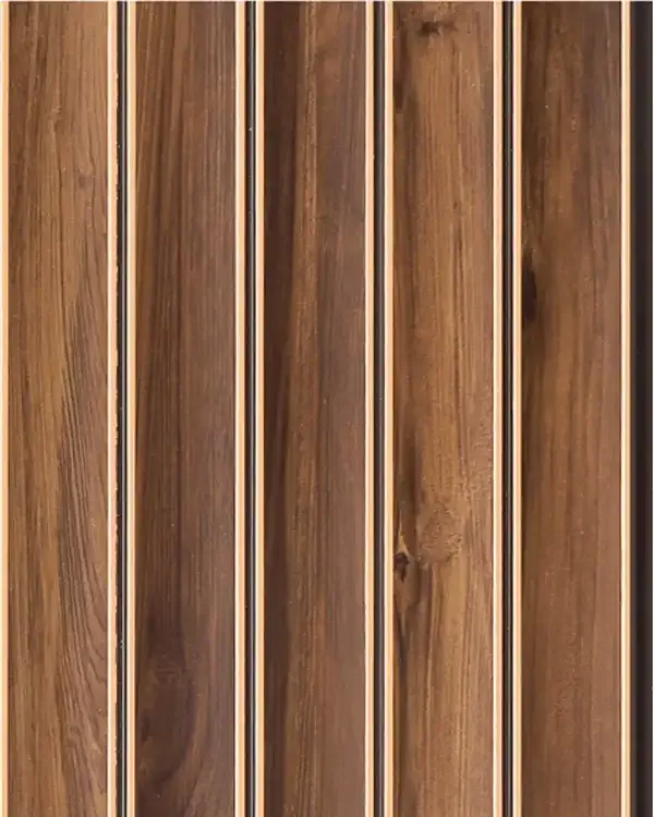
MD-4806

MD-4807
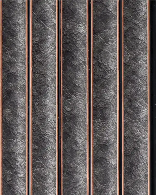
MD-4808
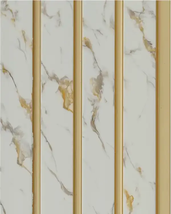
MD-4901
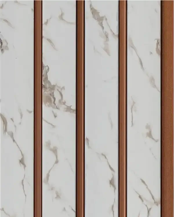
MD-4902
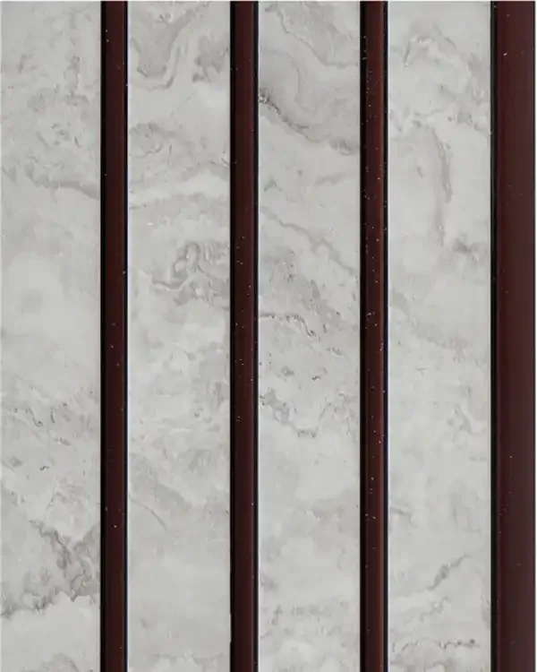
MD-4903
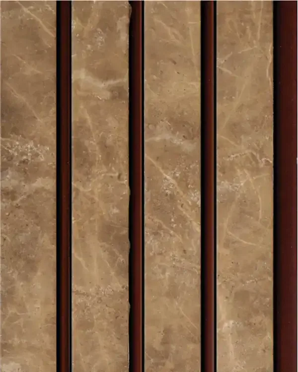
MD-4904
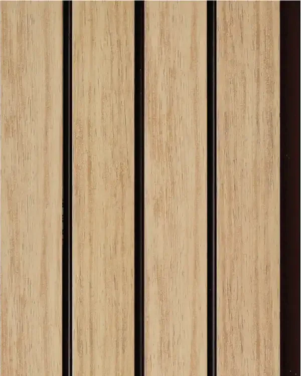
MD-4905
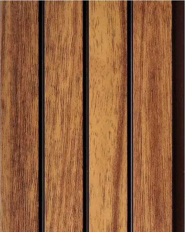
MD-4906
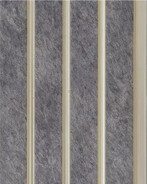
MD-4907
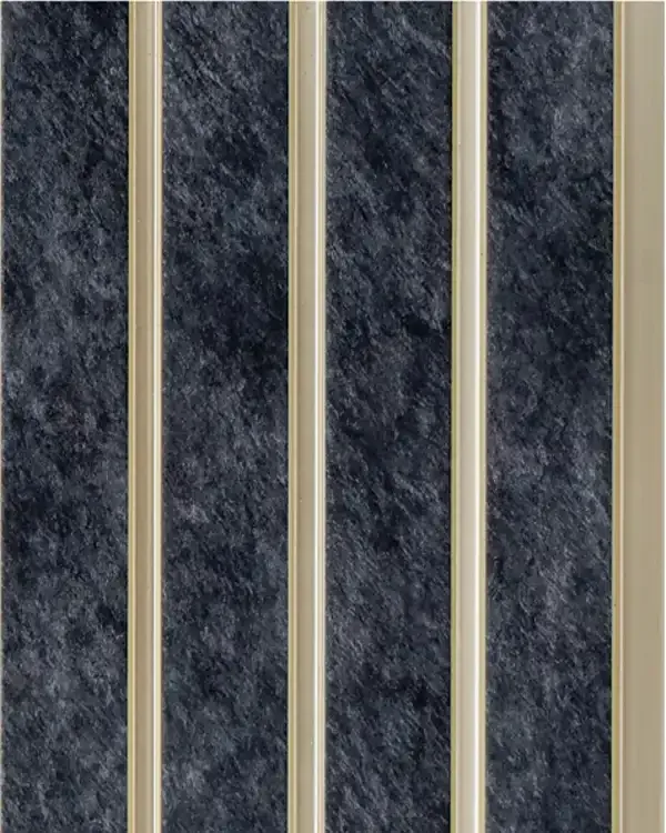
MD-4908
Volume - 5 Guide
Volume - 5 Louvers: A Finish-Led Collection for Interior Walls
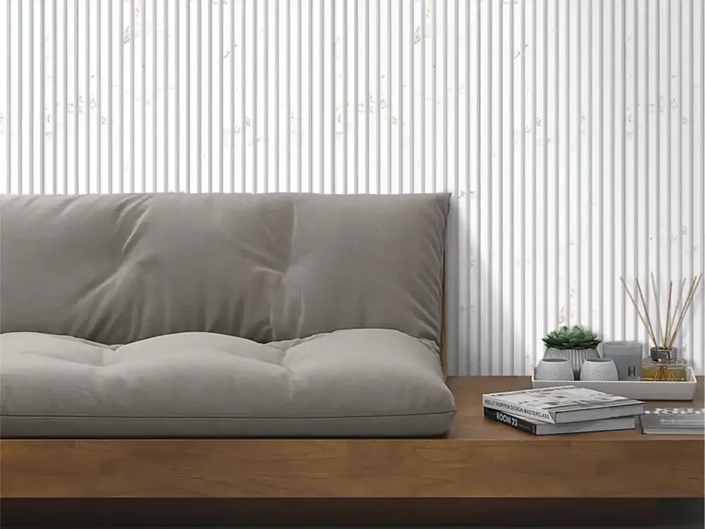
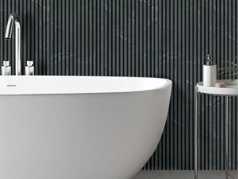
Volume - 5 by Mark Decor brings together 48 decorative designs built around the idea that a wall panel should be chosen for the entire room, not as an isolated colour swatch. The collection moves across wood-inspired grains, soft stone and marble appearances, dark charcoal, blue-grey, lighter neutrals and more expressive decorative treatments. Its most useful SEO and design identity is this wide variety of wood-look and marble-look wall finishes, rather than a generic claim to suit every room.
A good Volume - 5 selection starts by asking whether the wall should feel warm, calm, architectural or deliberately dramatic. Wood-look finishes connect naturally with timber furniture and warm flooring. Marble-look panels can bring a lighter, more formal appearance. A darker mineral or charcoal design makes stronger contrast with white cabinets or a pale sofa. The colour is only one decision; the direction of the grain and the amount of visible detail also matter.
Wood-Look Louvers: Teak, Walnut, Oak and Rich Brown Directions
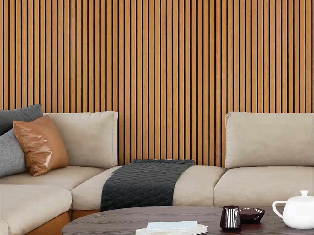
Warm teak and oak effects can be useful when a living room needs the visual comfort of timber without creating another heavy furniture piece. Walnut and deeper brown looks can provide more contrast behind a sofa or media console. Pale ash-inspired choices allow vertical pattern without reducing the sense of daylight. The exact shades and surface names belong to the individual Volume - 5 codes, but the collection offers enough variation to compare quiet and bold wood directions.
When combining wood-inspired louvers with real timber, compare undertones. A yellow-gold flooring may clash with a red-brown wall even if both finishes are called wood. Use a sample beside the flooring, door laminate and upholstered furniture. Consider whether the louver grain should echo cabinetry or deliberately contrast with it; trying to match every wood tone exactly can make a space look forced.
Marble-Look, Mineral and Decorative Surface Options
The Volume - 5 assortment also includes white marble impressions, grey mineral textures and decorative speckled finishes. These treatments can make a wall feel more polished or visually textured while retaining the collection’s regular louver rhythm. A pale marble-look design may suit a reception or a bright living room, while a grey-stone appearance can introduce a cooler architectural note. The texture is decorative: the catalogue-derived descriptions should never be interpreted as a natural stone specification.
A strong mineral pattern benefits from simple adjoining finishes. Pairing a busy marble effect with a second prominent marble surface can create competing lines. Instead, consider a plain cabinet face, uncomplicated upholstery and a few accents that repeat one colour from the panel. Metallic-looking flecks should be checked under both daytime and artificial lighting because their visual intensity may change considerably.
Matching Volume - 5 to Living-Room Furniture
An open-plan living room often contains several materials at once: flooring, a sofa, television cabinetry, curtains and dining furniture. Volume - 5 can serve as the linking surface if its undertone is shared with one or two of those materials. Warm walnut behind a cream sofa, for example, creates a different mood from pale ash behind the same furniture. Neither is universally better; the correct choice depends on room light and desired contrast.
The visual scale of the feature also matters. A full-width louver treatment will influence the entire room, whereas a narrow framed strip behaves more like an accent. Choose lighter finishes for a broad backdrop when daylight is limited, and reserve highly detailed or dark designs for sections where the architecture can support them. Marking the intended panel edges on the wall can help prevent an oversized feature.
TV Walls: From Restrained Backgrounds to Bold Contrast
Behind a screen, decorative louvers should usually help organise the media wall rather than draw the eye constantly away from the picture. Volume - 5 provides muted wood and pale mineral directions that can remain visually calm, while deeper espresso and charcoal finishes can form a stronger frame. The exact result depends on the size of the television, distance from seating and the way the panel catches light.
Before finalising a TV-wall design, coordinate electrical points, shelf fixing, access to wiring and ventilation for electronic equipment. A decorative panel is not the structural support for a heavy screen unless the installed assembly has been designed for that purpose. A quiet surrounding finish and well-planned cable access are often more valuable than an elaborate pattern behind the screen.
Bedroom Wall Design Using the Volume - 5 Palette
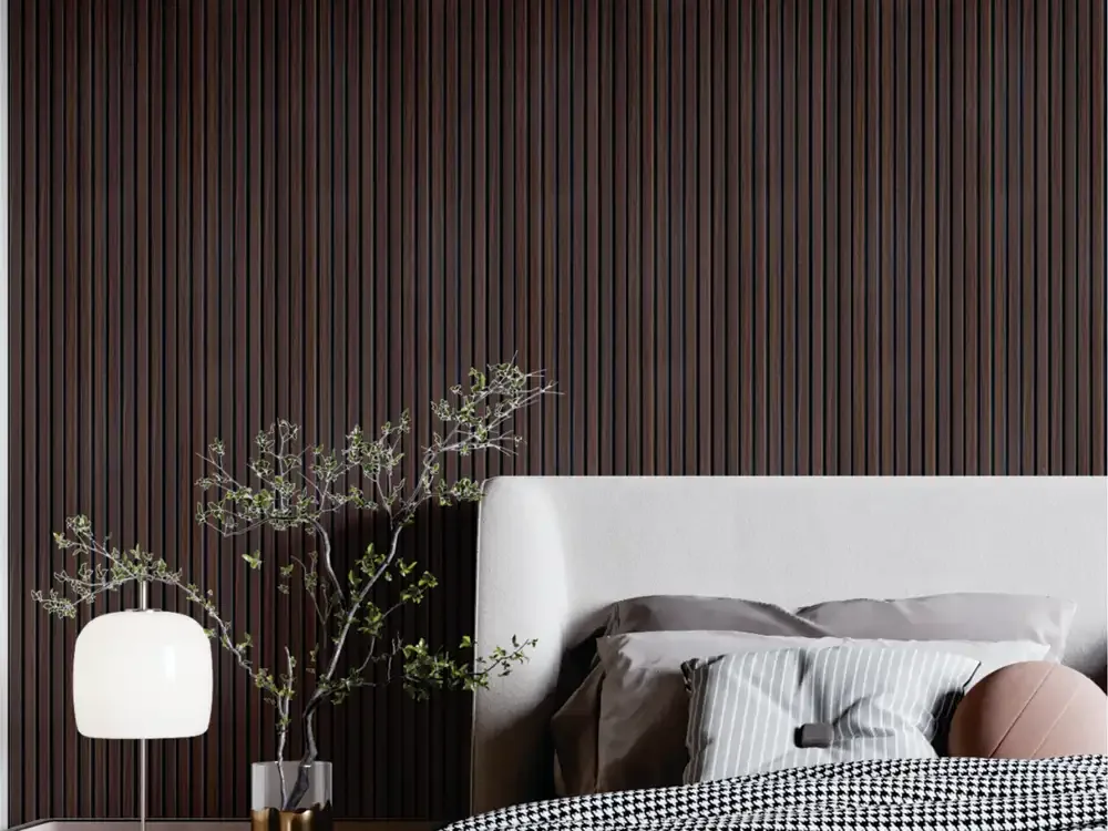
A bedroom backdrop has to feel comfortable at morning and night. Pale oak, soft ash and muted beige-related finishes can make a calm headboard feature, particularly beside layered neutral bedding. Dark walnut or chocolate-brown choices may make a large bedroom feel more intimate, while a blue-grey or mineral effect adds a cooler modern direction.
The placement and lighting of the panel are as important as its colour. Two narrow strips on either side of a headboard produce a different rhythm from a continuous feature wall. Warm bedside lighting softens deep finishes; cool white lighting may exaggerate grey undertones. Ask to see the shortlisted Volume - 5 sample at the height and direction in which it will actually be installed.
Dining Rooms, Cafes and Hospitality Finishes
For dining-room design, Volume - 5 offers a choice between a warm, timber-inspired background and an elegant stone-like appearance. A walnut finish can complement a solid wood table, whereas a light marble impression may work behind a contemporary sideboard. In a cafe, a darker surface can create intimacy around seating; a lighter one can brighten a space with limited natural light.
Commercial settings add practical considerations. Furniture impact, cleaning schedules, layout changes and signage can affect how a decorative wall performs in use. The current technical specification, fixing system and any applicable building requirements should be checked for the exact panel code. Catalogue images communicate style, not blanket approval for every public-space installation.
Office, Reception and Showroom Applications
A reception wall should support the identity of the business. A quiet mineral panel can sit behind signage, while a rich wood-look louver can lend warmth to a customer-facing counter. In a showroom, the surface can help define a product display zone without the need for several competing accent colours. The finish should also work with the lighting temperature and neighbouring display materials.
A meeting-room wall benefits from a calmer repeat pattern if large presentation screens and furniture already occupy the space. For executive areas, a deep wood look can establish a more formal character. Avoid describing every finish as universally luxurious; a successful commercial wall depends on selecting the appropriate colour, proportion, mounting and maintenance approach for that environment.
Length Options and the Importance of Exact Product Codes
The existing Volume - 5 PIM content describes lengths from 8 feet to 12 feet within the collection. That is a range-level statement, not confirmation that every finish or code is available in every length. Ask the supplier for the current size and stock options for the design selected, then calculate quantities using the actual effective coverage.
A long wall can include doors, return corners, bulkheads or changing ceiling heights. Those interruptions influence how much trimming is needed and how the grain or pattern should align. Confirm end details, joint positions and the treatment where a louver surface meets a different wall finish. These are practical questions that should accompany the colour decision, not be left until installation day.
Comparing Subtle and Statement Volume - 5 Designs
A subtle finish has low contrast between its grain and base colour; it can support a large background area with minimal visual noise. A statement finish has a stronger grain, bolder mineral pattern or darker overall value, making the feature wall more prominent. Both types belong in the Volume - 5 palette, but they should not be mixed indiscriminately unless a clear composition is planned.
Try choosing one dominant louver finish and at most one complementary material at first. Then review how that pair works with flooring and furniture. If the space already has a veined stone countertop, a restrained wood louver may be more coherent than another strongly veined panel. These choices are better made with samples than by adding every attractive catalogue image to one mood board.
Why Volume - 5 Has Its Own Search Intent
Volume - 5 should be discovered by people looking for a specific louver finish family: wood looks, marble-inspired panels, mineral textures and interior palette ideas. Broader questions about every type of wall louver belong to Mark Decor’s Louvers category. Questions about paired patterns belong to Infinite; tall 2900 mm dimensions belong to Volume - 6; and a wide 300 mm panel face belongs to 30 CM Louvera.
A buyer can begin here with the look of the finished room, compare a few designs and then move to the exact product code. That gives the subcategory a useful role without borrowing the same headline keyword from all its sister pages. It also helps architects specify a finish intentionally, based on actual code and room conditions rather than a generic label.