
The Weave Collection
Collections
The Weave Collection Guide
Designer Decorative Laminates That Bring Texture Into Interior Design
The Weave Collection by Mark Decor introduces designer decorative laminates for projects that need more than a flat colour or conventional imitation timber. Its surface language takes inspiration from cloth, basket patterns, interlaced strands and crafted geometry. That makes the collection useful when a designer wants the visual warmth of a textile with the planned proportions of an architectural sheet. The result can be subtle, like a close grey crosshatch, or expressive, like a contrasting diamond pattern. The choice should be guided by the room, not by the most dramatic catalogue photograph.
This guide is for architects, homeowners, carpenters and dealers comparing the collection as a whole. Design codes and samples remain the final reference.
Understanding the Collection: Textile Character Without Assuming Textile Construction
The appearance of a woven surface and its physical construction are not interchangeable descriptions. Mark Decor presents this range as a decorative laminate collection with a deep synchronized-embossed surface and an MCS mineral-composite base sheet. The surface conveys woven character through its visible pattern and texture; it should not be described as loose fabric upholstery, natural cane furniture or handwoven cloth unless a particular product is independently documented that way. That distinction matters when preparing accurate specifications for furniture and architectural applications.
This category therefore targets textured decorative laminates and the decisions around them. The linked subcategory retains the specialised real-weaving terminology and product-specific details.
From Quiet Neutrals to Distinctive Geometric Effects
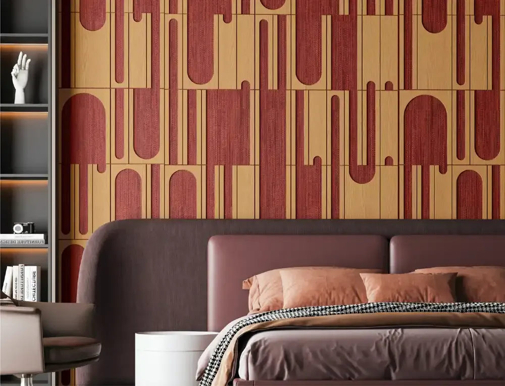
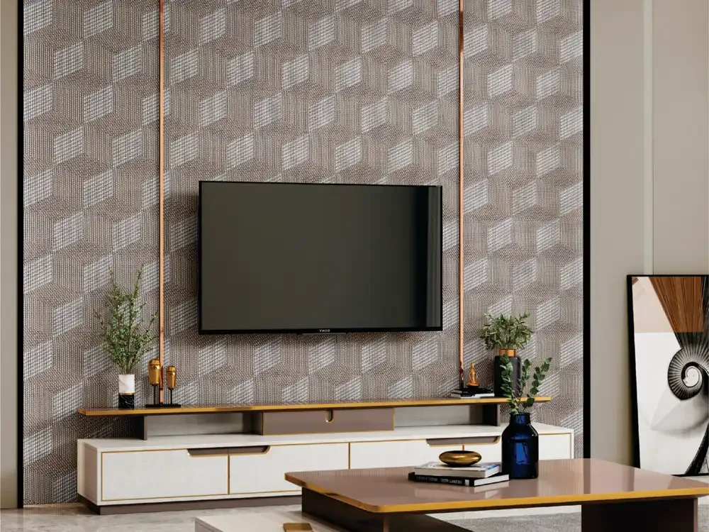
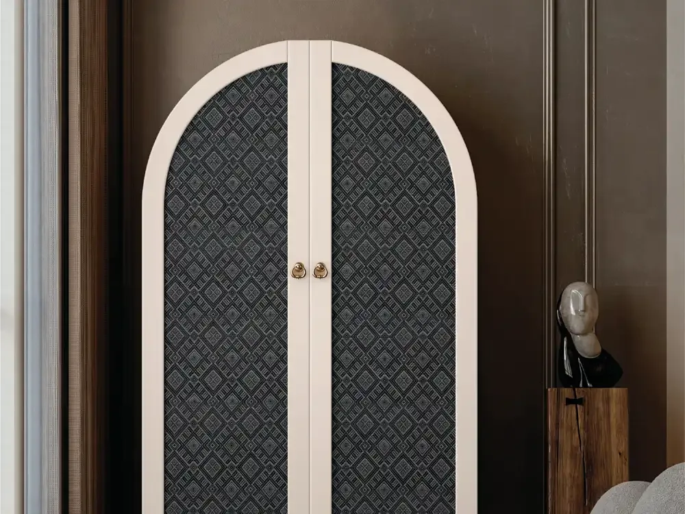
There is no single Weave look. The 16 catalogue product references span pale natural basket patterns, golden jute-inspired colour, compact silver-grey grids, cool grey crosshatching, blush pinstripes, rich ruby tones, charcoal diamonds and taupe patterns that form a dimensional cube impression. Ivory chevrons and checked combinations offer alternatives between those extremes. These are descriptions of the design appearances documented in the PIM, not a claim that every sheet uses the same woven material or strand technique.
On larger planes, assess pattern scale and contrast at viewing distance. Quiet grids and natural shades blend into rooms; diamonds and stronger colours create focal points. Orientation also affects the finished impression.
Choosing Textured Interior Surfaces for a Balanced Material Palette
A textured interior surface should add a deliberate layer, not compete with every other finish. For example, a light woven-look panel beside a warm oak tone creates material interest without sharp colour contrast. Against dark metal handles or graphite cabinetry, an ivory micro-pattern can improve definition. A bold patterned insert may pair better with plain shutters and calm paint than with strongly veined marble or multiple ornamental surfaces.
View real samples vertically beside proposed paint, cabinetry and hardware. Embossed detail changes under different lighting.
Wardrobes and Storage: When a Textured Accent Works Best
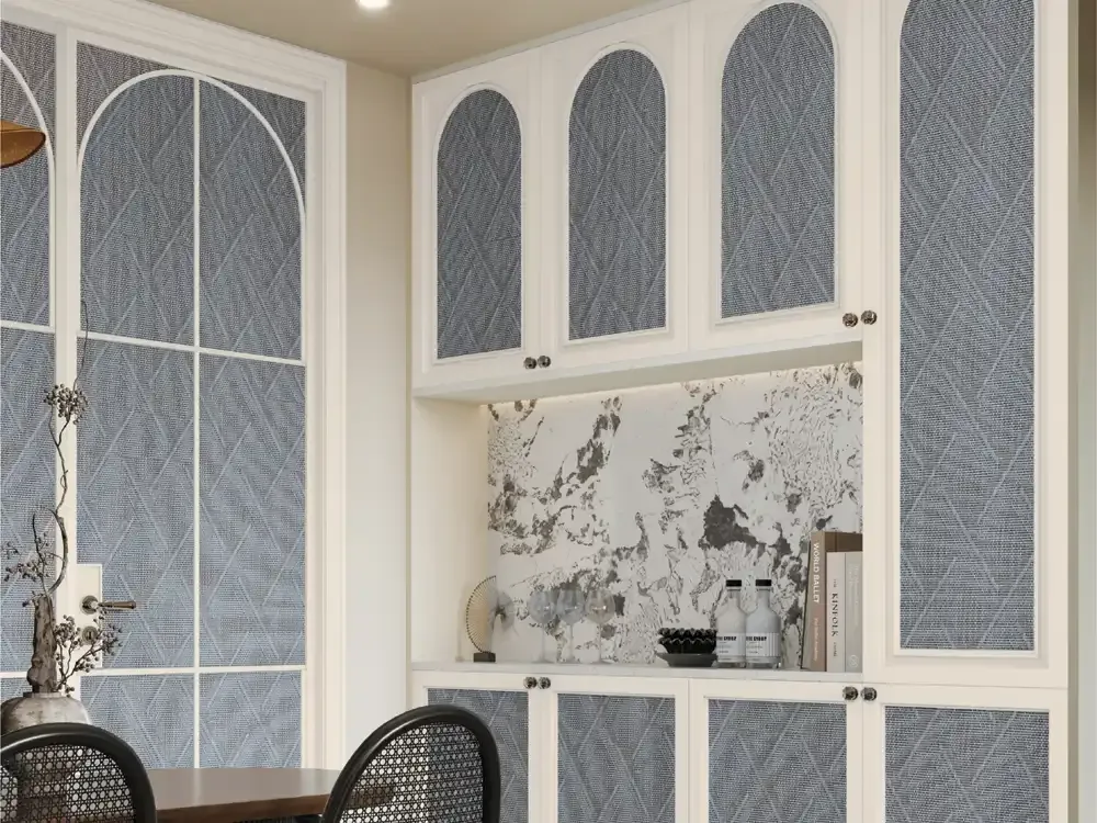
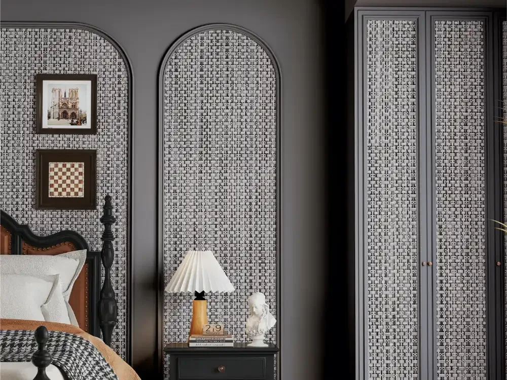
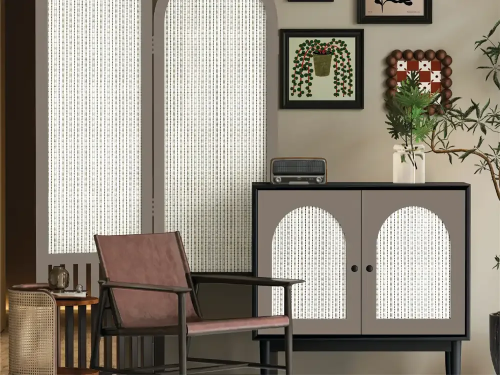
Wardrobe shutters are large repeating planes, so the scale of a pattern can determine whether the furniture feels refined or busy. Subtle grey, blush and natural-toned designs may work across several doors without creating strong visual movement. A darker geometric design often works more effectively as an accent panel or a smaller set of shutters. These are design approaches rather than rules: the actual room dimensions and the amount of daylight should determine the final choice.
For wardrobe laminate design, plan door divisions and pattern direction before cutting. The sample must make sense across full-height shutters and their visible joints, not only as a swatch.
Cabinets, Sideboards and Custom Furniture
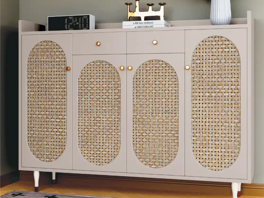
Decorative furniture benefits from a measured contrast between smooth functional components and expressive surface details. A woven-look front can give a sideboard a crafted appearance while plain surrounding elements maintain a clean outline. On kitchen or storage cabinets, compact crosshatch patterns can offer visual texture without demanding the same attention as a high-contrast geometric design. The PIM material references show the collection in cabinet and kitchen-shutter settings, but each installation still requires appropriate substrate and edge-detail planning.
Coordinate pattern orientation across doors and drawers, and review handles, edges and adjoining boards. Confirm the available sheet format before designing panel divisions.
Feature Walls, TV Backdrops and Architectural Accents
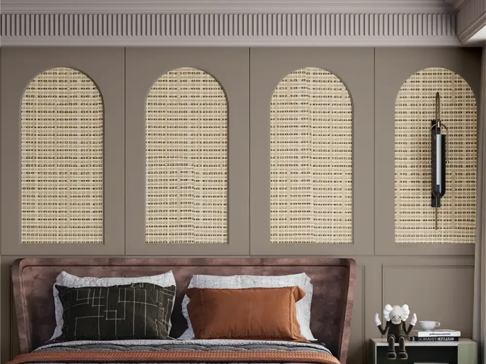
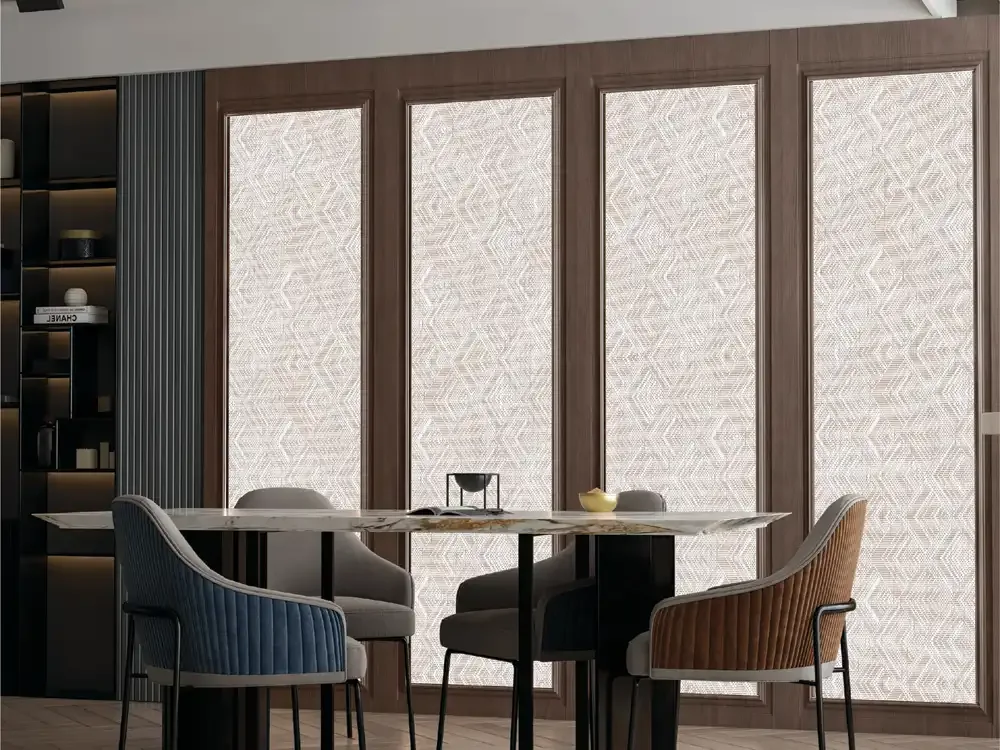
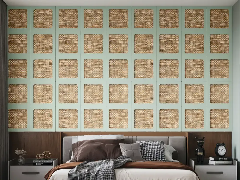
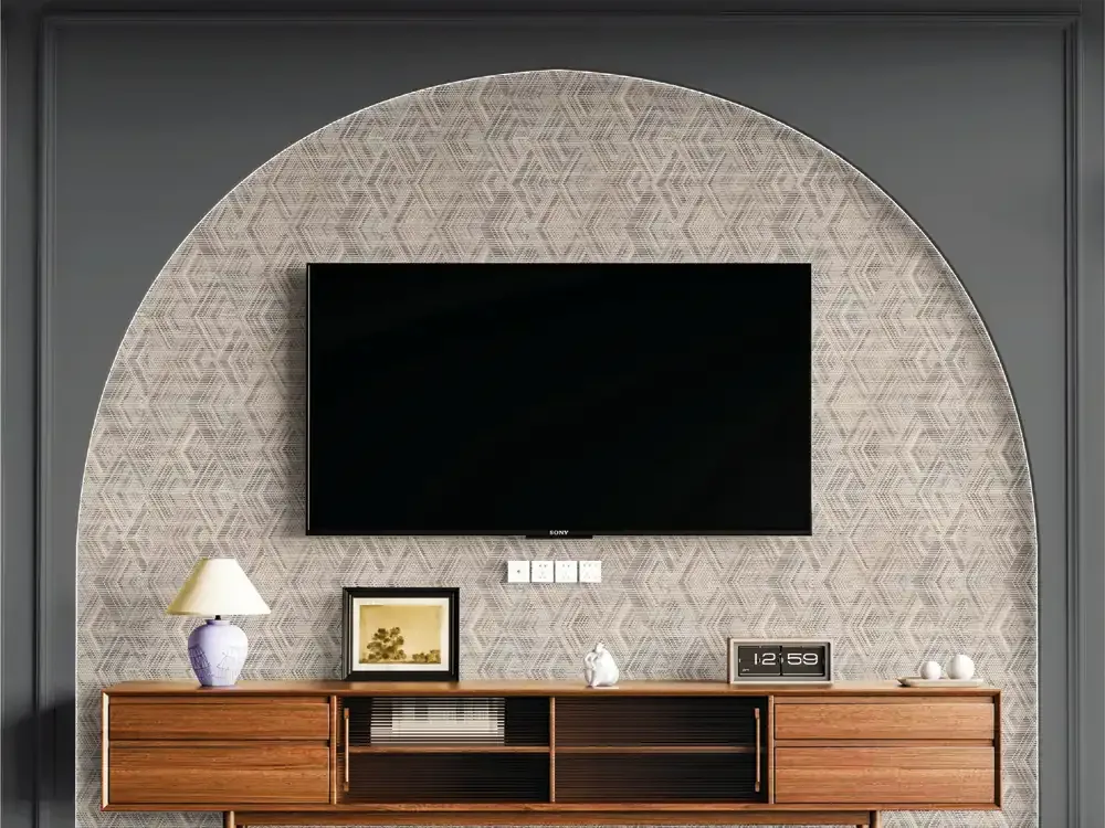
Decorative wall panels can introduce an interesting textile reference into living spaces where paint alone feels too flat. The Weave Collection includes designs shown in the PIM on TV walls, bedroom backdrops and full-height architectural surfaces. Fine pale patterns can create a quiet backdrop for a television or artwork, while bolder diamonds and three-dimensional woven effects may be better suited to a limited feature area where their geometry can be appreciated.
TV walls already contain screens, lighting and storage. Reserve bolder designs for a carefully sized feature zone; agree mounting, joints and corner details with the installer.
Bedrooms, Hospitality and Reception Design
Bedrooms often benefit from soft contrasts. Natural beige, straw and subdued grey patterns can add warmth behind a bed or on wardrobes without overwhelming the scheme. Blush pinstripes create a gentler linear expression, while a strong jewel-tone design may be reserved for a smaller piece of furniture or an accent area. Matching the surface to bed linen, curtains and flooring gives the room a more intentional material story.
Hospitality and reception joinery can echo the same material family without repeating one motif everywhere. Project-specific compliance and durability requirements still require verification.
Verified Sheet Format and Planning Around Dimensions
The existing Mark Decor PIM record identifies a 2 mm MCS mineral-composite base sheet and two catalogue-listed sheet formats: 2.0 ft × 9.5 ft and 4.0 ft × 9.5 ft. These are collection-level specifications. Confirm the availability of the particular chosen design and format before preparing a cutting schedule, rather than assuming all codes can be supplied in every format at every time.
Tall sheets can influence cutting layouts, but always verify code-specific supply, joints, transport and wastage. Listed sheet thickness does not establish a structural or adhesive specification.
Performance Features: Read the Claims in Their Proper Context
The existing PIM feature introduction lists several benefits, including anti-scratch performance, easy cleaning, anti-fingerprint performance, water resistance, impact resistance, colour stability, borer and termite resistance, and a fire-retardance claim. It also mentions 90° and 180° bendability. These are collection attributes recorded in the PIM and should be treated as manufacturer-stated features, not independent laboratory test results or universal guarantees for every application.
Request technical documentation before interpreting water resistance as waterproofing or fire retardance as a defined fire rating. Bendability also requires approved fabrication guidance.
Design Selection by Colour, Pattern Scale and Room Size
Start by asking whether the patterned surface will be a background or focal point. In a small or softly lit room, pale neutrals and micro-patterns may keep furniture visually lighter. In a larger room, darker checks and geometric effects can define an alcove, reception wall or furniture element. Warm cane-inspired tones tend to coordinate with timber and earthy upholstery; silver and cool greys can suit crisp contemporary combinations. The strongest effect usually comes from deliberate contrast, not from covering every surface.
Compare three shortlisted physical samples at the intended distance. Check undertones, perceived sheen, pattern scale and compatibility with any strong stone, flooring or upholstery motif.
Installation Planning and Long-Term Care
A successful finished surface depends on conditions that the SEO description cannot verify: substrate flatness, adhesive suitability, edge finishing, humidity, joint placement and the manufacturer's actual fitting recommendations. Before fabrication, review sample direction, cutting layout and the support system with the installer. For furniture, check junctions between shutters, drawers and side panels. For wall use, allow for service openings, corners and electrical fittings in the design stage.
Use the supplied surface's approved cleaning and installation instructions. Do not assume abrasive chemicals or high temperatures are safe because anti-scratch and easy-cleaning benefits are listed.
How the Weave Category Connects to Individual Designs
This category page is a starting point for collection selection, not a substitute for viewing real designs. The linked Weave product range explains the specific woven-laminate character and brings together individual product references from TWC-01 through TWC-16. For example, natural basket and cane-inspired looks occupy a different visual space from charcoal diamonds, ruby weaves, micro-grey patterns and dimensional cube motifs. Buyers can compare those separate visual families before asking for physical samples.
This category serves broad designer decorative laminate searches; the existing subcategory handles woven-laminate terminology and TWC-specific design selection. Visitors should move from overview to exact product codes.
Explore Mark Decor Decorative Surface Options with Confidence
The most effective decorative selection is one in which appearance, performance requirements and site constraints agree. Mark Decor's The Weave Collection offers an identifiable family of textured looks for furniture and interior accents, with options ranging from subtle textile grids to more assertive woven geometry. Decide first what role the finish should play, then narrow the palette and check individual products against the project brief.
Before purchase, confirm the code, physical sample, current supply, sheet size, installation guidance and technical documentation. Confirm an exact specification rather than relying on appearance.