
Dazzle Art
Collections

Dazzle Art Guide
Dazzle Art Metallic Decorative Surfaces by Mark Decor
A successful interior often needs one surface that gives the room an unmistakable identity. Mark Decor Dazzle Art brings that finishing accent through metallic colour, reflective detail and carefully varied patterns. Instead of treating every decorative element as another large wall treatment, the collection helps designers choose where shine, geometry or a subdued mineral effect will make the greatest difference. The result can be a welcoming reception backdrop, a jewellery display, a furniture highlight or a selective architectural feature.
Dazzle Art belongs to Mark Decor’s decorative interior range and is presented as a mineral-composite decorative sheet collection. Its twelve recorded designs span restrained charcoal and bronze through brighter silver, gold and warmer copper tones. The comparison begins with how these design directions can be coordinated with a real project. The individual Dazzle Art subcategory and product pages provide the closer wall-panel and SKU-level view.
Mineral Composite Sheet: Material and Sizes
Dazzle Art is identified in its collection specifications as a Mineral Composite Sheet developed with advanced mineral core technology. Its composition should not be confused with solid metal, mirrored glass, conventional solid acrylic or natural marble. A metallic-looking pattern describes the surface appearance, not the chemical composition of the sheet. Maintaining that distinction makes specifications clearer for architects, fabricators, dealers and customers.
Two panel formats are stated in the existing collection information: 2900 × 1220 × 1.5 mm and 2900 × 600 × 1.5 mm. Both have the same nominal length and thickness but different widths. The best choice depends on the intended layout, module size and desired visual continuity. Confirm the selected design’s available format, joining strategy, substrate compatibility and installation method with Mark Decor before ordering or specifying it for a project.
Metallic Colour Families: Gold, Silver, Copper and Charcoal
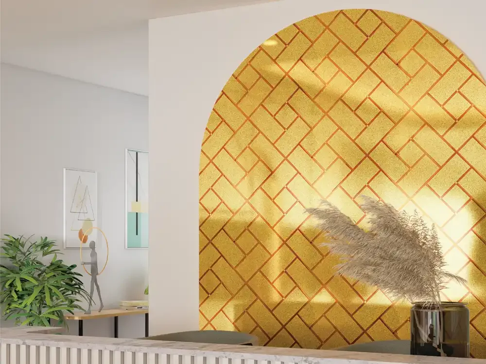
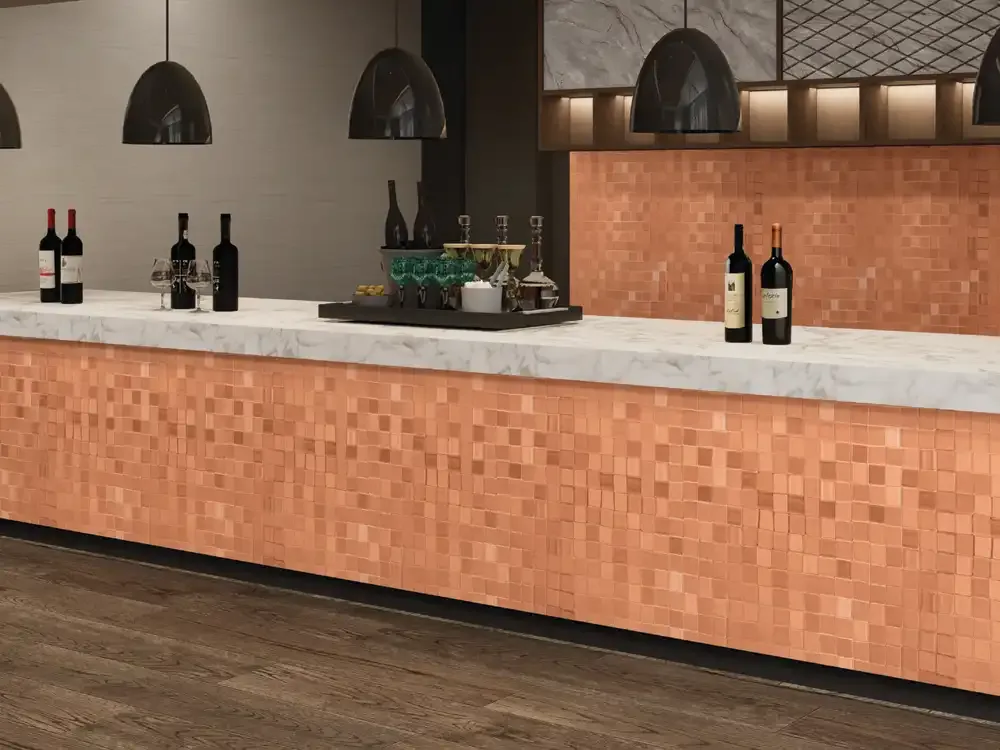
Gold is often selected for a warm, celebratory highlight, but its effect changes considerably with texture. A fine golden shimmer can read as one continuous field, while a gold mosaic has a more active arrangement of highlights. Bronze and copper bring warmer, earthier notes that pair comfortably with timber, dark stone and muted upholstery. Rose-copper sits between a soft blush accent and a metallic statement, helping designers avoid the harshness of a uniformly bright gold surface.
Silver and pale metallic designs introduce lightness, particularly beside white furniture, pale flooring or grey stone. Charcoal and deep bronze go in the opposite direction, supporting sophisticated contrast with controlled shine. There is no universally correct “premium” colour: a jewellery counter, quiet bedroom corner and corporate reception all respond to different palettes. Compare actual samples next to the principal materials before making the final selection.
Understanding Mosaic, Shimmer and Geometric Patterns
A mosaic pattern builds its character through many individual shapes. In Dazzle Art, that may be a regular square-grid effect or an arrangement in which bright blocks appear to cluster and scatter. A fine shimmer finish produces a more continuous surface, making it suitable when the surrounding space already contains elaborate furniture, signage or accessories. Neither effect is automatically more luxurious; they simply create different levels of visual activity.
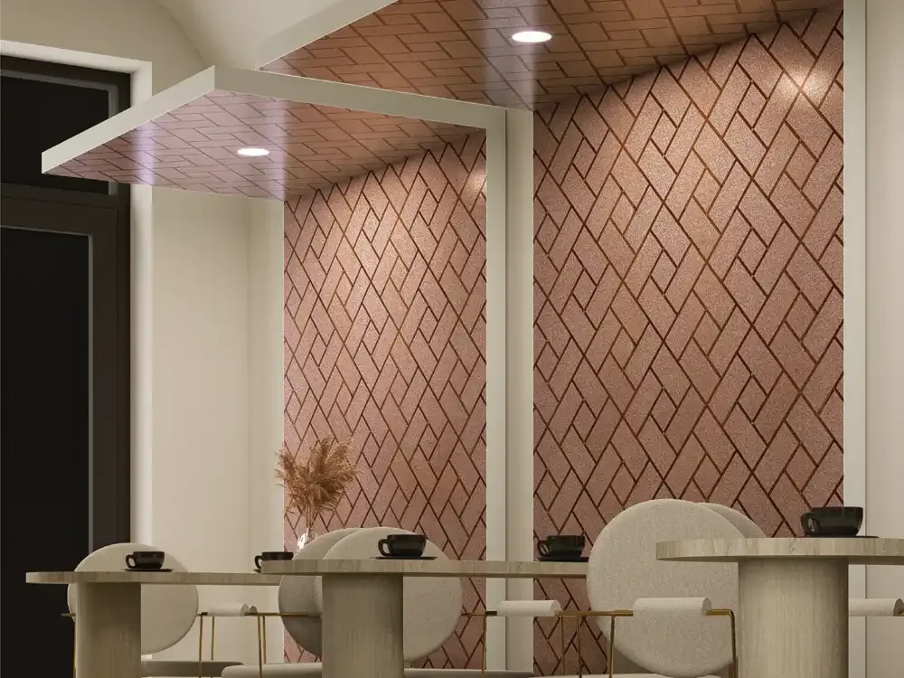
The geometric designs are especially useful when a project needs clear rhythm. Rectangular lines and interlocking forms can echo joinery divisions, shelving, ceiling details or floor joints. If the interior already has competing patterns, choose the quieter sheet and allow texture or lighting to provide the variation. If the surrounding finishes are plain, a stronger design can become the feature. This distinction helps avoid using ornate sheets indiscriminately across every available surface.
Residential Interiors: Focused Decorative Accents
In a home, a metallic decorative sheet is most effective when it belongs to a deliberate design composition. A small section behind a console, a niche near the dining area or a selected wardrobe accent can introduce a refined contrast without overpowering the room. Warm copper and bronze tones may complement wood furniture, while a pale silver design can provide a brighter highlight within a minimal setting. Scale the pattern to the distance from which it will usually be viewed.
For a bedroom, a narrow feature strip or an inset detail can be easier to live with than an extensive reflective surface. Near a television, choose a finish that does not create distracting glare at usual seating angles. For decorative furniture fronts, coordinate the chosen design with handles, profiles and nearby plain surfaces. These ideas describe possible decorative directions; final suitability depends on fabrication, site conditions and confirmed installation guidance.
Retail Displays, Showrooms and Reception Interiors
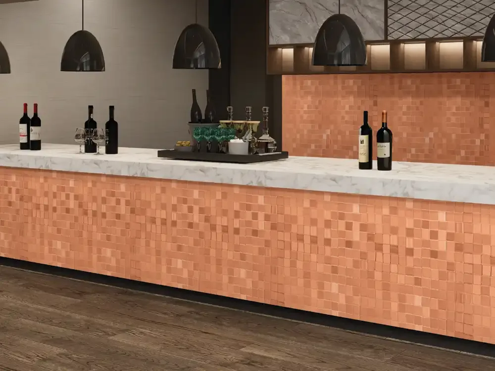
Commercial environments often require a memorable but controlled focal point. The Dazzle Art family offers ways to frame a reception desk, mark a featured display, distinguish a boutique zone or add texture to an interior sign backdrop. A bright golden surface may suit a display that celebrates ornament, whereas a charcoal mosaic may fit a sophisticated showroom or modern office concept. The correct choice begins with how the space should be experienced by visitors.
Do not overlook the relationship between decorative material and merchandise. Jewellery, beauty products, clothing and hospitality interiors have different lighting and display requirements. A patterned backdrop should support rather than compete with the objects placed in front of it. Use smaller material samples alongside signage, fixtures and furniture prototypes to judge the contrast. For public-facing interiors, review site-specific installation requirements and applicable safety standards before specification.
A Practical Method for Choosing Your Design
First identify the role of the surface: quiet background, warm accent, sharp geometric highlight or highly visible feature. Next identify the dominant materials and colours already chosen for the project. Then shortlist two or three Dazzle Art patterns with genuinely different visual behaviour rather than simply selecting three shades of the same type. Compare their appearance at the installation scale; a fine texture can look different when used across several joined sheets.
After the visual shortlist, check the exact product code, available dimensions, area coverage, panel joints and intended substrate. Confirm any installation questions before ordering. For a large commercial scheme, a mock-up can help resolve contrast, lighting and adjacency before work begins. This practical sequence makes the buying decision more dependable and also makes it easier for designers to explain their material choices to clients.
Examples from the Dazzle Art Product Range
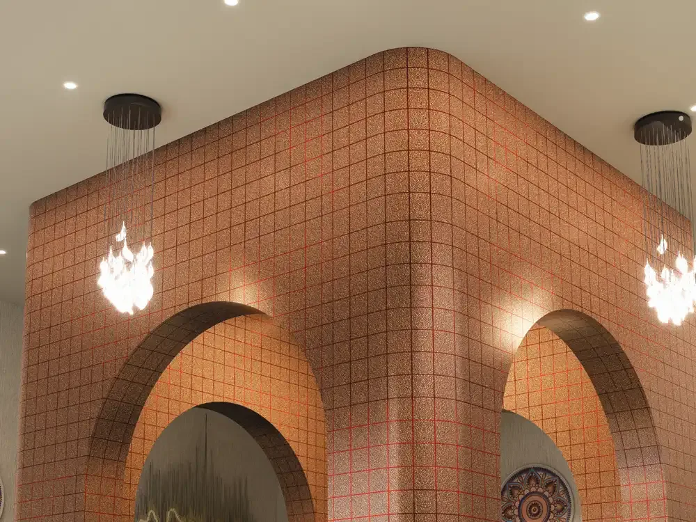
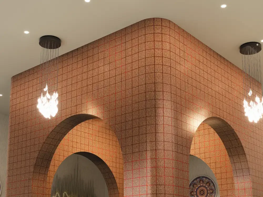
The twelve design codes illustrate the breadth of the collection. DZ-56107 uses a warm bronze and copper grid, while DZ-56108 offers a dark charcoal square-pattern direction. DZ-56140 has a lighter silver-white mosaic effect, and DZ-56142 presents a brighter champagne-gold square composition. These options are not interchangeable: a cooler minimal project and a warm boutique interior may call for completely different surface treatments.
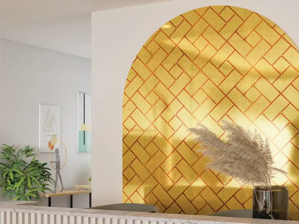
The other product families create additional choices. DZ-56145 is described with a quieter bronze shimmer, DZ-56146 with a more luminous gold finish, and DZ-56149 with interlocking rectangular geometry. The remaining codes extend the rose-copper, silver-grey and decorative-line directions. For final selection, inspect the individual product photographs and product-specific descriptions rather than relying on these broad category examples alone.
Performance Information and Responsible Specification
Dazzle Art lists Mirror Shine, Fire Resistant, Borer Free, Termite Resistant, 100% Water Proof, Easy to Clean and Long Durability among its catalogue features. The published collection details do not identify fire-test methods, numerical ratings, certification numbers or the full conditions behind these claims. We should not present them as a certified fire classification or proof that every installation detail is waterproof.
Water exposure, cleaning chemicals, mechanical stress, joints and adhesive systems can each affect a finished assembly. For kitchens, bathrooms, public spaces or any regulated project, request the appropriate technical confirmation and installation instructions. Similarly, “easy to clean” does not mean that abrasive pads or aggressive solvents are suitable. Treat the specification and actual service conditions together so that a visually attractive selection also has an appropriate practical basis.
Installation Planning and Surface Care
The collection’s thin sheet formats make layout planning especially important. Establish a clean and suitable supporting surface, confirm how panels will be cut and joined, and follow the manufacturer’s installation recommendations for the actual use case. Do not assume that an adhesive recommended for another Mark Decor collection is automatically appropriate for this material. The installer should also account for edges, movement, corners and transitions to other finishes.
For maintenance, begin with the specific care advice supplied for the selected product. Routine gentle cleaning is preferable to experimental polishing, scraping or strong chemical treatments, particularly on decorative metallic finishes. Where a surface will be frequently touched, discuss practical cleaning access during design rather than after installation. Good planning protects the appearance of the accent while reducing future maintenance difficulties.