A design guide to marble finish laminate sheets, showing where stone-look patterns work on TV units, wardrobes, sideboards, offices and accent furniture without overusing the effect.
Marble has a familiar visual language: flowing veins, tonal variation and a sense of mineral depth. Marble finish laminate sheets borrow that language for furniture and decorative surfaces without being real marble. The design opportunity is not to make every cabinet pretend to be stone. It is to use the pattern where a mineral reference adds value.
Browse Mark Decor’s Acrylic category and a suitable Luster Marble collection while applying the material moods below.
Material mood: quiet white marble around a TV composition
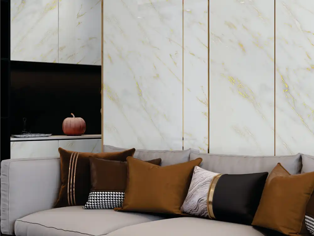
A light marble-look laminate can make a TV unit feel cleaner and more architectural when the veining is controlled. Use it on a backing element, side storage or selected cabinet faces, then let wood or a plain neutral calm the screen zone.
Avoid chopping a large vein pattern into many tiny pieces. A broader uninterrupted plane gives the motif enough room to read.
Material mood: dark marble on a sideboard
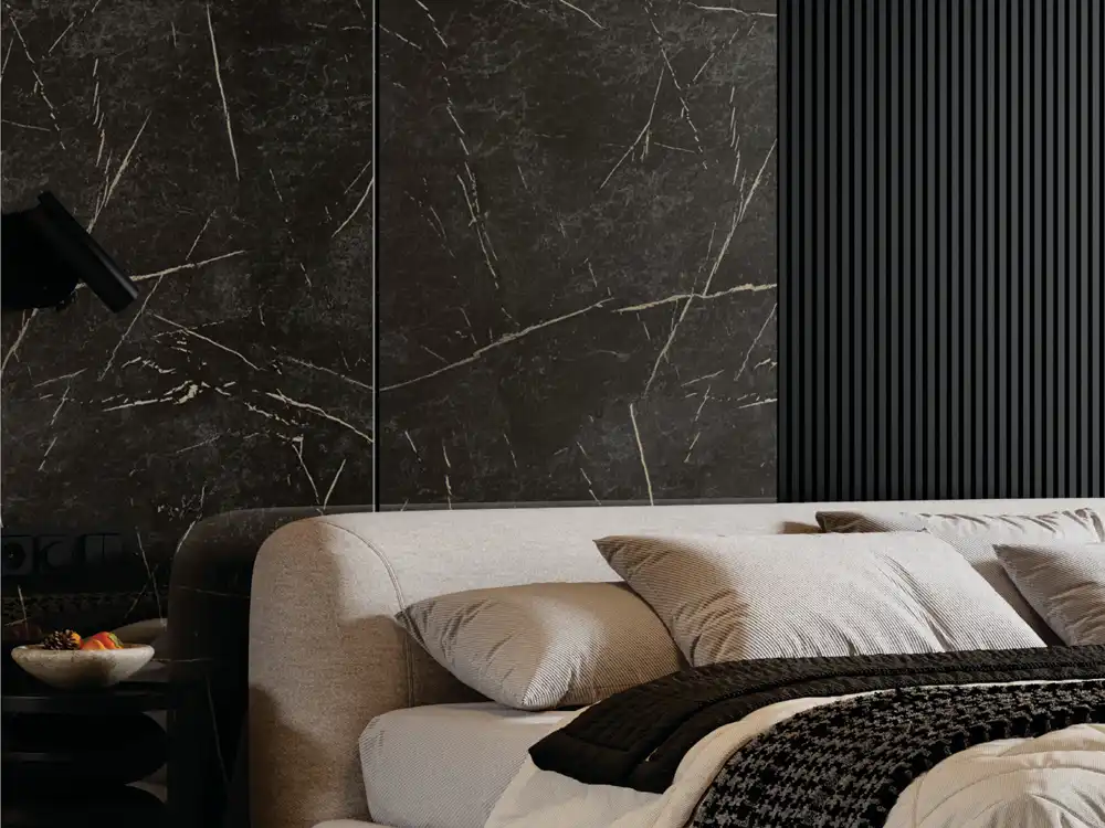
Deep charcoal, black or brown marble-inspired finishes can make a sideboard feel sculptural. Because the pattern is already dramatic, keep handles and surrounding accessories simple.
Dark stone looks are especially effective where they can be seen from a few metres away and receive soft side lighting rather than harsh glare.
Material mood: marble-look drawer fronts with plain carcass
One controlled use is to apply the stone pattern on selected shutters or drawers while the main furniture body remains wood-inspired or solid. The eye reads the marble look as an accent rather than as an attempt to turn the entire object into stone.
Choose the supporting finish from the base colour or vein tone so the transition feels intentional.
Material mood: hospitality-style bedside furniture
Warm beige and ivory marble looks can add a hotel-like character to bedside tables or headboard-integrated cabinets. Pair them with upholstered fabric and warm wood to prevent the room from feeling too hard.
Check pattern scale on small fronts. A giant vein crossing one narrow drawer can look accidental.
Material mood: a mineral reference without visual mass
Real stone is associated with thickness and weight. A laminate carrying a stone motif can introduce similar visual character on lighter-looking furniture forms.
This is useful in apartments where the designer wants a mineral cue but does not want every surface to read as heavy cladding.
Material mood: reception desk focal face
A marble-look desk front can give an office, clinic or salon a polished arrival point. Keep the wall behind the desk calmer if the pattern is strong.
If a logo sits on the same elevation, verify that the vein does not cross letters in a way that reduces legibility.
Material mood: wardrobe accent rather than full wardrobe
Full-height marble pattern across every shutter can dominate a bedroom. Use it on a centre bay, dressing niche, drawer block or selected doors while the remaining shutters stay quieter.
This lets the mineral motif add luxury without competing with bed textiles and curtains.
Material mood: kitchen furniture with only one stone language
If the countertop already has strong marble or granite veining, another unrelated marble pattern on cabinet shutters can create conflict. Either coordinate closely or let one surface become the dominant stone expression.
Suitability for the exact kitchen application depends on the chosen laminate and fabrication, so confirm current product guidance separately from visual selection.
Pattern rule: scale is more important than the word marble
Some designs use soft clouding; others have large sweeping veins. The correct scale depends on the size of the furniture face and the viewing distance.
A small sample can hide how far apart the veins are. Review a larger image or sample before committing to a full wardrobe or long console.
Pattern rule: plan vein direction deliberately
Directional designs change when rotated. Decide whether a long console should carry the visual movement horizontally or whether wardrobe shutters should emphasise vertical height.
For adjacent fronts, tell the fabricator whether pattern continuity matters or whether each panel can read independently.
Pattern rule: avoid several unrelated marble motifs in one room
A marble-look laminate, heavily veined countertop and patterned floor can create three competing mineral stories. Choose one hero pattern and reduce movement elsewhere.
A quieter laminate or wall surface can make the chosen marble look more convincing.
Pairing rule: add one warm counter-material
Wood-inspired laminate, warm paint or textured fabric balances the cool visual association of marble. This combination is especially useful in living rooms and bedrooms.
For broader furniture planning, the Mark Decor furniture-laminate guide offers application ideas beyond stone-look surfaces.
Pairing rule: keep metal accents slim
Brass, bronze, black or brushed-metal details can sharpen a marble-inspired composition. The effect becomes decorative quickly, so use metal in handles, legs or narrow frames rather than large competing surfaces.
The stone pattern should remain the visual feature.
Viewing rule: stand back before approving
A vein that looks subtle from 30 centimetres may become a strong graphic line from across the room. Evaluate the sample from the real sofa, entrance or corridor position.
This is particularly important when the marble look sits beside a screen, logo or artwork.
Construction rule: treat the material as laminate, not stone
A marble finish describes appearance. It does not mean the sheet has the heat, water, scratch or structural properties of real marble.
Use current product information and suitable furniture construction for the application instead of transferring assumptions from natural stone.
Palette rule: limit the composition to three strong materials
Try one marble-look laminate, one wood or warm neutral, and one quiet solid. Assign them roles: pattern, warmth and background.
The Luster Marble collection should work inside that palette, not simply be the most dramatic sample in isolation.
Sample exercise: compare the marble pattern in three crops
Photograph or view the design as a small crop, a full shutter and a wider furniture elevation. A marble motif that looks elegant in a 100 mm sample can become much more graphic when repeated across several cabinet fronts. This three-crop exercise helps designers judge both vein spacing and how often similar marks may appear across the finished furniture.
FAQs
Are marble finish laminate sheets real marble?
No. They are decorative laminate surfaces with marble-inspired visuals, so their performance should be evaluated as laminate.
Where can marble-look laminate be used?
Depending on the exact product and construction, it can be considered for furniture such as TV units, wardrobes, sideboards, desks and reception furniture.
Should marble-look laminate match the countertop?
It does not need to match exactly, but vein colour, undertone and pattern scale should be compatible when the surfaces are seen together.
Is bold marble pattern suitable for small furniture?
It can be, but check the scale. A very large vein may not read well across a small drawer or narrow panel.
The best stone look is used as a design accent, not a disguise
Marble finish laminate sheets work best when the pattern is used honestly as a decorative surface. Control scale, direction and surrounding materials, and the mineral character can feel refined without trying to turn every cabinet into real stone. Explore Mark Decor’s Acrylic range and the relevant Luster Marble collection, then contact Mark Decor for current samples.
Related reading: Laminate Sheets for Furniture: Where They Work Best in Modern Interiors Laminate Sheets for TV Units: Modern Finish Ideas for Living Rooms Matte Laminate Sheets: Where Soft, Low-Sheen Finishes Work Best