A palette guide to stone finish laminate sheets, comparing concrete, slate and mineral looks for wardrobes, TV units, offices, retail furniture and mixed-material interiors.
Stone-inspired furniture finishes have expanded beyond obvious marble veins. Concrete greys, slate charcoals, sandy minerals and subtle cloudy textures can give cabinets an architectural character without using actual stone on every surface. Stone finish laminate sheets are useful when furniture needs visual weight but the composition should remain flexible.
The first decision is not the exact sample. It is which stone mood the room needs. Use Mark Decor’s Acrylic category and a relevant Marble collection while comparing the palettes below.
Palette family: soft concrete
Mid-grey concrete-inspired laminate works as a calm neutral on TV units, office storage and kitchen-adjacent furniture. Pair it with warm wood, black metal and textiles so the room does not become visually cold.
The best concrete looks often feel understated rather than heavily mottled.
Palette family: pale cement
Light cement tones add more movement than plain grey while remaining suitable for broad wardrobes or cabinets. They can keep a compact space visually lighter than dark slate.
Check whether the grey leans warm or cool beside beige flooring and off-white walls.
Palette family: charcoal slate
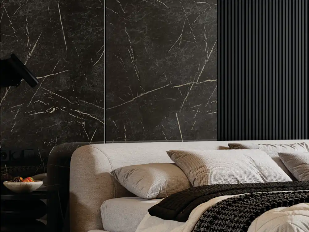
Slate-inspired finishes create a stronger graphic base. Use them on a console, selected shutters or side tower when the furniture needs contrast.
Full-height dark slate can feel heavy in a small room, so balance it with lighter surrounding surfaces and adequate light.
Palette family: warm mineral sand
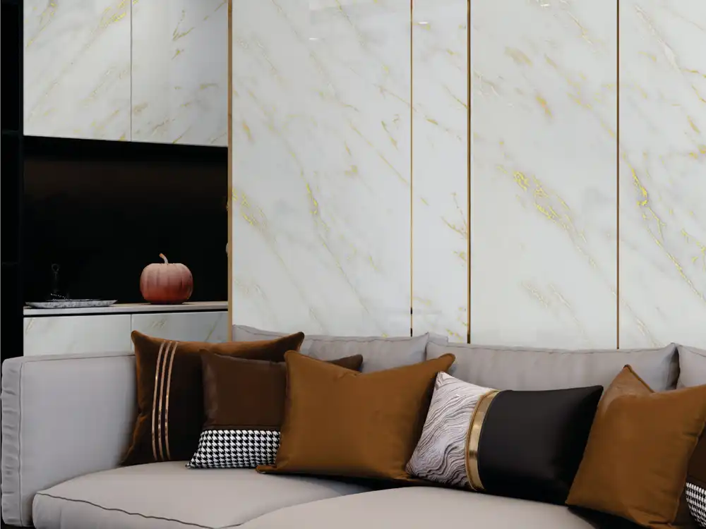
Beige, taupe and sandstone-like looks bridge wood and neutral paint. They suit bedrooms, dining furniture and reception desks where marble feels too formal and concrete feels too cool.
Warm mineral tones can also connect well with brass or bronze accents in small proportions.
Palette family: terrazzo-inspired speckle
Speckled mineral patterns can add personality to café counters, desks or compact cabinets. Because the pattern already carries several colours, surrounding finishes should be quieter.
Use a larger sample to understand speckle density before applying it across a broad surface.
Palette family: cloudy mineral texture
Some stone looks rely on soft tonal movement rather than a clear vein or speckle. These are among the easiest to use on large shutters because the surface has depth without obvious repetition.
They also work well as camera backgrounds in home offices because the pattern remains subdued.
Pairing strategy: stone plus wood
This is one of the most dependable combinations. Stone-look laminate brings mass and neutrality; wood brings warmth and direction.
Decide which material is dominant. A TV unit might use concrete-look tall storage with a wood console, or reverse the relationship.
Pairing strategy: stone plus matte solid
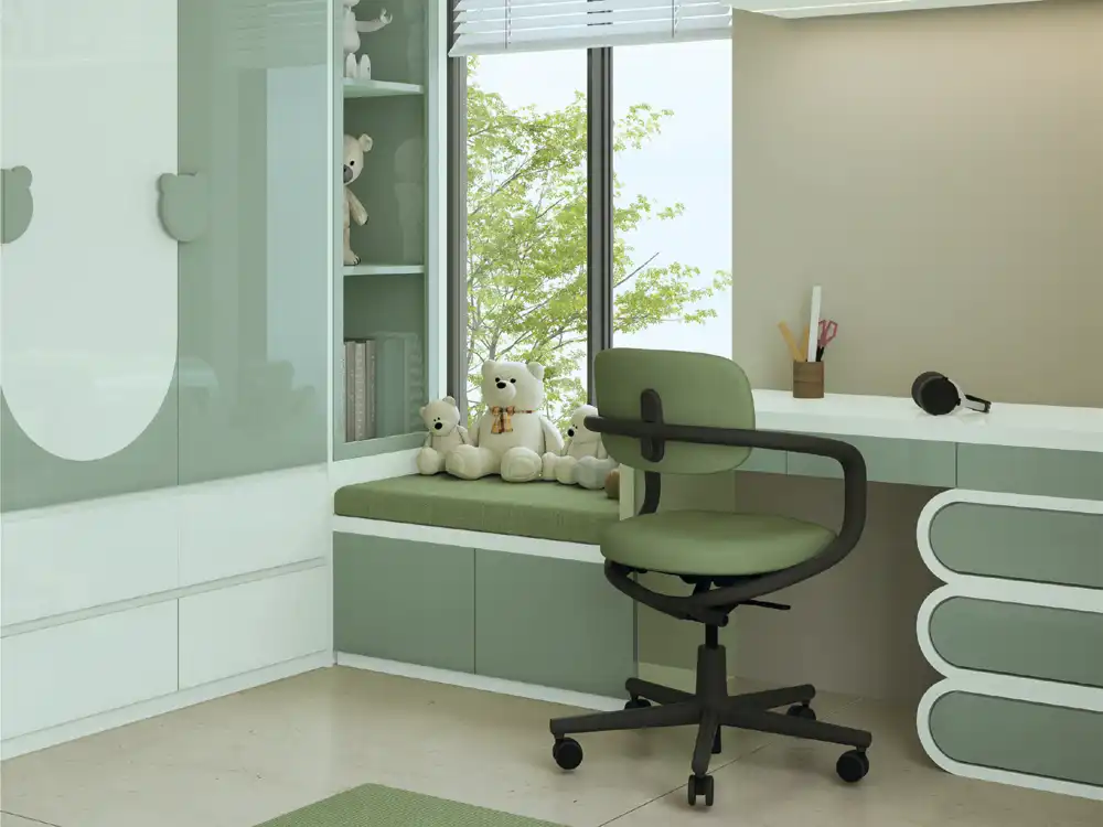
A muted solid such as off-white, greige or olive-grey can let the mineral texture become the feature without adding another pattern.
The matte laminate guide is useful when building a low-sheen supporting palette.
Pairing strategy: stone plus restrained metal
Black, bronze or brushed-metal accents can sharpen the architectural character, particularly in offices and retail furniture. Keep metal to frames, handles or slim details.
Large amounts of metal plus dark slate can push the room toward a harder commercial aesthetic.
Application lens: TV unit
Use stone look to frame the screen rather than compete with it. A calm concrete or mineral background can work directly around the TV, while a bold pattern may be better on side cabinets.
Test reflections and pattern movement from the sofa position.
Application lens: wardrobe
Large shutters reveal pattern repetition. Fine mineral texture usually scales more calmly than a bold repeated stone motif.
Review more than a small sample before covering an entire bedroom elevation.
Application lens: office storage
Concrete and slate tones coordinate with glass partitions, black frames and neutral carpet. Medium-value mineral surfaces can look professional without becoming stark.
Use brighter or warmer accents in furniture or soft finishes if the office palette becomes too grey.
Application lens: retail furniture
Stone-look counters can provide a neutral architectural base behind colourful products. The furniture should support merchandise rather than compete with it.
Controlled lighting can reveal texture without creating excessive glare.
Detail lens: edge colour
Stone-inspired faces can lose sophistication when the edge has an unrelated colour. Review the edge treatment together with the face sample on shelves, desks and exposed side panels.
Often the cleanest edge matches the base tone rather than every small colour in the pattern.
Reality check: a stone look is still laminate
The visual design does not transfer the technical properties of concrete, slate or natural stone. Confirm the exact laminate’s suitability and care for the intended furniture construction.
Do not infer heat, water, scratch or structural performance from appearance.
Four-sample palette test
Place the stone-look laminate beside flooring, wall colour, one wood or solid furniture finish and a metal or fabric accent. If all four demand attention, simplify.
The Marble collection should fit the overall material story rather than win only as an isolated sample.
Palette family: oxidised or weathered mineral looks
Some stone-inspired designs sit between concrete and metal, using smoky, rust-influenced or weathered tones. These can work well in cafés, retail counters and contemporary offices, but they carry more personality than a neutral concrete. Use them in smaller areas and repeat one undertone elsewhere so the effect feels intentional.
Application lens: study desks and workstations
A fine mineral texture can create a sophisticated desk backdrop or storage face, while a highly active stone pattern may distract across the work surface. Consider using the stronger design on drawers or vertical storage and a quieter finish where laptops, notebooks and task lighting occupy the visual field.
Pattern lens: understand repeat before covering a long run
Long cabinet elevations can reveal repeated motifs. Review a larger reference and discuss the cutting plan where continuity matters. The goal is not to imitate random natural stone perfectly, but to avoid accidental repetition that becomes more noticeable than the furniture form.
Lighting lens: mineral texture changes under warm and cool light
Concrete and slate tones can shift noticeably under different colour temperatures. Warm lighting may soften grey surfaces, while cooler light can make them feel more industrial. Review the sample under the room’s actual evening light as well as daylight before committing to a large furniture elevation.
FAQs
Are stone finish laminate sheets made of stone?
No. They are decorative laminate surfaces with stone-inspired visuals, so technical performance should be evaluated as laminate.
Which stone look is easiest to use at home?
Subtle concrete, warm mineral and soft slate tones are versatile, but the best choice depends on light, flooring and other furniture finishes.
Can stone-look laminate be combined with wood?
Yes. The combination balances architectural mineral character with warmth and works across many furniture types.
Where should bold stone patterns be used?
They often work best as controlled accents or on surfaces large enough for the pattern to read clearly without excessive repetition.
Stone look works when furniture needs architectural weight without another heavy material
Stone finish laminate sheets can bring concrete, slate or mineral character to furniture while keeping the room palette flexible. Choose the stone family first, then control scale, edge colour and surrounding materials. Explore Mark Decor’s Acrylic range and the relevant Marble collection, then contact Mark Decor for current samples.
Related reading: Laminate Sheets for Furniture: Where They Work Best in Modern Interiors Matte Laminate Sheets: Where Soft, Low-Sheen Finishes Work Best High Gloss Laminate Sheets: Where Shine Works Best—and Where It Doesn’t