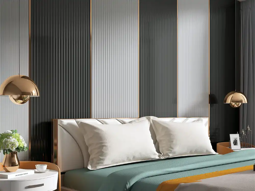

Plan louver design for reception areas around the visitor journey, brand wall, desk, waiting zone, lighting and circulation in offices and showrooms.
A reception area has only a few seconds to communicate what kind of place a visitor has entered. In an office it may need to feel organised and credible. In a showroom it may need to feel expressive and product-led. In a clinic it should feel calm and easy to understand. That is why louver design for reception area should begin with the visitor journey rather than with a decorative pattern.
Louvers can bring vertical rhythm, warmth and a defined focal point without requiring the entire reception to become visually heavy. The most effective layouts usually support the desk, logo, lighting and circulation instead of competing with them. You can review Mark Decor’s current Louvers category and a relevant Infinite subcategory while planning the overall wall language.
Design the reception as five visitor moments
Instead of treating the room as one feature wall, break the experience into five moments: approach, recognition, arrival, waiting and exit. The louver treatment can support one or two of these moments strongly while the remaining surfaces stay quieter.
Moment 1: the approach
Before a visitor reaches the desk, the reception should provide a visual anchor. A vertical louver zone behind or beside the desk can be visible from the entrance and create direction. If the entrance is narrow, avoid extending a dark or highly textured louver treatment across every wall; a focused panel can make the space feel more intentional.
Moment 2: brand recognition
The logo wall often becomes the natural place for decorative louvers. The key is to give the brand mark enough visual breathing room. If the louver profile is strongly ribbed, consider a calmer logo mounting panel or a plain band within the composition. The logo should remain readable from the entrance, not disappear into the vertical pattern.
Moment 3: arrival at the desk
At close distance, visitors notice detail and lighting more than they do from the doorway. Check how the louver finish looks at eye level and under reception lighting. Avoid placing very bright point lights where they create distracting highlights or harsh shadows across the surface.
Moment 4: the waiting zone
The waiting area does not need to repeat the logo wall exactly. It can borrow one element—finish, vertical rhythm or colour family—and use it in a lighter way. This creates continuity without making the room look like every surface received the same treatment.
Moment 5: the exit view
Visitors often see a different wall when leaving. If that wall is completely unfinished visually, the reception can feel front-loaded. A small louver detail, directional sign or coordinated finish can complete the experience without creating another full feature wall.
Reception type 1: corporate office
Corporate receptions benefit from restraint. Use louvers to create order around the logo, reception desk or a framed architectural zone. Neutral wood-inspired or understated finishes can work well when coordinated with flooring, desk material and signage. The exact finish should be selected from current samples and checked in the project lighting.
For long walls, consider dividing the composition into a louver zone and a plain zone. This gives the logo a clear location and leaves space for directories, artwork or digital displays.
Reception type 2: retail showroom
A showroom can take more visual energy because the space is designed to attract attention. Louvers can be used as a backdrop for the brand mark, product display, launch graphic or consultation desk. The important point is hierarchy: the wall should frame the product story, not compete with every display in the room.
If the showroom already has many colours and materials, use a simpler louver finish. If the merchandise is visually quiet, the reception wall can carry more texture.
Reception type 3: creative studio
Creative businesses can use asymmetry more freely. Instead of covering a full rectangle, run louvers through one side of the wall, stop them short of the ceiling, or combine them with a contrasting plain surface. A bench, artwork or suspended light can overlap the composition visually.
Use the Infinite page to compare current profiles before deciding how dense or directional the wall should feel.
Work from the desk outward
The desk is the functional centre of reception. Set its width, position and visitor approach first. Then decide how much of the rear wall needs texture. A common mistake is to design a full louver wall first and later place a desk that feels too small or misaligned against it.
Aligning the louver field with the desk or logo does not always mean making them the same width. The panel can extend beyond the desk to create balance, but the relationship should look intentional.
Use vertical lines to manage awkward proportions
Vertical louvers can visually emphasise height, which is useful in low or wide receptions. In very tall lobbies, however, uninterrupted vertical lines may exaggerate the height further. Break the surface with a logo panel, horizontal shelf, lighting band or change in material so the wall remains human in scale.
Plan lighting for texture, not glare
Louvers create shadow. That is part of their appeal. Use lighting to reveal depth rather than flatten the surface. Grazing or directional lighting may accent the profile, while diffuse light can create a softer appearance. The right solution depends on the actual louver geometry and room lighting plan.
Always review a physical sample under the intended warm or neutral light temperature if possible. A finish chosen under daylight can feel different in a reception that operates mostly under artificial lighting.
Three layout formulas that are easy to adapt
- Centered brand wall: desk in front, logo centred, louvers spanning a controlled zone behind both.
- Offset composition: louvers occupy one side while the logo or signage sits on a calm contrasting panel.
- Wraparound corner: a limited louver field turns onto an adjacent wall to connect reception and waiting zones.
Choose a formula based on circulation and wall dimensions, not only on reference images.
What to coordinate before installation
- Final reception desk location and height.
- Logo size, fixing points and electrical requirements.
- Switches, sockets, screens, access panels and door frames.
- Wall condition and substrate preparation.
- Lighting positions and beam direction.
- Exact louver code, finish and orientation.
- Termination details at corners, ceiling and skirting.
Avoid these first-impression mistakes
Too many feature materials: stone, louvers, mirror, metal, signage and strong colour can all be attractive separately but overwhelming together.
Logo lost in texture: a detailed background can reduce contrast and readability.
Ignoring camera views: receptions often appear in customer photos, recruitment content and social media. Check the wall from common visitor and camera angles.
No allowance for updates: businesses may change signage, digital screens or brand graphics. Avoid making every element impossible to modify without disturbing the decorative surface.
FAQs
Are louvers suitable behind a reception desk?
Yes. A controlled louver zone can create a strong backdrop, especially when the logo, desk width and lighting are planned with it rather than added later.
Should the full reception wall be covered with louvers?
Not necessarily. Partial coverage often creates stronger hierarchy and leaves visual breathing room for signage, art or digital displays.
What colour louvers work in office reception areas?
Choose a finish that coordinates with flooring, desk material, doors and brand colours. Current physical samples should be reviewed in the actual lighting before approval.
Can louvers be used in small reception areas?
Yes. In compact spaces, use a narrower feature zone and a controlled finish so the texture adds depth without making the room feel crowded.
Make the wall support the welcome
The best louver design for reception area does not ask visitors to admire the wall before understanding where to go. It creates a clear first impression, frames the brand and supports an easy arrival experience. Start with circulation and desk position, then use louvers as a controlled architectural layer.
Explore the Mark Decor Louvers range and relevant Infinite options, then review current catalogues or contact the team with your reception-wall dimensions and project requirements.