Ten entrance-wall panel concepts alternating between residential foyers and commercial reception zones, with guidance on mirrors, logos, storage, lighting and arrival sightlines.
An entrance wall is seen before the rest of the interior has a chance to explain itself. In a home, it welcomes visitors while hiding everyday clutter. In an office, hotel or clinic, it can identify the brand and guide people toward reception. That is why feature wall panels for entrance areas should be designed around arrival rather than selected as decoration in isolation.
The ten scenes below alternate between residential foyers and commercial reception zones. Explore Mark Decor’s Fresco Panels category and a suitable Fresco Panels collection while choosing the right surface character.
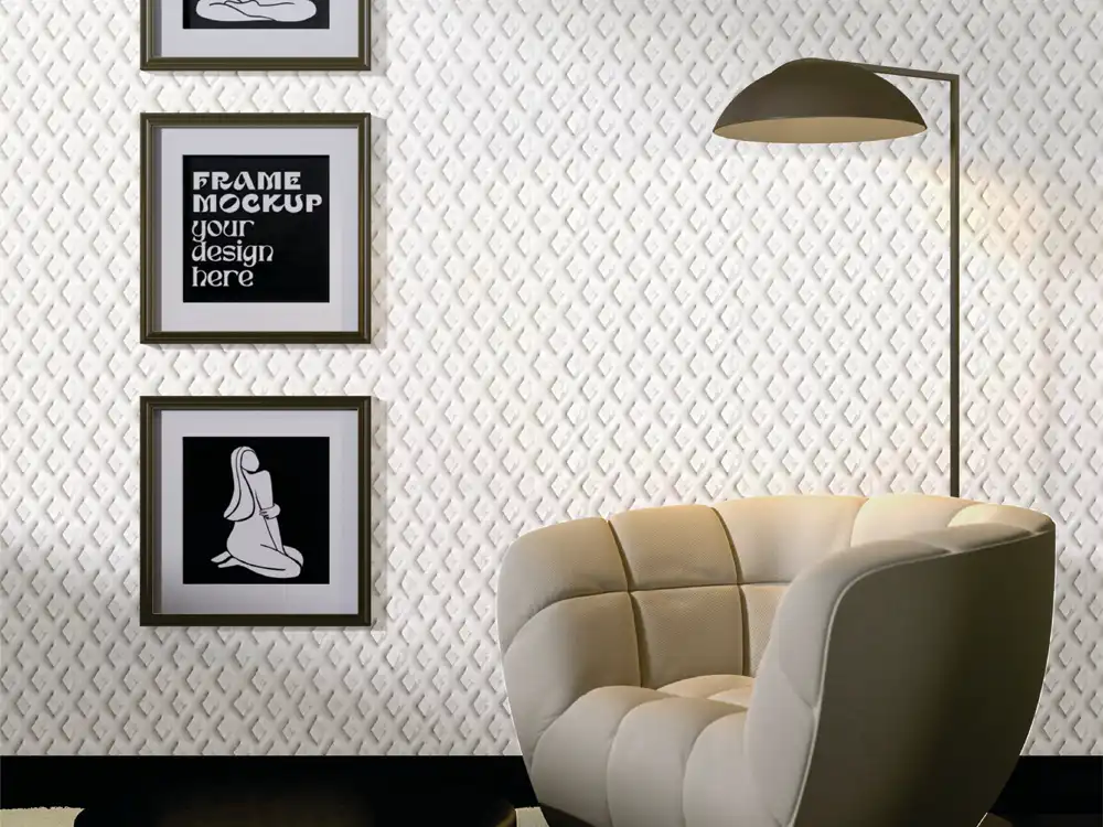
Entrance scene one — home: panel behind a floating console
A slim console gives keys and small items a place to land. A panel field behind it adds depth without occupying floor area.
Keep the console slightly narrower than the feature so the surface remains visible, and choose either one mirror or one artwork rather than filling every gap.
Entrance scene two — reception: logo on a calm textured background
Use a controlled panel surface behind the company name or emblem. Texture should support the logo, not make lettering harder to read.
Plan wiring and structural fixing through appropriate backing before the decorative finish is installed.
Entrance scene three — home: mirror inserted into a framed panel zone
A mirror can increase the sense of width and help with last-minute checking before leaving home. Frame it with panels or place it inside a broader textured bay.
Check the reflection. A mirror that mainly shows shoe clutter or a utility door weakens an otherwise polished entrance.
Entrance scene four — reception: use a side wall to guide movement
The strongest feature does not always belong behind the desk. A panelled side wall can create a visual line from the entrance toward reception.
This is useful when the front wall already contains glazing, doors or digital displays.
Entrance scene five — home: integrate shoe storage below the feature
Closed storage at the base keeps the entry practical. Let the panel start above it or continue behind it according to the design.
Check door swing, handle projection and walking clearance before fixing the feature width.
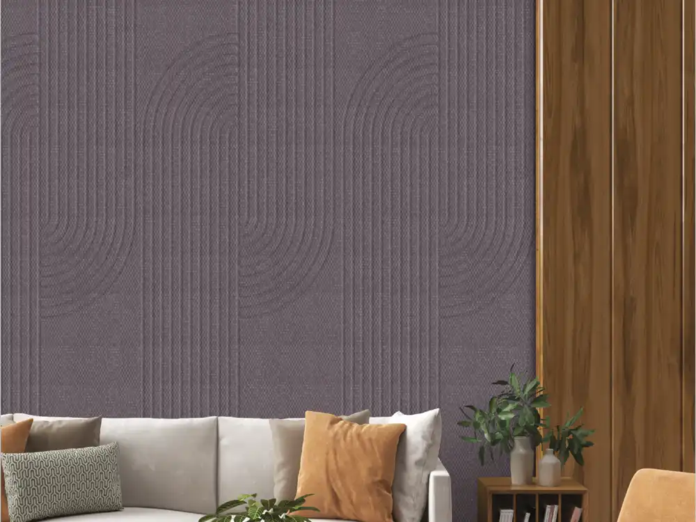
Entrance scene six — reception: panel the waiting backdrop
If visitors spend time seated, the waiting wall deserves more than leftover decoration. A warm panel behind lounge seating can make the reception feel complete even when the desk wall is simple.
Choose pattern scale from seated distance because people may view the wall closely for several minutes.
Entrance scene seven — home: narrow vertical feature beside the door
Where wall width is limited, a narrow panel band can mark the arrival without covering the whole foyer. Align it with a console edge, ceiling light or architectural line.
The remaining painted wall becomes intentional negative space.
Entrance scene eight — reception: separate the digital screen from the texture
A reception may need a visitor-information or branding screen. Keep the display on a smooth zone and place decorative panels beside it.
This creates a clearer hierarchy and makes cable and service access easier than cutting the screen randomly into a strong repeated pattern.
Entrance scene nine — home: connect the foyer to dining
In many apartments, the entrance opens directly into dining. Choose a panel tone that relates to the dining sideboard or chairs without copying them exactly.
A shared undertone can connect the zones while still allowing the foyer to keep its own identity.
Entrance scene ten — reception: combine panel with one supporting premium material
For hotels, clinics or executive offices, pair the panel with one calm supporting material such as stone-look surface, mirror or slim metal detail.
Keep the supporting material secondary. Luxury comes from hierarchy rather than the number of finishes.
Storyboard note: let the arrival axis choose the feature
Stand at the doorway and photograph what a visitor sees first. The correct wall may be opposite the entry, beside it or farther inside behind reception.
Do not centre a feature on a wall if the real arrival path is clearly off-axis.
Storyboard note: use lighting to reveal rather than overwhelm
A downlight, wall washer or restrained concealed edge can bring texture to life. Compact entrances rarely need several lighting effects at once.
Check glare in mirrors, polished floors and reception signage.
Storyboard note: edge quality matters more at entrances
Visitors stand close to door frames, corners, skirting and consoles. Poor transitions are easy to see in these high-contact areas.
Plan the panel termination carefully where it meets the main door, glass partition or another finish.
Storyboard note: practical information still needs a home
Homes need switches, keys and shoes. Receptions need signs, screens, security devices and access controls. Decorative panels should organise these functions rather than conceal them awkwardly.
Accessibility and maintenance remain more important than uninterrupted pattern.
Storyboard note: design intensity should match dwell time
A home foyer may be experienced for seconds, allowing a stronger gesture. A clinic waiting entrance is viewed for longer and may benefit from calmer texture.
Think about how long people actually look at the wall, not only the first impression.
Storyboard note: make the entrance photograph well but live even better
Reception and foyer walls often appear in social media and visitor photos. Check the background through a phone camera, but also walk through the space naturally.
A photogenic feature that causes glare, poor storage or awkward circulation is not a successful entrance design.
Five questions to answer before choosing the final layout
What is the first sightline? What practical items must live here? Which element is the hero—logo, mirror, artwork or panel? Where do services need access? Which material is visible in the next room?
Once those questions are clear, panel coverage and colour become easier to decide.
Storyboard note: coordinate flooring transition with the feature wall
Entrances often sit where exterior, foyer and main-room flooring meet. The panel colour should be checked against that transition so the arrival zone does not feel visually disconnected.
Storyboard note: keep the first two metres visually disciplined
The zone immediately inside an entrance receives the closest inspection. Keep panel joints, skirting, switches and console edges especially clean here.
FAQs
Which wall should be the entrance feature wall?
Choose the wall that controls the arrival sightline and supports practical functions such as a console, reception desk, logo or waiting zone.
Can wall panels be used in small foyers?
Yes. Partial, framed or narrow applications can add depth without overwhelming a compact entrance.
Can a logo or mirror be mounted over panels?
Yes when appropriate backing and fixing are planned. Heavy objects should not rely only on the decorative surface.
How many materials should an entrance feature use?
One dominant panel plus one supporting material is often easier to control than several equally strong finishes.
A successful entrance tells visitors where to look and where to move
The best feature wall panels for entrance areas create identity without blocking function. Whether the setting is a home foyer or commercial reception, use panels to organise the arrival view, then let storage, signage and lighting support that hierarchy. Explore Mark Decor’s Fresco Panels range and a relevant Fresco Panels collection, then contact Mark Decor with the entrance wall dimensions.
Related reading: Wall Panels for Foyer: Modern Entrance-Wall Ideas for Indian Homes Wall Panels for Reception Areas: Design Ideas for Offices, Hotels & Clinics Louver Design for Home Entrance: Foyer Walls, Consoles & Lighting