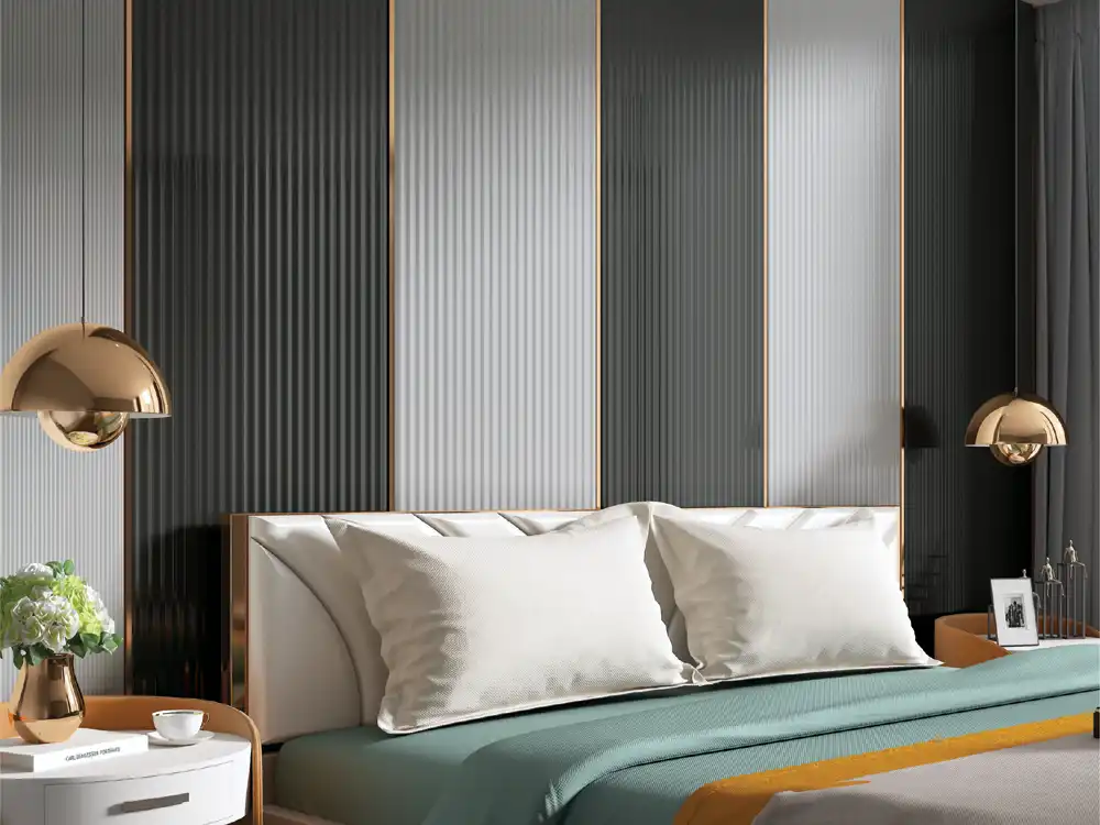

A visual-design playbook for horizontal louver walls, explaining perceived width, joint planning, furniture alignment, lighting, corners and where horizontal rhythm works best.
Most louver inspiration is vertical, so a horizontal louver wall design immediately changes the visual rules. Horizontal lines lead the eye sideways. They can make a wall feel longer, connect furniture across a broad composition and create a calm, layered backdrop. They can also make a low room feel flatter if used without care.
The question is not whether horizontal louvers are modern. The useful question is what the horizontal direction does to the room. Consider the Mark Decor Louvers category and a suitable Volume - 6 collection while testing these visual effects.
Effect 1: a narrow wall can feel wider
Repeated horizontal lines extend the eye from side to side. On a compact TV wall or console wall, this can make the composition feel broader than a vertical pattern would.
The effect is strongest when the louver field continues across a meaningful width without too many vertical interruptions. If the wall is broken into many narrow columns, the horizontal reading weakens.
Effect 2: a low ceiling can feel lower
The same sideways emphasis that widens a wall can reduce the sense of height. In a room with a very low ceiling, full-height horizontal texture should be tested carefully.
One solution is to use a partial-height horizontal band and keep the upper wall plain. Another is to choose a lighter finish and stronger vertical elements elsewhere, such as curtains or tall doors, to rebalance the room.
Effect 3: long furniture can look more integrated
Horizontal louvers pair naturally with low TV consoles, sideboards and long reception desks. Their direction reinforces the furniture rather than cutting across it.
Align one louver joint or band with a significant furniture edge. When the wall and furniture share a horizontal datum, the composition feels intentionally built rather than separately decorated.
Effect 4: the eye notices level errors quickly
Horizontal lines act like a visual spirit level. Even a slight slope or inconsistent spacing can be obvious across a long run. Accurate setting-out is therefore essential.
Establish a reliable reference line before installation and check it against the finished floor, ceiling and furniture. If the ceiling itself is uneven, do not automatically use it as the setting-out reference.
Effect 5: seams become part of the rhythm
Depending on product length and wall size, horizontal runs may need joints. Decide where those joints occur. Random staggered seams can look busy, while aligned joints can create a visible grid.
Sometimes a planned vertical divider, mirror, screen or plain panel can break the wall into modules and hide the need for awkward mid-run joints.
Effect 6: corners can pull the eye around the room
Wrapping a horizontal rhythm around an inside corner can visually connect two walls. This can work well in lounges, reception areas or retail spaces where the design should lead people through the room.
But the corner detail must be resolved carefully. Confirm how the selected product terminates or transitions before assuming it can wrap seamlessly.
Effect 7: shelves can either reinforce or destroy the idea
Floating shelves placed parallel to the louver direction can strengthen the horizontal composition. Too many shelves, however, create a stack of competing lines.
Use fewer, stronger elements. One long shelf aligned with the wall rhythm may look more intentional than several short shelves at unrelated heights.
Effect 8: the television becomes part of a wide frame
On a media wall, horizontal louvers can visually connect the screen to the console and side storage. Leave enough quiet space around the television so the repeated lines do not distract during viewing.
A smooth backing panel behind the screen can interrupt the louver field and create a calm visual zone without abandoning the horizontal concept.
Effect 9: grain direction can amplify the line
If the finish itself contains a directional wood grain, the relationship between grain and profile direction matters. Horizontal grain on horizontal profiles creates a strong lateral effect. A different grain direction may produce a more complex reading.
Review a larger sample from the Volume - 6 collection rather than relying on a small chip.
Effect 10: grazing light creates a different shadow pattern
With horizontal grooves, light from above or below can create pronounced stripes of shadow. Side light behaves differently than it does on vertical profiles.
Test the wall with the intended downlights, cove or wall washer. Avoid creating bright-dark bands that compete with eye-level tasks or television viewing.
Effect 11: wall art needs a cleaner zone
A wide horizontal rhythm can make small pictures appear to float on a moving background. If artwork is important, create a plain inset, use one larger piece or stop the louver field before the art zone.
The wall should have one clear visual hierarchy.
Effect 12: partial-height applications can feel architectural
Horizontal louvers do not have to run floor to ceiling. A band behind a headboard, console or bench can act almost like an architectural dado. The plain wall above gives the room height while the lower texture adds width.
This strategy is useful when full-height coverage feels too heavy.
Where horizontal louvers are especially effective
Consider them for wide TV walls, long corridors that need a focal end, retail cash-counter backdrops, reception desks, restaurant banquettes and selected headboard compositions. They are less automatic in very low rooms or narrow walls where the line has insufficient length to read.
What to draw before ordering
Sketch the exact wall rectangle, furniture outline, door positions and major services. Draw the louver courses as lines. Mark where they start, end and joint. This simple drawing reveals whether the concept has enough continuous width.
Vertical versus horizontal is not a trend choice
Vertical profiles emphasise height and produce a different rhythm. Horizontal profiles emphasise width and alignment. Choose based on the room’s proportions and focal composition, not because one orientation is currently more common on social media.
Effect 13: doors and openings become vertical punctuation
A doorway cuts across the horizontal rhythm and therefore becomes visually prominent. Use that interruption deliberately. Stop the louver field cleanly at the frame, create a plain border, or restart on the other side only if the alignment is controlled. Random continuation around openings can make the wall look fragmented.
FAQs
Do horizontal louvers make a room look wider?
They can emphasise width because the eye follows repeated horizontal lines. The effect depends on wall length, colour, furniture and interruptions.
Are horizontal louvers suitable for low ceilings?
They can be, but full-height dark horizontal texture may emphasise the room’s low proportion. Partial-height or lighter applications may be more balanced.
Can horizontal louvers be used behind a TV?
Yes. Plan a calm viewing zone, cable access and screen support, and check whether the line pattern creates distraction or glare.
What is the biggest installation risk with horizontal louvers?
Poor level alignment is highly visible. Accurate setting-out and planned joints are essential.
Use horizontal rhythm when the room benefits from width
A successful horizontal louver wall design is more than a vertical pattern turned sideways. It changes how the eye reads width, height, furniture and light. Use that effect intentionally, draw the joints before installation and let the architecture decide the direction.
Browse Mark Decor’s Louvers range and a suitable Volume - 6 collection. For a horizontal-wall concept, send Mark Decor your wall dimensions and application.