Use this practical framework to choose Thermolam colours, textures and combinations for kitchens, wardrobes, TV units and commercial furniture.
A surface colour never appears alone. It is influenced by daylight, artificial lighting, flooring, wall paint, hardware, room size and the direction in which it is applied. This is especially true when the surface wraps around an edge, because light reaches the face and side at different angles. Choosing Thermolam colours and finishes therefore requires more than selecting an attractive swatch from a catalogue.
The most successful interiors begin with a clear role for the material. Thermolam may become the quiet background of an entire kitchen, a warm wood element in a bedroom, a deep-colour feature island or a rounded reception counter. Once that role is defined, colour and texture decisions become easier.
Begin with the interior concept
Write three words that describe the desired room: for example, warm, calm and natural; sharp, urban and minimal; or colourful, youthful and playful. Use those words to reject options that do not support the concept. A highly reflective dark surface may be impressive in isolation but unsuitable for a soft, light bedroom. A pale neutral may be elegant but too restrained for a retail brand that needs energy.
Collect samples of the fixed materials first: flooring, countertop, wall tile and major furniture. Thermolam should connect these elements rather than add an unrelated colour.
Understand undertones
Neutrals are not truly neutral. White may have a blue, grey, cream or pink undertone. Grey may lean green, blue or brown. Beige may feel yellow in cool light. Place candidate samples directly beside the wall paint and countertop. A mismatch that is invisible in the showroom can become obvious across a large bank of cabinets.
Warm undertones generally coordinate with timber, brass and earthy stone. Cool undertones coordinate with stainless steel, black, blue-grey and crisp white. Mixed undertones can work, but they should be intentional and balanced.
Light colours
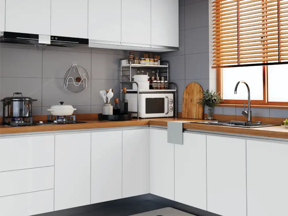
Light Thermolam colours can make compact rooms feel open and reduce the visual weight of large storage. Warm white, ivory, sand and pale greige are versatile choices for kitchens and wardrobes. Because the décor can continue around the edge, the unit may appear even more continuous.
Do not assume light colours are maintenance-free. Dust may be less visible, but food stains, pencil marks or dirty handprints can stand out. Test the exact finish with normal cleaning methods before final approval.
Mid-tone and earthy colours
Clay, taupe, olive, muted blue and warm grey provide more character than white while remaining easy to combine. These tones work well in Indian homes because they can coordinate with wood, stone, textiles and warm lighting. They also support biophilic and nature-inspired interiors without requiring literal woodgrain everywhere.
Use one earthy colour as the main surface and repeat it in smaller décor elements such as cushions, artwork or backsplash accents. Avoid matching everything exactly; controlled variation creates depth.
Dark colours
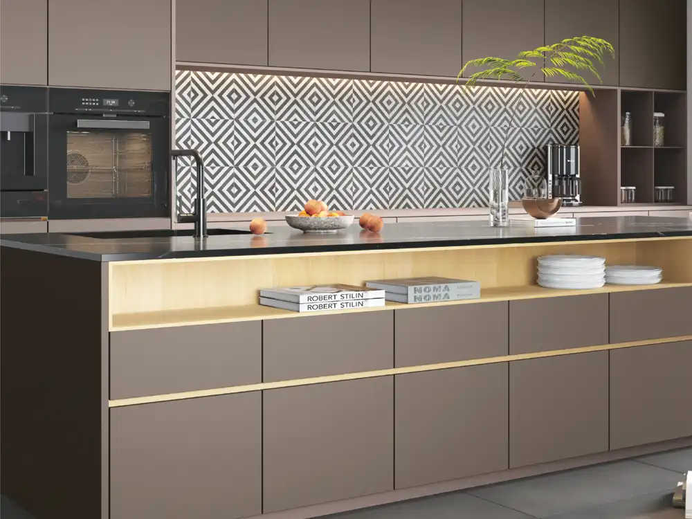
Charcoal, black, deep green, navy and burgundy can give Thermolam furniture a dramatic monolithic appearance. They are effective on islands, TV units, bar cabinets and selected wardrobe sections. The wrapped edge helps maintain the solid-block effect.
Dark surfaces absorb light and can make a small room feel heavier. Balance them with lighter walls, countertops or open space. They may show dust, fingerprints and fine surface marks more clearly, depending on finish. A hands-on sample test is essential.
Wood designs
Woodgrain brings warmth and familiarity. Fine straight grains suit contemporary wardrobes and kitchens, while expressive grains can create a feature panel. The direction of the grain should follow the furniture geometry. Vertical grain emphasises height on tall shutters; horizontal grain stretches drawers and low consoles.
When the sheet bends around an edge, observe how the grain travels. A realistic continuous movement can make the component appear solid. An awkward cut or sudden pattern change can draw attention to the construction. Approve a wrapped sample, not only a flat piece.
Texture and sheen
Matt finishes absorb light and support calm, sophisticated interiors. They can make strong colours easier to live with. Fine textures hide minor handling better than extremely smooth surfaces, but deep textures may collect dust in demanding locations.
Satin or soft-sheen surfaces create gentle highlights across a bend. They can reveal the curve beautifully without the strong reflections of gloss. Gloss finishes, where available, require very flat substrates and careful cleaning because reflections expose waviness.
Touch matters. A finish used on wardrobe handles or drawer fronts will be experienced by hand every day. Compare smooth, tactile and structured options through a physical sample.
Room-by-room recommendations
Modular kitchen: Choose a finish that tolerates frequent wiping and works with the countertop. Light neutrals suit compact kitchens; deeper colours can feature on an island. Wood designs add warmth to an otherwise plain scheme.
Wardrobe: Consider the wall area and bedroom lighting. Calm mid-tones, warm whites and vertical woods are reliable. A dark central section can create depth.
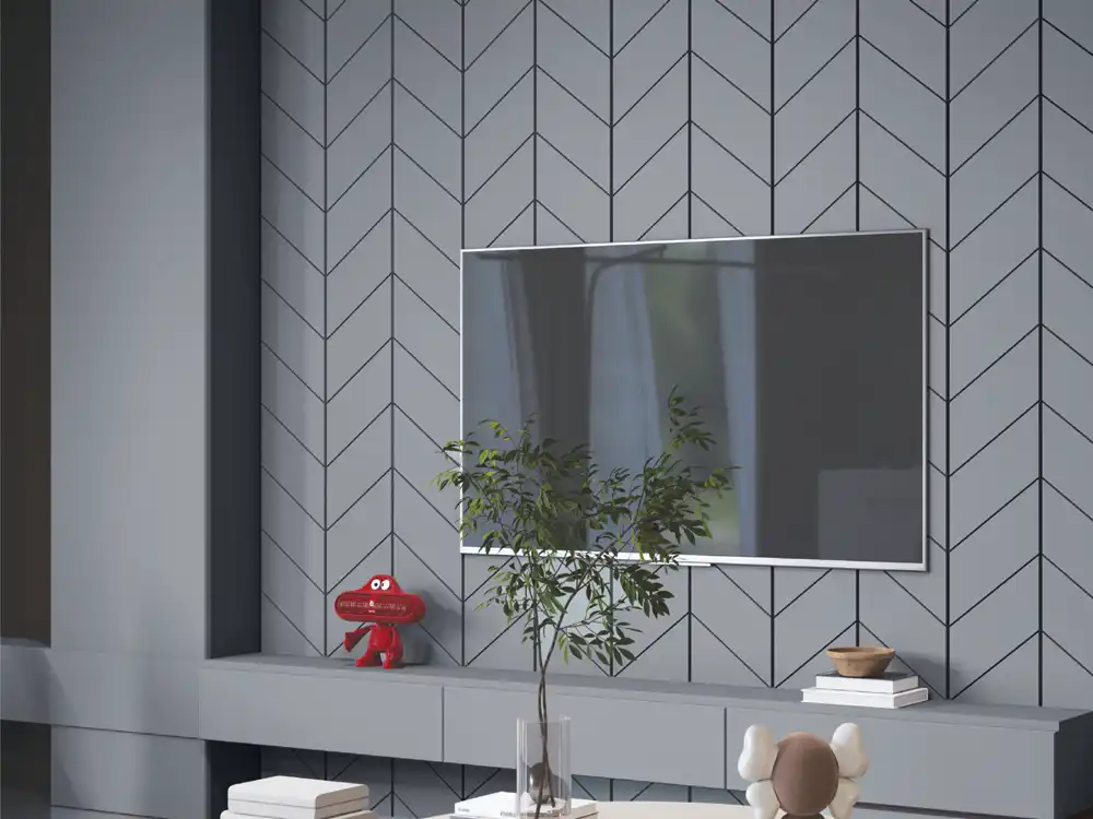
TV unit: Control reflection around the screen. Matt or textured Thermolam may be easier than a highly reflective finish. Use a wrapped console edge as a subtle design feature.
Study and home office: Mid-tone neutrals and woods reduce visual distraction. Avoid very light desk surfaces if strong screen glare is a concern.
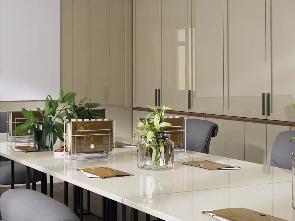
Retail and reception: Brand colours can be used more boldly. Confirm availability for repeat installations and keep reference samples for future branches.
Combining Thermolam with other Mark Decor surfaces
Thermolam can be paired with louvers for vertical rhythm, acrylic for a glossy focal plane, mirror art for reflection, cane-inspired surfaces for warmth or decorative panels for a feature wall. The strongest schemes use contrast in a controlled way.
A useful rule is to combine no more than one dominant surface, one supporting surface and one accent in a single furniture composition. For example: warm-grey Thermolam as the dominant shutter, wood louver as the supporting panel and black metal as the accent.
Sample evaluation process
- Shortlist no more than five options from the catalogue.
- Obtain physical samples from the current production range.
- View them vertically and horizontally, not only flat on a table.
- Check morning daylight, afternoon daylight and night lighting.
- Place them beside flooring, countertop, paint and hardware.
- Make a wrapped corner sample using the actual substrate.
- Test routine cleaning on the sample.
- Approve the design code and retain a labelled reference.
Common colour-selection mistakes
Using only online images: screens alter colour and cannot communicate texture.
Selecting under one light source: a neutral can shift dramatically between daylight and warm LEDs.
Ignoring scale: a strong décor may be attractive on a 100 mm sample but overwhelming on a full wall.
Too many woods: multiple unrelated grains make the room visually noisy.
Forgetting the edge: the colour on the side receives different light and may appear darker. Evaluate the actual bend.
Following trend without context: choose a palette that works with the home and can be maintained over time.
Availability and future matching
For large or phased projects, confirm stock and production continuity. Natural changes in batches or finish perception can occur, so purchase coordinated quantities where possible. Record the product name, design code, batch details and supplier. Keep an offcut for future reference.
Do not describe a colour only as “beige” or “wood.” Similar names can refer to very different designs. The exact code should appear on drawings, purchase orders and workshop labels.
Conclusion
The right Thermolam colour is the one that supports the room’s concept, responds well to its lighting and works across both the face and wrapped edge. Solids emphasise geometry, woods add warmth and textures shape the way light and touch are experienced. A disciplined sample process prevents expensive surprises.
Review the latest AASA Thermolam collection, then compare your shortlist with flooring, paint and hardware. Visit Mark Decor Catalogues or contact the team for samples and project guidance.