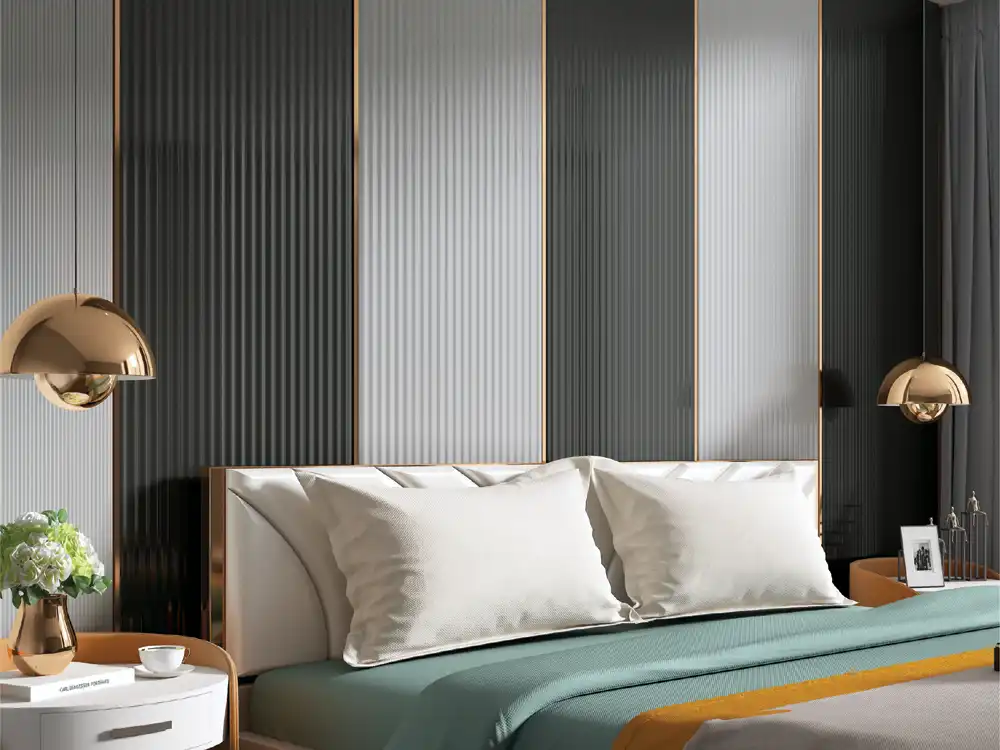

A corridor design guide showing how louver width, colour, placement, lighting and termination can add texture without visually narrowing circulation spaces.
Corridors are easy to over-design because they offer long uninterrupted walls. Yet they are also among the most sensitive spaces: people move through them quickly, widths are limited, doors interrupt the rhythm and poor lighting can exaggerate every surface. Good louver design for corridor spaces adds texture without turning circulation into a visual tunnel.
The key is selective use. Review the Mark Decor Louvers category and a suitable Infinite collection while applying the optical rules below.
Rule 1: Do not panel both long walls by default
When both sides of a narrow corridor receive strong vertical texture, the visual field becomes dense. In many situations, one feature wall or a series of controlled bays is enough. Keep the opposite wall lighter and simpler.
Before: dark louvers from floor to ceiling on both sides. After: one louver wall at selected locations with a plain painted wall opposite. The corridor retains character while gaining visual breathing room.
Rule 2: Use end walls as destinations
A louver feature at the end of a corridor draws the eye forward and can make circulation feel purposeful. This is particularly useful where the end wall carries artwork, signage, a console or a doorway.
Because the viewer approaches the wall frontally, the texture can be stronger here than on a long side wall. Add controlled lighting to reinforce the destination.
Rule 3: Break long runs into bays
Very long continuous texture can amplify the tunnel effect. Divide the wall into louver bays separated by painted sections, doors, artwork or lighting intervals. The corridor then reads as a sequence rather than one endless surface.
Align the bay rhythm with architectural elements such as door groups or ceiling modules where possible.
Rule 4: Keep dark finishes in proportion
Dark louvers can look sophisticated, but they carry visual weight. In a narrow or poorly lit corridor, use them on a shorter end wall, lower percentage of the surface or a framed bay. Pair with lighter ceiling and floor finishes.
A medium wood or warm neutral can often provide enough contrast without compressing the space.
Rule 5: Let vertical lines increase perceived height
Vertical louvers naturally pull the eye upward. Use this effect where the corridor ceiling is low. Full-height profiles on a selected wall can make the proportion feel taller, especially when the top termination is clean.
Avoid cluttering the same wall with many horizontal shelves or signs that fight the vertical movement.
Rule 6: Protect the walking width
Decorative treatment should not interfere with clear circulation. Consider the actual projection of the louver system, skirting, door handles and furniture. A corridor that is visually beautiful but physically tighter is not successful.
Measure the finished width, not only the structural width, before finalising the system.
Rule 7: Plan around doors
Corridors contain repeated door frames, which already create vertical rhythm. Louvers can either reinforce this rhythm or compete with it. Start the pattern from a logical door edge, centre line or wall boundary.
Avoid very narrow leftover strips between the last profile and a frame. Draw the elevation with actual dimensions before installation.
Rule 8: Keep service devices readable
Fire-safety equipment, electrical panels, room numbers, switches and access points should remain visible and accessible. Do not hide important devices simply to keep a continuous decorative wall.
Where a service panel falls inside the feature zone, coordinate a deliberate access detail instead of cutting around it at the last minute.
Rule 9: Use light to reveal, not exaggerate
Louvers create shadow naturally. Strong grazing light on a narrow corridor can create high-contrast stripes that make the walls feel busier. Softer wall washing or a moderate spotlight at selected bays can be more comfortable.
Before: continuous bright linear light along every groove. After: focused light at an end wall and subtle general illumination along the route.
Rule 10: Use mirrors carefully
A mirror can visually expand a corridor, but combining a mirror, strong louver field and multiple lights in a tight space can create too much reflection. Let one element dominate.
A useful composition is a narrow louver band beside a large simple mirror rather than texture surrounding the mirror on all sides.
Rule 11: Coordinate with floor direction
Long floor planks or tiles already guide the eye along the corridor. Vertical louvers on the wall can balance that horizontal movement. If the floor pattern is very busy, keep the wall louver finish calm.
Compare samples with flooring before approval because undertones become more obvious across a long passage.
Rule 12: Give corners a deliberate ending
Corridors contain many turns. Decide whether the louver treatment stops before the corner, wraps a short return or continues into the next zone. An accidental half-profile at a corner makes the installation look unfinished.
The Mark Decor Infinite collection can be reviewed with edge and return details in mind, not only front-facing colour.
Use louver rhythm as a wayfinding cue
In larger buildings, the same louver finish can appear at important decision points rather than continuously. A repeated bay near lift lobbies, meeting-room clusters or apartment entries becomes a visual marker. Keep the size and lighting of these markers consistent so people recognise them subconsciously as part of the route.
This approach adds identity without narrowing the whole corridor and is especially useful when conventional signage must remain simple.
Keep the repeated marker simple enough that it still works when doors, signs and ceiling conditions vary slightly from one corridor segment to another.
Three corridor scenarios
Compact apartment passage: use one short louver bay at the end, with lighter side walls. Hotel guest corridor: repeat controlled louver bays at lift lobbies or corridor nodes rather than every metre. Office corridor: use louvers near meeting-room entrances, brand graphics or collaboration pockets while keeping main circulation calm.
Measure viewing distance before choosing profile intensity
In a corridor, people often see a wall from only one to two metres away. Deep grooves and very strong patterns can therefore feel more intense than they do in a showroom. Hold the sample vertically at the expected distance and walk past it.
The moving view matters as much as the static elevation.
FAQs
Can louvers make a corridor look narrower?
They can if very dark, deep or continuous texture is used on both sides of a tight corridor. Selective placement, lighter finishes and controlled lighting reduce that risk.
Where is the best place for louvers in a narrow corridor?
An end wall, a short framed bay or one selected long wall usually works better than full treatment on both sides.
Should corridor louvers run full height?
Full-height vertical profiles can increase perceived height, but the decision should account for doors, skirting, services and the overall wall proportion.
What lighting works with corridor louvers?
Moderate wall washing, focused lights at feature bays or soft general lighting usually provides enough depth. Test the shadow effect before finalising.
Corridor texture works best in controlled doses
The most successful louver design for corridor does not treat every available wall as a feature. Use louvers to mark destinations, create rhythm and add height while preserving clear width and visual calm. In circulation spaces, restraint makes the texture more noticeable, not less.
Explore the Mark Decor Louvers range and the relevant Infinite collection, then contact Mark Decor with your corridor width, wall lengths and preferred finish direction.