
Four office-reception design routes using louvers for corporate, warm, creative and premium brand personalities, with guidance on logos, lighting, desks and visitor sightlines.
A reception wall is often the first physical expression of a company’s brand. Good louver design for office reception should therefore do more than decorate the wall behind a desk. It should support the logo, organise the visitor’s sightline, complement the company’s personality and still look professional after daily use.
Rather than presenting one “best” reception design, this guide offers four design routes. Choose the route that matches the organisation, then adapt it using the Mark Decor Louvers category and a relevant Infinite collection.
Route 1: The precise corporate reception
This route suits offices that want clarity, order and restraint. Use a consistent vertical louver rhythm across a defined central bay behind the reception desk. Keep surrounding walls plain and allow the logo to sit on a calmer backing area or on top of a carefully planned louver field.
Choose a controlled finish such as a balanced wood tone, neutral or sophisticated dark shade that complements the company palette without copying every brand colour literally. Straight desk geometry, clean signage and aligned ceiling lights reinforce the sense of precision.
Best layout move
Centre the main louver bay on the visitor’s arrival axis rather than automatically centring it on the entire wall. The reception desk, door position and waiting chairs may shift the real visual centre.
Route 2: The warm professional reception
Consultancies, healthcare-adjacent offices, design practices and client-service businesses may want a reception that feels professional but less formal. A warm wood-inspired louver finish can create texture behind a neutral desk, with soft wall lighting and a small amount of greenery.
Instead of covering the full wall, frame the louver section between painted surfaces. This gives the texture room to breathe. Add a mirror, artwork or slim shelf only if it supports the brand story; too many decorative layers can make a small reception look residential rather than professional.
Best layout move
Use a louver width that relates to the desk and logo scale. A very fine pattern can become visually busy on a broad wall, while an oversized rhythm may overpower a compact reception.
Route 3: The creative-studio reception
Creative agencies, architecture studios and media businesses can use louvers more expressively. Consider an off-centre feature, alternating solid and louver zones, or a louver field that wraps from wall to a short return. The objective is controlled energy, not random complexity.
A stronger finish can work if furniture and signage remain simple. Use a single visual idea—such as a bold vertical band, a framed logo bay or a contrast between dark louvers and light walls—and repeat it deliberately.
Best layout move
Plan where visitors will photograph the reception. If the logo wall is likely to appear in social media, recruitment posts or client photos, check that desk clutter, door hardware and ceiling reflections do not weaken the background.
Route 4: The premium executive reception
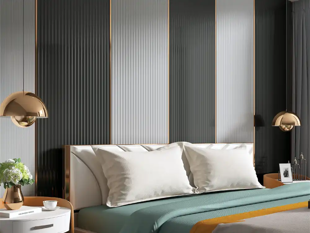
For premium offices, louvers can act as one layer in a richer material composition. Pair a controlled louver field with stone-look surfaces, metal accents, refined lighting or a high-quality reception desk. The key is proportion: every premium material should not compete for equal attention.
Use louvers to provide rhythm and depth while another material carries the main logo or central focal point. Darker finishes can feel sophisticated when the reception has enough light and floor area to support them.
Best layout move
Create depth through layering rather than adding more colours. A small setback, side lighting or a framed border can make a simple palette feel more architectural.
Decide where the logo sits before laying out the profiles
The logo is usually the most important graphic element. Mark its exact width, height and fixing points on the elevation. If letters cross multiple louver grooves, check legibility from the entrance. A backing panel behind the logo can sometimes create a cleaner reading zone.
Structural or electrical requirements for signage should connect to an appropriate substrate. Decorative louvers should not be assumed to support heavy signs or conceal unplanned wiring.
Use the desk as part of the wall composition
The reception desk blocks the lower portion of the feature wall. Draw wall and desk together so the strongest louver pattern is not hidden. If the desk has a strong decorative front, make the wall simpler. If the desk is minimal, the wall can carry more visual texture.
Aligning one desk edge with a louver bay or frame can make the entire elevation feel intentional.
Plan visitor sightlines from three positions
Check the reception wall from the entrance, from the waiting seat and from the standing position at the desk. A design that looks balanced in a front elevation may feel off-centre from the real arrival path.
Also consider visibility from glass partitions or corridors. A well-positioned vertical rhythm can guide the eye toward reception, while a cluttered feature wall can reduce wayfinding clarity.
Control lighting instead of over-lighting
Louvers create natural shadow, so lighting should reveal the texture without turning every groove into a dramatic stripe. Wall washers, ceiling spots or concealed side lighting can work depending on the concept. Test the angle before final installation.
Logo illumination and wall illumination should be balanced. If both are very bright, the reception may look harsh rather than premium.
Coordinate with acoustic and service requirements separately
A reception may need acoustic treatment, access panels, switches, security devices or fire-safety equipment. Decorative louvers should be coordinated around these systems, but do not assume a decorative louver product provides acoustic or fire performance unless the exact product has documented properties for that use.
Keep essential controls visible and serviceable. Hiding every device inside a decorative wall can make maintenance difficult.
Choose the finish with the brand, not only the floor
Many offices make the mistake of matching louvers only to flooring. The reception wall is closer to the logo, desk, lighting and visitor eye level, so those relationships matter more. Compare sample options beside the actual brand colours and desk finish.
Review the Infinite collection and shortlist finishes that support the company personality rather than merely repeating another brown tone already present.
FAQs
Should office reception louvers cover the full wall?
Not always. A framed central bay, side band or partial-width feature often creates stronger hierarchy, especially in compact receptions.
Can a company logo be installed over louvers?
Yes, with proper planning. Check letter legibility, fixing points, electrical requirements and the supporting substrate before the louvers are installed.
Which louver colours work for professional offices?
Wood-inspired, neutral and darker sophisticated tones are common choices, but the best option depends on brand colours, lighting, flooring and the reception desk.
How do I keep a louver reception wall from looking too busy?
Limit the number of materials, leave plain wall around the feature, control signage, and use one clear louver rhythm rather than several competing profile directions.
Design the reception around the brand experience
Effective louver design for office reception begins with brand personality and visitor movement. Whether the office is corporate, warm, creative or premium, the same principles apply: give the logo room, coordinate the desk, test sightlines, control lighting and keep service details practical.
Explore the Mark Decor Louvers range and the relevant Infinite collection, then contact Mark Decor with your reception wall dimensions, logo size and preferred design route.