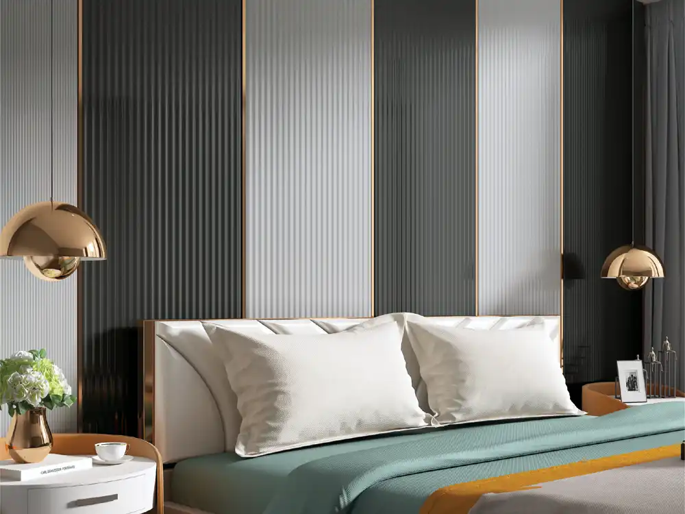

A visual guide to louver profile width, explaining how narrow, medium and wide rhythms change wall scale, shadow, furniture relationships and viewing distance.
Louver profile width changes much more than the number of vertical lines on a wall. It affects rhythm, shadow, perceived scale, visual density and the way furniture or artwork relates to the feature. Two walls in the same colour can feel completely different when one uses a fine narrow rhythm and the other uses broader profiles.
This guide explains the visual physics behind width. Use the Mark Decor Louvers category and a relevant Volume - 6 collection to compare real profile options, dimensions and finishes.
Start with rhythm, not millimetres
People experience louvers as repeated light and shadow. Narrower profiles create more frequent repetition across the same wall. Wider profiles create fewer, stronger beats. The correct choice depends on how calm or active the wall should feel.
Before choosing by number, ask whether the room needs fine texture, balanced rhythm or bold architectural lines.
Narrow profiles: finer visual texture
Narrow louver rhythms create many vertical lines. From close range they can feel detailed and crafted; from farther away the individual lines can merge into a textured field.
This can suit compact feature areas, furniture backdrops or spaces where the louver should add texture without creating very large shadow bands.
Where narrow profiles can become busy
On a very large wall, repeating a fine profile hundreds of times can create high visual activity. Strong side lighting can increase this effect by producing many narrow shadows.
If the room already has patterned flooring, bold stone or busy furniture, a fine louver rhythm may compete rather than complement.
Medium profiles: the versatile middle ground
Medium-width rhythms often balance detail and architectural presence. They can read clearly from typical residential viewing distances without becoming too fine or too bold.
This makes them useful for TV walls, foyers, dining features and office reception areas where the wall needs identity but should still support furniture and signage.
Wide profiles: stronger architectural scale
Wider louvers create fewer vertical divisions and often stronger light-shadow contrast. They can suit broad walls, double-height spaces or commercial interiors where the feature must remain visible from farther away.
Because the rhythm is larger, every termination, corner and relationship to furniture becomes more noticeable.
Where wide profiles can feel heavy
In a small room or narrow corridor, very broad and dark profiles may dominate. The wall can feel closer because each element carries more visual weight.
Use a lighter finish, smaller coverage area or better lighting if the room cannot support a bold rhythm.
Viewing distance changes everything
A sample held at arm’s length does not represent a wall seen from three or six metres. As viewing distance increases, narrow rhythms visually merge while wide rhythms remain distinct.
For a large lobby or staircase, test the profile from the real approach distance. For a bedroom headboard or foyer, evaluate it from the normal standing or seated position.
Wall width affects the number of repetitions
A profile width that looks balanced on a one-metre sample may produce an awkward partial rhythm on a specific wall. Calculate how many repeated modules fit across the wall and what happens at both ends.
Adjust the start point or frame the louver field if necessary so the feature does not end with an unintended narrow sliver.
Ceiling height changes perceived proportion
Tall ceilings can visually support stronger vertical elements. A wide profile may feel appropriately architectural in a double-height room while appearing oversized on a low, compact wall.
Narrow profiles can exaggerate verticality through repetition, but the final effect depends on colour and lighting as well.
Furniture scale should influence profile scale
A large TV console, hotel reception desk or long dining sideboard can support a broader wall rhythm. A small floating console or delicate bedside table may sit more comfortably against a finer profile.
Draw furniture and louvers together. The feature should not look as if the wall and furniture were designed independently.
Logo and signage need a calm reading zone
In commercial spaces, wide grooves or frequent narrow lines can both affect logo legibility. Test the sign against the exact profile. Sometimes a flat backing panel behind the logo provides a cleaner reading area.
Plan fixing points and electrical requirements before installation.
Lighting amplifies width
Side or grazing light makes every profile cast a shadow. Narrow profiles create many close shadows; wide profiles create fewer, broader shadows. A wall can therefore look much more dramatic at night than during the day.
Test lighting angle on a sample section rather than assuming the strongest shadow is the best effect.
Colour modifies the perceived width
Dark profiles tend to feel visually heavier. Light and medium finishes can make the same physical width appear less dominant. Wood-inspired grain also adds another scale layer that interacts with the profile rhythm.
Compare width and colour together, not as separate decisions.
Use mixed widths only with a clear concept
Combining two widths can create custom rhythm, but random mixing usually looks accidental. If widths vary, define a repeat sequence or use the wider profile to frame a specific zone.
For most interiors, one consistent profile rhythm is easier to execute and more timeless.
Profile width versus coverage width
Do not confuse the width of each louver with the overall width of the louver feature. A narrow profile can cover a broad wall, and a wide profile can be used only in a short band. Both variables affect visual intensity.
Often the simplest way to reduce heaviness is to reduce feature coverage rather than change the product itself.
Compare the shadow gap as well as the face width
What the eye reads as “profile width” is influenced by both the visible face and the gap or recess beside it. Two products with similar face dimensions can create very different rhythms if one has a deeper or wider shadow line. When comparing samples, look from the front and at an angle under the same lighting.
A quick selection exercise
Print or draw the wall elevation at a fixed scale. Mark three alternative rhythms: narrow, medium and wide. Add the TV, console, mirror or logo. Even a simple sketch reveals which repetition feels proportional.
Then compare real samples from the Mark Decor Volume - 6 collection to confirm depth, finish and actual dimensions.
FAQs
Are narrow louver profiles better for small rooms?
They can create finer texture, but too many repeated lines may also feel busy. Room size, wall coverage, colour and lighting should be considered together.
Do wide louvers make a wall look smaller?
Wide, dark profiles can add visual weight, especially in compact spaces. On larger walls, the same width may feel balanced and architectural.
Which profile width works best behind a TV?
There is no single best width. Compare the profile rhythm with TV size, console width, wall dimensions and viewing distance.
Does lighting change how louver width appears?
Yes. Directional lighting increases shadow and makes the rhythm more pronounced. Test the selected profile under the planned light angle.
Width is a proportion decision
The right louver profile width is the one that fits the scale of the wall, room, furniture and viewing distance. Narrow profiles create finer rhythm, wide profiles create stronger architectural lines, and medium widths often sit between the two. Treat width as part of the composition, not simply a catalogue dimension.
Explore the Mark Decor Louvers range and the relevant Volume - 6 collection, then contact Mark Decor with your wall dimensions and intended application for profile guidance.