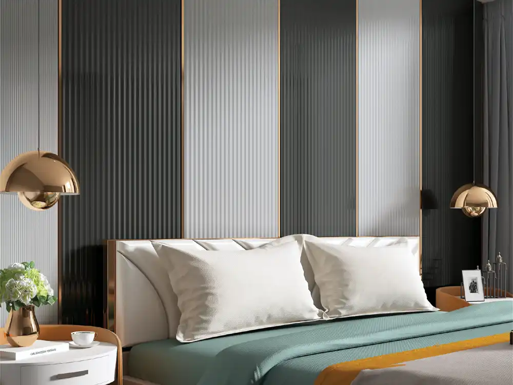

An architectural composition guide to vertical louver wall design, explaining rhythm, scale, edge control, colour, lighting and how vertical lines change perceived height.
Vertical lines change how we read a room. They pull the eye upward, divide a wide surface into repeated beats and can make an ordinary wall feel more architectural. But vertical louver wall design is not automatically elegant. The result depends on proportion, rhythm, where the pattern begins and ends, and how light travels across the grooves.
Think of the wall as a composition rather than a material application. The Mark Decor Louvers category and a chosen Volume - 5 collection provide the vocabulary; the room determines how that vocabulary should be arranged.
Principle: verticality is strongest when the eye can complete the line
A vertical pattern feels taller when it runs cleanly from a deliberate lower boundary toward the ceiling. Interruptions such as random shelves, switches and floating objects break that movement. This does not mean the wall must be empty; it means interruptions should be composed.
A low console can form a clear horizontal base while the louvers rise above it. A mirror can overlap the rhythm if its shape and position are intentional. Scattered small objects weaken the same effect.
Principle: rhythm has a tempo
Narrow repeated lines create a faster visual tempo. Wider profiles or wider spacing create a slower, calmer reading. Neither is inherently better. The correct tempo depends on viewing distance, wall width and how much other information the room already contains.
A compact foyer may become busy with very fine repetition. A broad hotel lobby can absorb a stronger or larger rhythm. View the sample from the distance at which the finished wall will normally be seen.
Principle: the first and last line matter
Designers often focus on the centre of the wall, but people notice awkward endings. Before installation, decide where the louver field begins: at a corner, door frame, console edge, panel border or measured offset from the wall edge.
Then calculate the opposite end. A narrow leftover strip beside a door can make an otherwise precise wall look accidental. Small adjustments to the starting position may create a much cleaner finish.
Principle: use asymmetry deliberately
A louver feature does not need to be centred on the wall. It can align with the furniture composition, television, bed, console or circulation axis instead. An off-centre vertical band often feels contemporary when the remaining plain wall balances it.
The key is visible logic. If the band aligns with nothing, asymmetry feels accidental. If it aligns with the edge of a console or a ceiling slot, the relationship is easy to read.
Principle: scale the pattern to the furniture
Furniture creates a second grid in the room. A TV console establishes a horizontal length, a bed creates a central width, and a reception desk defines a foreground. The louver field should relate to those dimensions rather than ignore them.
For a bed wall, the vertical feature may be wider than the bed and side tables, or it may occupy only one controlled side. For a TV wall, it might frame the screen without crowding it. Draw both furniture and wall together before choosing coverage.
Principle: dark verticals feel heavier even when they feel taller
Vertical lines can visually increase height, while dark colour can increase visual weight. These two effects operate at the same time. In a small room, a deep finish may still feel enclosing even though the pattern runs vertically.
Balance with lighter adjacent paint, warm lighting or limited coverage. In a large, bright room, a darker Volume - 5 collection option may create useful depth.
Principle: side light reveals texture; front light flattens it
Light striking across the profiles creates shadow and depth. Light aimed directly from the front can make the same wall appear flatter. This is why a showroom sample should be tested under the project’s likely light direction.
A wall washer, side slot or carefully positioned downlight can reveal the rhythm. Avoid adding light simply to make the grooves dramatic; the room still needs comfortable overall illumination.
Principle: the ceiling is part of the wall composition
If the vertical lines stop at a ceiling with visible beams, coves or multiple levels, check the relationship. A louver field aligned beneath a ceiling break can feel integrated. One that stops a few centimetres before a strong ceiling line may look unresolved.
Reflected ceiling plans are useful even for decorative wall design because lighting and ceiling geometry change how the vertical pattern is perceived.
Principle: contrast determines whether the louvers lead or support
High contrast between louvers and surrounding wall makes the feature dominant. Low contrast allows texture to appear more gradually. Decide whether the wall is the room’s main focal point or a supporting backdrop.
For rooms with dramatic furniture, artwork or views, lower contrast may be more sophisticated. For a simple entrance or reception, stronger contrast can create the necessary identity.
Principle: interruptions should become modules
Doors, screens, mirrors and niches do not have to ruin the rhythm. Treat them as modules within the composition. A door can sit inside a framed plain zone; a television can occupy a smooth panel inserted into the vertical field; a mirror can replace a measured number of profiles.
Designing the interruption is better than cutting around it after installation.
Principle: corners change the rhythm
At an inside or outside corner, decide whether the pattern stops, wraps or transitions to another material. Each approach changes the perceived volume of the room. Wrapping can make the wall feel more architectural, while a clean stop can create a crisp focal panel.
Check the actual product and installation detail for the intended corner treatment before committing to the elevation.
Principle: repetition needs a quiet neighbour
Vertical louvers are already an active texture. Pairing them with heavily veined stone, patterned wallpaper and complex cabinetry on the same wall can create competition. Give the rhythm a quieter neighbouring material so the eye can read it.
A plain painted wall, restrained laminate or simple mirror usually provides enough contrast without another strong pattern.
Three compositions to sketch before choosing
Full field: louvers cover the entire focal wall, creating maximum rhythm. Framed field: the louver area sits inside a plain border, giving it a deliberate edge. Offset band: a narrower vertical zone aligns with furniture or circulation and leaves the rest of the wall calm.
Draw all three in simple rectangles. The best option is often obvious once the furniture is included.
Principle: negative space controls how premium the feature feels
Vertical rhythm becomes more legible when there is plain surface beside it. A feature wall covered edge to edge can be powerful, but it also removes contrast. Leaving a measured painted border or adjoining calm wall gives the eye a reference and can make the louver texture feel more intentional rather than simply extensive.
FAQs
Do vertical louvers make a room look taller?
They can emphasise height because the eye follows the repeated vertical lines upward. The final perception also depends on colour, coverage, ceiling height and surrounding furniture.
Should vertical louvers cover a whole wall?
No. Full-wall coverage is one composition. Framed or offset applications can be stronger in compact rooms or where the wall contains furniture and services.
What lighting works with vertical louvers?
Light that grazes across the surface reveals more shadow and depth. Downlights, wall washers or side lighting can work depending on the room and product.
How do I avoid awkward narrow cuts at the wall edge?
Draw the profile rhythm across the exact wall width before installation and adjust the starting position or border so the final edge is intentional.
Vertical design succeeds when repetition has a reason
The beauty of vertical louver wall design comes from disciplined repetition. Control the tempo, align the field with furniture, resolve the edges and let lighting reveal rather than overpower the texture. When every line belongs to the composition, even a simple wall can feel designed.
Study Mark Decor’s Louvers options and a suitable Volume - 5 collection, then share your wall dimensions with Mark Decor if you need help narrowing the visual direction.