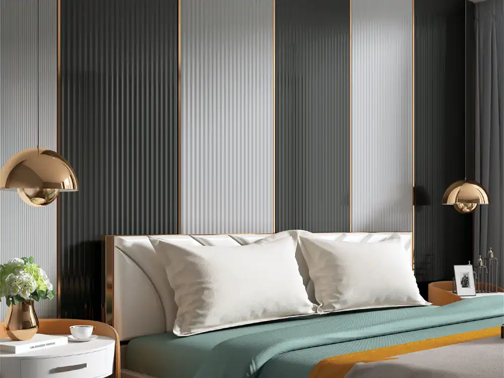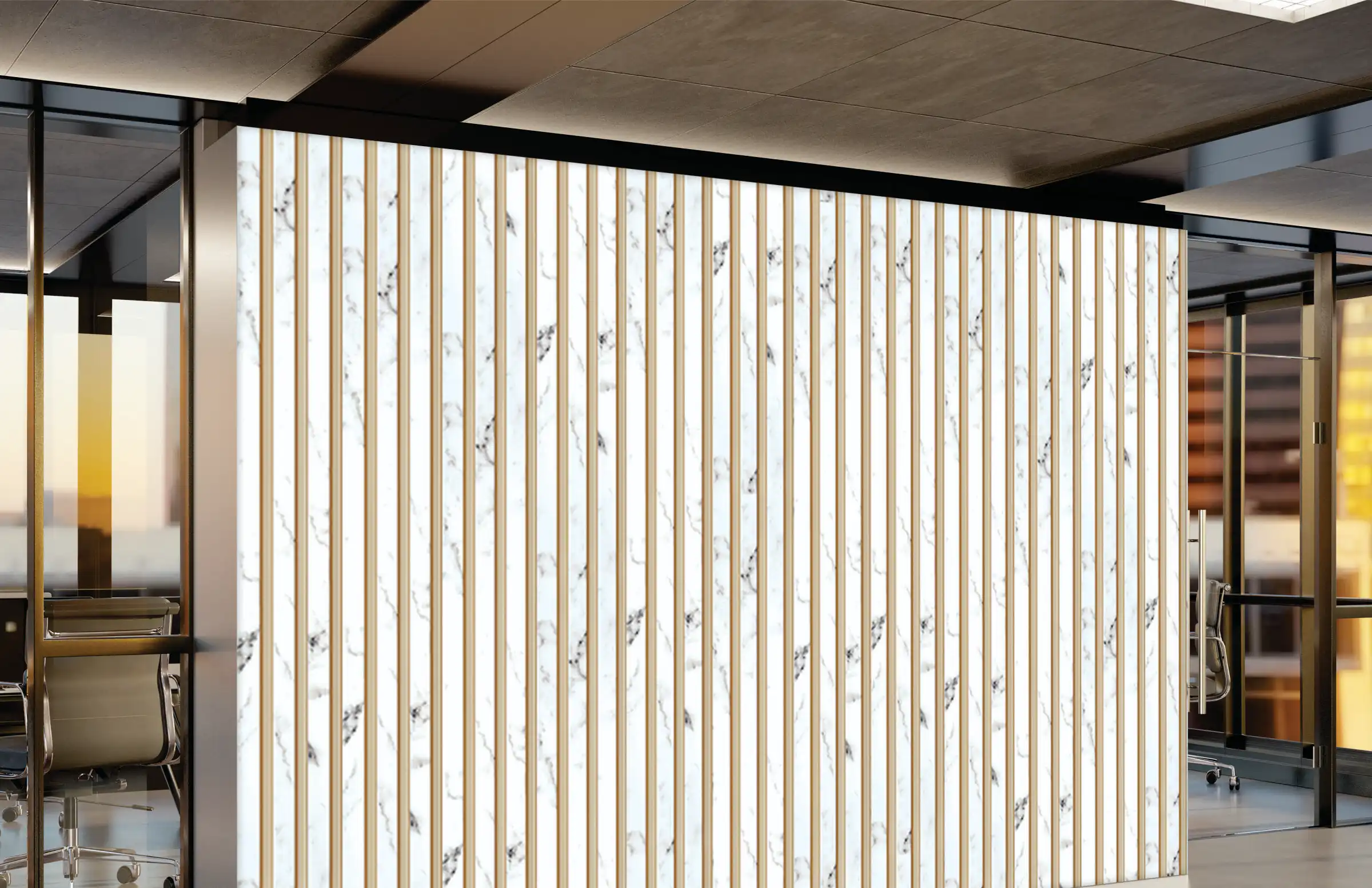
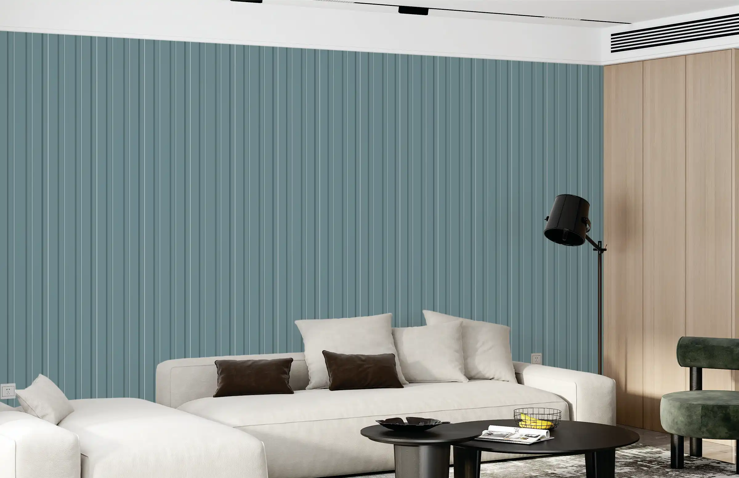
Nine apartment-specific louver strategies for studios, 1BHKs, 2BHKs and larger open plans, using controlled coverage, rhythm, zoning and material repetition without clutter.
Modern apartments ask one wall to perform several jobs. The living room may connect to dining, the entrance may open directly into the social space, and storage competes with visual breathing room. Good louver design for modern apartments uses depth selectively. The goal is not to texture every wall; it is to make compact architecture feel more intentional.
The nine moves below respond to different apartment types. Use Mark Decor’s Louvers category and a suitable Volume - 5 collection to test the right tone and profile rhythm.
Apartment move one: use one band to create a zone in a studio
A vertical louver band behind the TV or beside the sofa can define the living area without building another partition. Align it with the console, ceiling light or rug edge so the zone feels planned.
Because almost every surface is visible in a studio, reduced coverage usually feels more premium than a full wall of competing texture.
Apartment move two: repeat the finish once, but much smaller
Use the main louver feature as the hero, then echo its colour in a narrow entrance strip, shelf backing or small furniture detail. The second use should create continuity rather than another focal wall.
This repetition is especially effective in open layouts where the entry and living room are seen in one glance.
Apartment move three: let a 1BHK entrance solve storage and identity
When the front door opens near the sofa, combine a slim louver-backed console with closed shoe storage or a drawer. The feature becomes useful rather than decorative only.
If the entrance already has strong texture, keep the nearby TV wall calmer to avoid two competing arrival views.
Apartment move four: lower the visual weight in rooms with little daylight
A dark full-height louver sample may look luxurious in a showroom but feel heavy in a compact apartment at night. Try a medium tone, lighter finish or narrower feature field.
Evaluate under the actual evening lighting because apartments are often occupied most after sunset.
Apartment move five: combine TV storage and texture in one elevation
A 2BHK commonly needs practical storage. Use a low console or side tower with a louver section rather than giving the full wall to decoration.
Leave a calmer zone behind the screen if the profile rhythm is strong. The TV, cabinet and louvers should read as one planned piece of architecture.
Apartment move six: give dining identity with a framed panel
A dining sideboard can sit against a framed louver bay instead of another full-height feature. This creates a distinct dining moment while the open living-dining room remains visually connected.
For compact-space proportions, compare the approach with the small-living-room louver guide.
Apartment move seven: use louvers at transitions in larger plans
In a family apartment, a textured strip can mark the passage from foyer to lounge, living to corridor or dining to balcony zone. Transitional use feels architectural because it organises movement.
Keep circulation clear and make sure projecting details do not reduce comfortable doorway or passage width.
Apartment move eight: build one finish family across open plan
Choose one louver finish family and vary the amount. The entry can use a vertical band, dining a framed bay and living a narrow side accent.
The repeated tone connects the apartment while different proportions prevent a copy-and-paste look.
Apartment move nine: let scale increase only when the room earns it
A larger apartment can carry a broader louver field or stronger profile rhythm, but the feature still benefits from simple geometry. More space does not require more decorative tricks.
View the profile from the main seating distance and consider the wide-versus-narrow profile guide before deciding.
Editing rule: pair texture with a quiet neighbour
If louvers sit beside strong stone, patterned wallpaper, decorative ceiling and ribbed furniture, the room can feel overloaded. Remove or simplify one of those elements.
The eye needs plain surfaces to understand the texture as intentional.
Editing rule: use vertical rhythm where height needs emphasis
Vertical lines can draw attention upward, particularly when the louver field runs cleanly and is not interrupted by random shelves. This can help standard-height apartments feel more structured.
The colour still matters: a very dark wall can feel heavy even when its lines are vertical.
Editing rule: solve doors and switches before setting out the feature
Apartment walls contain many door frames and electrical points within short distances. Draw them before deciding the start and end of the louver field.
A deliberate plain strip around controls often looks cleaner than cutting every groove around several small plates.
Editing rule: use mirrors only when the reflection helps
A mirror beside louvers can widen perception and brighten an entrance or dining corner. It also reflects whatever is opposite it.
Check the reflected view from normal positions. A beautiful mirror composition is less successful if it mainly shows utility storage or clutter.
Editing rule: let soft furnishings balance hard linear rhythm
Curtains, rugs and upholstery can soften the repeated geometry of louvers. If every cabinet and wall also uses fluted or grooved texture, the apartment can feel rigid.
Alternate architectural rhythm with visually softer surfaces.
A nine-question apartment test
Before approval ask: Is there one clear focal wall? Is the entrance too busy? Is storage solved? Are there more than two strong textures in one view? Does the louver tone relate to the floor? Are edges resolved? Are switches coordinated? Does the lighting help? Is the second louver application smaller than the first?
If several answers are unclear, edit the room before adding more surface treatment.
Apartment move ten: use the louver wall to simplify the ceiling, not compete with it
Compact apartments often already contain false-ceiling edges, curtain pockets and downlights. If the wall has a strong repeated louver rhythm, keep the ceiling treatment restrained. Align lighting with the feature where possible and avoid adding another dense set of decorative lines overhead. A simpler ceiling makes the louver wall feel intentional and can reduce visual clutter in open living-dining spaces.
FAQs
Are louvers suitable for apartments?
Yes. They can add depth in entries, living rooms, dining zones and transitions when coverage and colour are controlled.
Can the same louver finish be used in several rooms?
Yes, but changing the proportion and application usually feels more natural than repeating the same full-wall design everywhere.
Which direction works best in apartments?
Vertical rhythm can emphasise height and horizontal rhythm can emphasise width. The choice should respond to wall proportions and furniture.
How can I avoid clutter?
Limit major textures, leave plain surfaces around features, solve storage and give one material the dominant role in each visible zone.
Apartment depth comes from hierarchy, not from covering more walls
The best louver design for modern apartments adds enough texture to define space and then stops. Use one strong application, repeat the language quietly and let storage, lighting and negative space keep the home calm. Explore Mark Decor’s Louvers range and a relevant Volume - 5 collection, then contact Mark Decor with the main wall dimensions.
Related reading: Louver Design for Small Living Rooms: Scale, Colour & Placement Tips Louver Design for Home Entrance: Foyer Walls, Consoles & Lighting Louver Profile Width: How Wide vs Narrow Profiles Change a Wall